
Brand Consistency in Email Marketing
Reading Time: 4 minutesBrand consistency is the first thing to consider when designing your HTML email. The look and feel of your email should be consistent with your brand’s personality, graphics, colours, fonts and images.
Why is Brand Consistency so Important?
People prefer to interact with brands they know and they can easily recognize. Brand consistency allows you to solidify your message and gain your clients’ trust. It’s a major step towards letting people know you as an organisation.
Below, you will find the five most important tips on How to Make Your HTML Email Consistent With Your Brand Image.
1. Brand Personality


Brand personality is the way a brand speaks and behaves. Every brand has its unique voice, one that matches the products or services it offers.
How does your business communicate? Do you use a lot of humour? Or do you use a more formal tone to communicate with your audience?
Whatever your brand voice is, it should be consistent across all your marketing channels, including email.
Stay true to your brand in your email marketing campaigns and make sure your tone is easily recognised by your email subscribers. Your real fans will definitely notice the difference.
2. Logo Placement
Logos are a critical aspect of your email designs. Your company logo anchors your company brand and reflects its values and principles. It is also one of the most powerful marketing tools your company has.
Placing your logo in the top left corner of your email is the most common email design decision. Readers of left-to-right languages look at the left side of the screen first and often the first design element they see is the logo. This helps them identify quickly the email they are opening.
Another HTML email design option is to place your logo in the centre of the header. Being in the header it’s still in a dominant position and still promotes your brand perfectly. It is a slightly unconventional email design approach, but perfectly acceptable as your logo remains in the header area at the top of the email template.
Choosing left or central position is totally up to you, however, the logo have to always be placed in the header of the email in some form or another.
3. Fonts
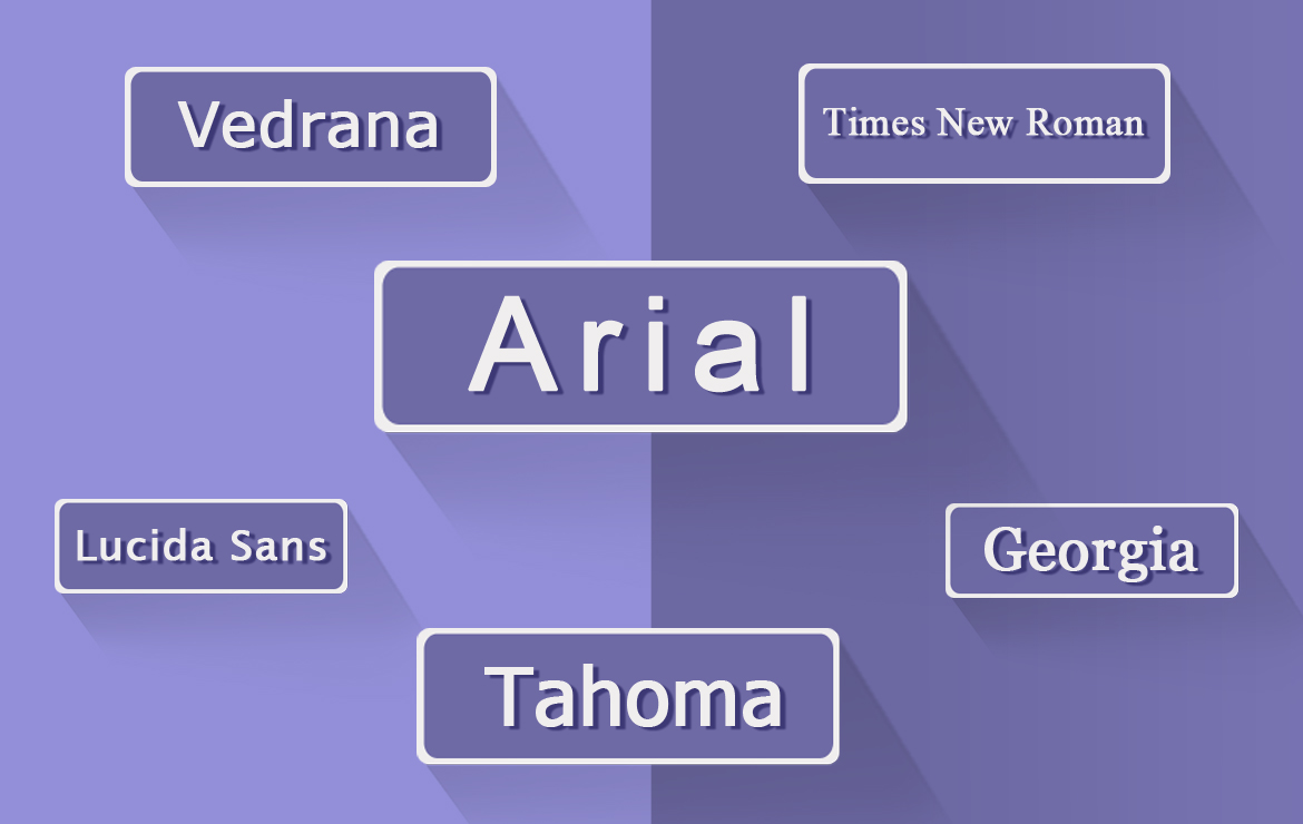

While the content of your email is incredibly important, another crucial aspect affecting how your message is perceived are the fonts you are using.
Often times, fonts play a very important role in strengthening your brand, creating interest in your product, and highlighting your central message.
Although, you might be using beautiful fonts to express your brand on your website and print materials, choosing the right fonts for your HTML email design can be a daunting task. Here is why.
When one of your subscribers opens your email, their email client (gmail, apple mail, yahoo, etc) needs to have access to the fonts you are using to display them. Otherwise a replacement font will be automatically displayed and it has to be one that is still in line with your brand and message.
This is why we recommend that the fonts you use in your email template design are web fonts, self-hosted fonts or system fonts.
To find out more on the proper use of fonts in HTML email design, read the article Fonts in HTML Emails – Limitations, Solutions and Industry Standards.
4. Colors


Color is a very important part of your brand identity system. It is the visual component people remember most about a brand. It has the power to express a brand’s attributes and values. There are studies revealing that our brains prefer immediately recognizable brands, which makes color an even more important element of your brand identity.
Color is a major consideration in HTML email design too. No matter the size of your business, the color scheme is one of the most significant factors in the overall look and appearance of an email template.
Our advice is to stick to your brand colours and to try to use them across various graphic elements such as text, icons and backgrounds, and even use images that harmonise with your palette.
5. Images
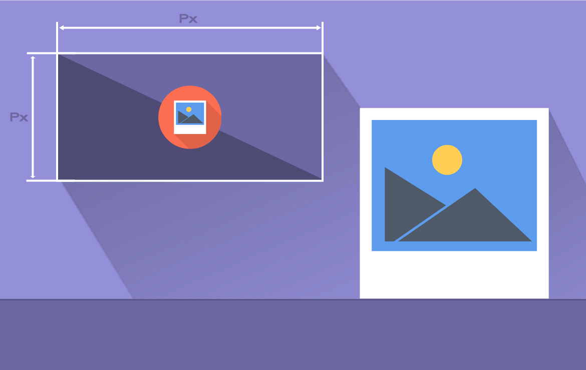

There are many reasons why the images are so important for your brand identity. First of all, visual information is very convenient. We could quickly scan an image or a chart, however, reading a piece of text takes a little longer. Along with that, images trigger memories and emotions, which helps tie up your audience emotionally to your brand and products.
We use images in our HTML email designs to add meaning to our brand, support our message and the functionality of our email template – company logo, main message image, buttons and other navigation.
Other graphics could still be used, however, they should not take the focus off the main image. The use of flat colours, subtle contrast and gentle gradients will help you with this, while allowing the secondary graphics contribute to the overall appeal of the email template design.
When considering a particular image for your email design, first try to answer these few questions:
- Does the image cover the fundamentals – size, quality and composition?
- Does the image grab your attention? Is it effective?
- Does the image convey the main message of your email?
- Will the image create desire for the product and influence reader’s decision-making?
Conclusion
Today, with the use of so many different marketing mediums to promote our brands, the success of our campaigns depends largely on the consistency of our brand image.
People are more likely to choose the brands they are more familiar with and the best way to achieve this familiarity in email is to have clearly identifiable brand elements – images, colors, fonts and logo.
Maintaining your brand image will help you build relationship with your clients and let them spot your message quickly when browsing their inboxes.
If you need assistance to create your brand consistent email campaign, see what what we can do to help you design and code your HTML Email From Scratch.