40+ Welcome Email Design Examples That Hook You At First Glance


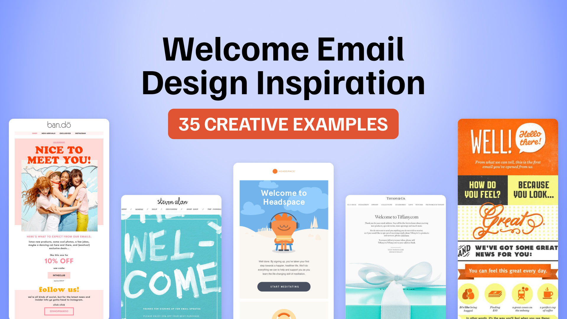
A welcome email is one of the first chances a brand gets to show new subscribers what it looks, sounds, and feels like. Some brands lead with a first-order discount. Others use the moment to introduce their products, explain what makes them different, or simply make the next step obvious.
The best approach depends on what a new subscriber needs from you first.
Below, we’ve collected 40+ welcome email design examples and grouped them by what they do best, from leading with an offer and expressing brand personality to explaining products, encouraging discovery, guiding first steps, and building longer-term relationships.
Looking for even more inspiration? Explore our collection of 150+ welcome email examples, including welcome sequences, subject line ideas, and examples for different industries.
Quick links:
→ Welcome Emails That Lead With an Offer
→ Welcome Emails That Focus on Brand Personality
→ Welcome Emails That Explain the Product
→ Welcome Emails That Encourage Product Discovery
→ Welcome Emails That Help Users Get Started
→ Welcome Emails That Build Community
Welcome Email Design Examples
There is no single formula for a good welcome email. The right design depends on what you want a new subscriber to understand or do first. To make the examples easier to explore, we’ve grouped them by the role the email plays in the customer’s first interaction with the brand.
Welcome Emails That Lead With an Offer
These welcome emails make the introductory discount, free shipping, gift, or other incentive the main reason to act. The strongest examples keep the offer easy to understand while still making the email feel connected to the brand.
Offer-First Welcome Email by Hush Puppies
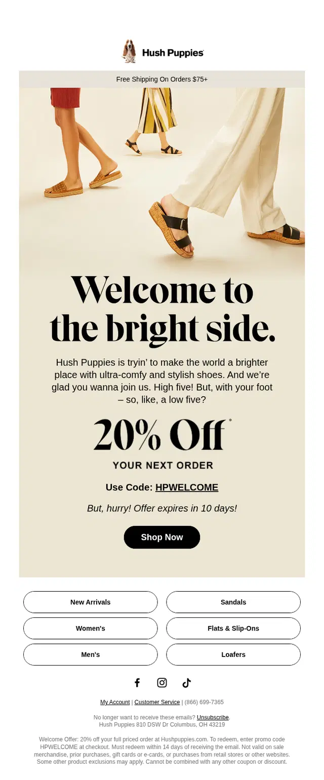
Hush Puppies makes the 20% welcome discount the clear focal point of the email. A large lifestyle image introduces the brand visually, while the offer, promo code, and Shop Now CTA are grouped together so there is little ambiguity about what the subscriber should do next. The category links below give shoppers more ways to explore without competing with the primary offer.
Discount-First Welcome Email by TN Nursery
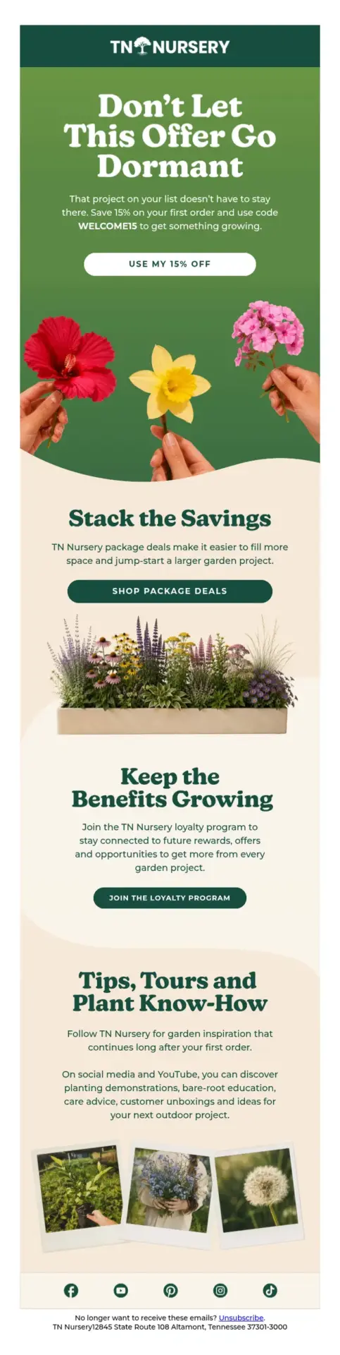
TN Nursery leads with a 15% first-order discount, making the offer the clear focal point of the welcome email. The promo code and CTA appear prominently at the top, while package deals, the loyalty program, and gardening content add extra value further down the message.
Discount-Led Welcome Email by Steven Alan
Steven Alan makes the welcome message almost impossible to miss with oversized hand-painted lettering and a bright turquoise background. The 15% discount sits directly beneath the thank-you message, keeping the email focused on a single incentive rather than adding extra products or navigation. The sparse layout also gives the typography most of the visual weight, making a relatively simple welcome offer feel much more distinctive.

Playful Discount Welcome Email by Joy Supply
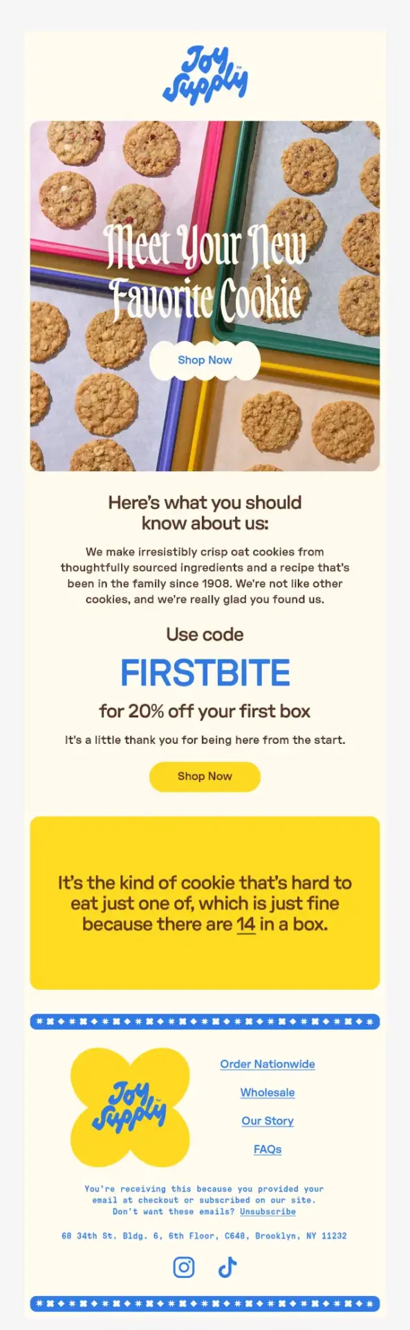
Joy Supply combines a 20% first-order discount with colorful product photography, playful typography, and a visual style that immediately feels connected to the brand. The offer is easy to spot, but it does not take over the entire email. That balance helps the email do two jobs at once: give the subscriber a reason to buy and introduce the personality behind the products.
Discount-First Welcome Email by Steve Madden
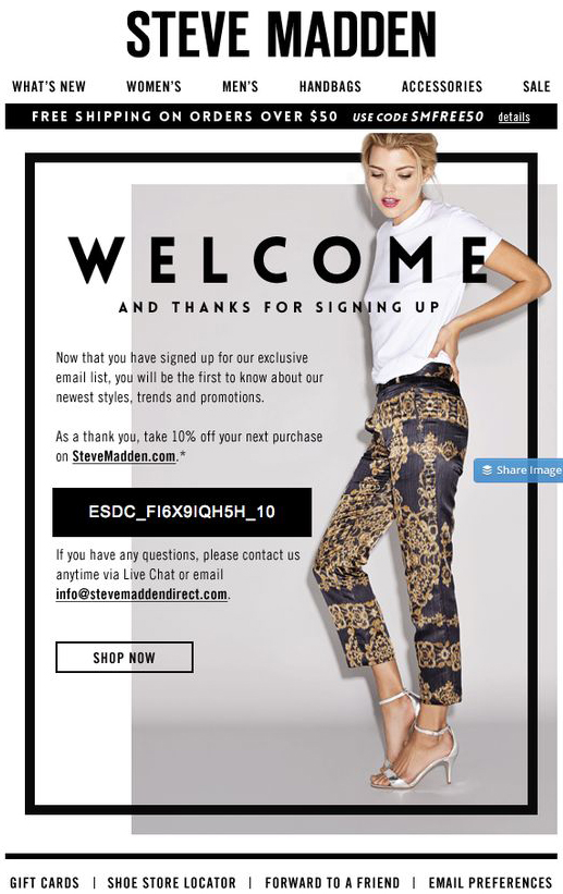
Steve Madden pairs a straightforward welcome message with a 10% first-purchase discount, keeping the promo code and Shop Now CTA easy to find within a bold fashion-focused layout. The large editorial image gives the email a strong brand feel while the offer provides new subscribers with an immediate reason to visit the store.
Discount-Led Welcome Email by Bloomingdale’s
Bloomingdale’s puts its 10% first-purchase discount at the center of the welcome email, with the promo code and Shop Now CTA immediately visible. The surrounding fashion imagery keeps the message visually tied to the brand, while the short list of subscriber benefits gives readers a quick preview of the new arrivals, product launches, and exclusive offers they can expect.

Welcome Emails That Focus on Brand Personality
These emails use the welcome moment to establish how the brand looks, sounds, and feels. Strong typography, distinctive imagery, recognizable color choices, and a clear tone of voice do more of the work than product education or a large promotional offer.
Luxury-Led Welcome Email by Tiffany & Co.
Tiffany & Co. keeps the welcome unmistakably on-brand with its signature blue packaging, restrained copy, and elegant typography. Rather than relying on a discount or dense product selection, the design uses familiar brand cues to establish the exclusivity and sophistication associated with Tiffany.

Bold Brand Personality Welcome Email by EAT DIRT
EAT DIRT makes its personality impossible to miss. Bright orange and blue, oversized product imagery, and copy such as “Hello, Filthbag” immediately establish the playful, irreverent tone behind the brand.
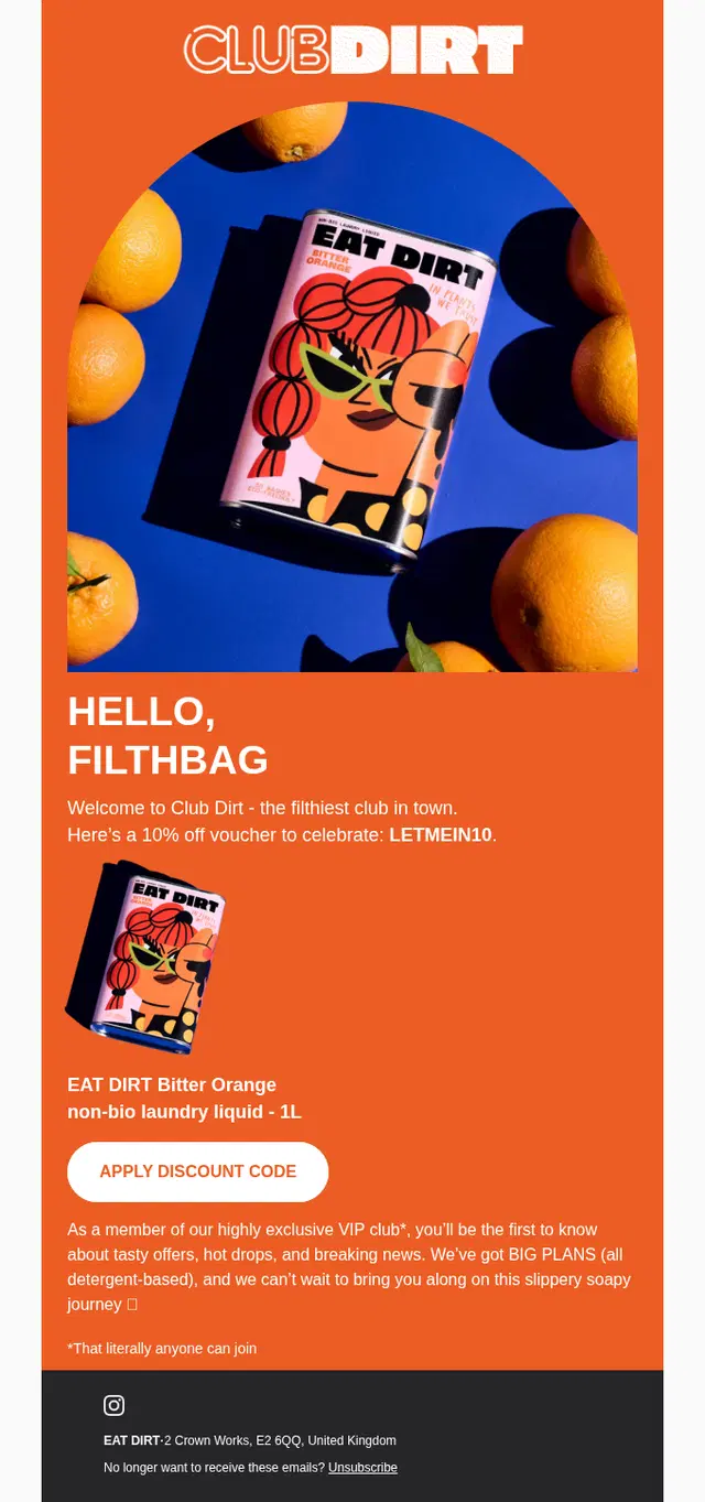
The same attitude continues throughout the email rather than disappearing after the hero section, making the whole design feel like one consistent introduction to Club Dirt.
Fashion-Led Welcome Email by Hudson
Hudson uses bold black-and-white photography and oversized typography to make the welcome feel more like a fashion campaign than a standard signup message. The introductory offer is still easy to find, but the visual identity clearly leads the experience.

Brand Introduction Welcome Email by Bezar
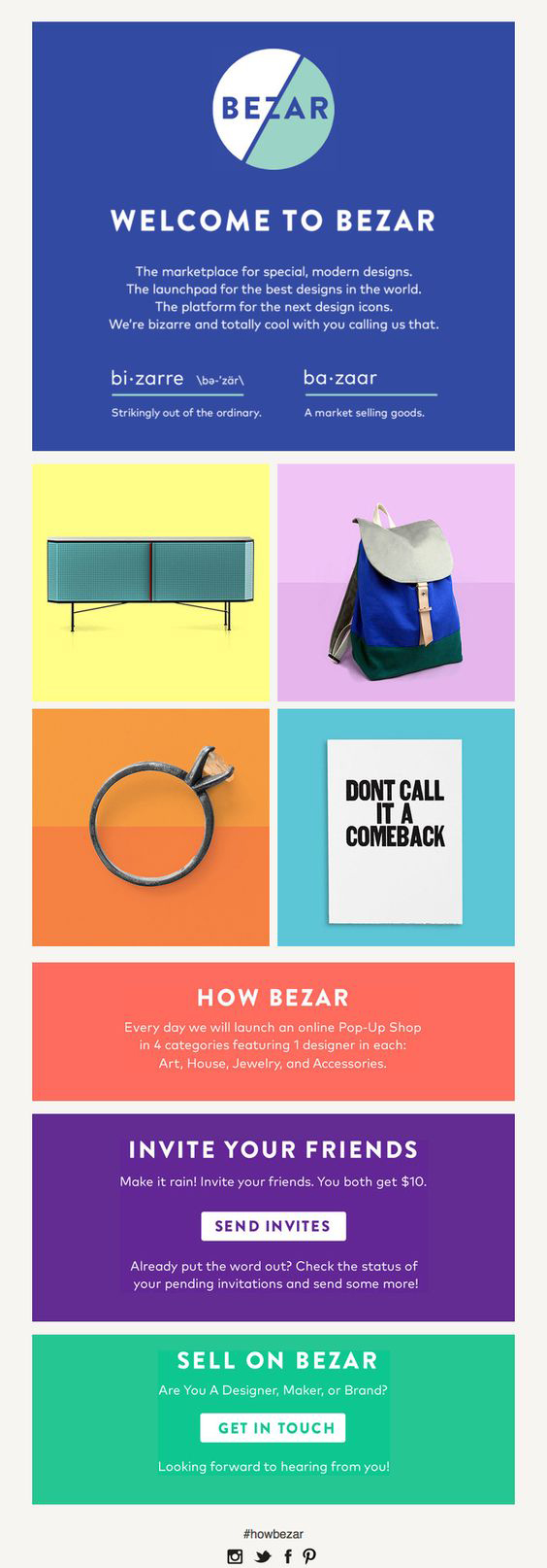
Bezar uses its welcome email to explain what the brand is before asking subscribers to shop, defining its name, introducing its design-focused marketplace, and showing the colorful products they can expect to discover. The referral and seller sections extend that introduction further, making the email feel like an invitation into the wider Bezar world rather than a simple signup confirmation.
Typography-Led Welcome Email by The Arrivals
The Arrivals makes typography the defining feature of its welcome email, pairing a distinctive type treatment with sharp copy and fashion imagery. The editorial approach gives subscribers an immediate sense of the label’s visual identity without relying on a large promotional offer.

Color-Driven Welcome Email by Lilly Pulitzer
Lilly Pulitzer uses bright color, watercolor-style elements, and a distinctly summery visual direction to make the welcome feel immediately recognizable as part of the brand. The email relies on that energetic aesthetic to create the first impression, with the visual identity carrying more weight than product education or a promotional hook.

Retro-Inspired Welcome Email by Upworthy
Upworthy uses bold retro typography, a warm orange-and-yellow palette, and playful copy to give the welcome email a strong, recognizable personality from the start. Popular stories appear further down as examples of what subscribers can expect, but the distinctive visual style and tone are what shape the first impression most strongly.

Globally Inspired Welcome Email by Tea Collection
Tea Collection pairs its welcome offer with travel-inspired imagery and a short introduction to the ideas behind the brand. The email gives new subscribers a quick sense of its globally influenced identity and playful approach to children’s clothing while still providing a clear reason to start shopping.

Welcome Emails That Explain the Product
Some products need more context before a new subscriber is ready to buy. These emails use the welcome message to explain what the product is, how it works, what makes it different, or why it is worth trusting, usually through short benefit-led sections and supporting visuals.
Product Education Welcome Email by Huha
Huha opens with a 15% welcome offer, then quickly explains what makes its underwear different. Short sections highlight breathable fabrics, thoughtful construction, and the brand’s mineral gusset technology, supported by product photography and simple visual cues.
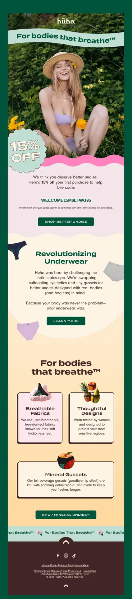
Instead of placing all of that information in one dense block, the design breaks the product story into smaller benefits that are easy to understand while scrolling.
Trust-Building Welcome Email by Butternut Box
Butternut Box pairs a prominent 50% introductory offer with information that helps new customers feel more confident about the product. Ingredients, veterinary expertise, and the benefits of fresh dog food all receive space alongside the promotion.
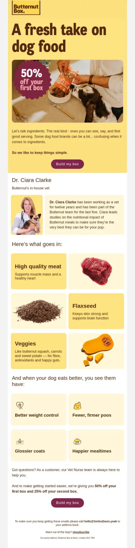
That is especially useful for a product where subscribers may have questions about quality, nutrition, and whether switching is right for their dog.
How-It-Works Welcome Email by Vivino
Vivino uses the welcome email to explain the core value of the app: users can scan and rate wines, and those actions help generate more personalized recommendations over time. The simple two-part structure makes the product easy to understand before directing readers toward its features and wine marketplace.

Welcome Emails That Encourage Product Discovery
These welcome emails encourage new subscribers to explore what the brand has to offer. Some use a broad invitation to browse, while others highlight categories, collections, new arrivals, best sellers, or several clear shopping paths.
Category-Led Welcome Email by PrettyLittleThing
PrettyLittleThing uses the welcome email to push new subscribers straight into browsing, first highlighting its latest fashion and then offering clear paths into New In, Tops, Dresses, Shoes, and Sale. The bright pink styling and playful copy add plenty of brand personality, but the email’s main job is clearly to help readers discover what they can shop next.

Coffee-Lover Welcome Email by Trade
Trade greets subscribers as fellow coffee lovers and quickly promises plenty to explore, whether they prefer their coffee black or with cream and sugar. The minimal message builds curiosity around the range available, then turns that interest into a simple next step with a prominent “Shop Coffee” CTA.

Shopping-Led Welcome Email by John Lewis
John Lewis uses its welcome email to move new subscribers naturally toward exploring the store, pairing a simple introduction with clear “Start exploring” and “Start shopping” prompts. The restrained layout keeps those browsing paths easy to find while giving the email a polished retail feel.

Experience-Driven Welcome Email by Carnival
Carnival uses this welcome email to sell the bigger experience, not just a booking. The message opens with a bold vacation promise, then quickly breaks that promise into concrete areas to explore, like dining and destinations. That structure works well because it helps new subscribers picture what the brand offers while naturally guiding them toward the next click.

Choice-Driven Welcome Email by Review Australia
Review Australia welcomes new subscribers with a short introduction and a clear Start shopping CTA, then offers two secondary paths: creating a wishlist or joining the rewards program. The hierarchy makes the main action obvious while still introducing other useful parts of the customer experience.

The illustrated black-and-white background and soft pink panels give each action its own space without turning the email into a dense navigation menu.
Product Discovery Welcome Email by Tory Burch
Tory Burch combines a welcome discount with clear browsing paths for new arrivals, shoes, clothing, and handbags. The structure helps subscribers move naturally from the initial offer into product exploration without making the email feel crowded.

Need a welcome email built for your brand?
We design and code custom email templates that turn your ideas into responsive, inbox-ready emails.
Welcome Emails That Help Users Get Started
These welcome emails focus on what happens after signup, giving new users clear guidance on what to do next. They may introduce key features, explain first steps, or point people toward the actions that help them get value from the product or service quickly.
App Onboarding Welcome Email by ChefsFeed
ChefsFeed uses the welcome email as a quick tour of the app, showing new users how to follow chefs, discover nearby dishes, and save favorites for later. The bright yellow design and playful copy give the message plenty of personality, but its main job is practical: helping someone understand what they can do in the app right away.

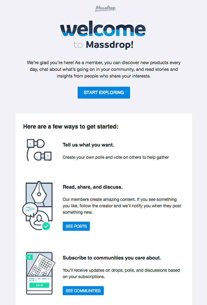
Member Onboarding Welcome Email by Massdrop
Massdrop uses the welcome email as a clear onboarding guide, showing new members exactly how to start participating. After a broad “Start Exploring” CTA, it breaks the experience into practical next steps: vote in polls, read and discuss community posts, and subscribe to communities they care about. The community aspect is strong, but the email’s primary job is clearly helping a new member get started.
Login-Ready Welcome Email by Ballpark
Ballpark keeps the welcome email focused on helping a new user take their first action. It briefly explains what they can do in the platform, provides their login details, and makes “Log In Now” the clear next step. The message is functional and reassuring, with just enough guidance to move someone from signup into actually using the service.

Guided Onboarding Welcome Email by Headspace
Headspace uses its welcome email to do more than say hello. It immediately guides new subscribers toward a first action with a clear “Start Meditating” CTA, then explains what to do next by introducing the Basics course before showing what comes after. The result feels calm, supportive, and highly practical, which makes it a strong example of a welcome email that helps users get started with confidence.

Sample-Project Welcome Email by Dovetail
Dovetail turns the welcome email into a practical onboarding step by giving new users a sample project and explaining how it can help them understand the platform’s basic concepts. From there, it introduces key actions like viewing projects, taking research notes, and organizing customer feedback, making the next steps feel clear rather than overwhelming.

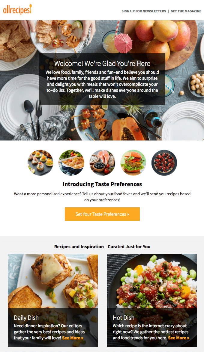
Preference-Setting Welcome Email by Allrecipes
Allrecipes turns the welcome into a practical first step by asking new subscribers to set their taste preferences so future recipe recommendations can be more relevant. The prominent “Set Your Taste Preferences” CTA makes personalization the main action, while the curated recipe sections below give readers an immediate preview of the kind of content they can expect afterward.
First-Form Welcome Email by Wufoo
Wufoo makes the next step unmistakable by encouraging new users to create their first form right away. The email supports that main CTA with a short explanation of what they can do next, from choosing a template and embedding the form to tracking responses, while links to templates, guides, and the Help Center provide extra support if they need it.

Personalized Onboarding Welcome Email by BBC
BBC uses the welcome email to explain how its email experience will work, from weekly roundups and interest-based recommendations to preference controls that help shape future messages. It then moves naturally into a “Let’s get you started” section with clear content paths such as drama, comedy, music, news, and wildlife, giving new subscribers an immediate way to begin exploring.

Account-Ready Welcome Email by Allbirds
Allbirds keeps the welcome simple and practical, explaining how the new account can make future shopping easier by speeding up checkout and keeping order history in one place. The playful sheep illustration adds personality, but the email’s main purpose is to orient the customer around their new account and give them a clear next step with “Visit our store.”

Welcome Emails That Build Community
These welcome emails introduce subscribers to more than the first purchase. They encourage people to stay connected through loyalty programs, social channels, educational content, events, membership benefits, or other parts of the brand community.
Relationship-Led Welcome Email by ban.do
ban.do opens with a warm “Nice to Meet You” message and quickly sets expectations for the ongoing relationship, from new products and playful content to exclusive deals and Instagram updates. The 10% discount adds an incentive, but the email’s stronger message is that subscribers are joining a lively, social brand world they can keep engaging with.

Community-Focused Welcome Email by Claire’s
Claire’s makes new subscribers feel part of the brand from the start, using friendly language around becoming a “new best friend” alongside promises of special offers, secret sales, events, and social content. The playful design supports that sense of belonging rather than making the email feel like a simple shopping prompt.

Community-Driven Welcome Email by Lovely Notes
Lovely Notes uses the welcome email to invite subscribers into an ongoing relationship with the product, encouraging them to follow new features, share what they create with the #lvlynotes hashtag, leave feedback, and suggest future ideas. The friendly copy and playful visual style make the message feel personal, while the emphasis on participation and conversation makes community the clearest fit.

Warm Community Welcome Email by MOO
MOO creates an immediately warm and inclusive welcome, speaking to new subscribers as people the brand is genuinely happy to have found. Phrases like “Together we’re going to make some great stuff” and “Welcome, new friend” make the message feel relationship-led, while the brief introduction to MOO’s products and the “Take a look around” CTA remain secondary.

Personal Welcome Email by ModDeals
ModDeals keeps the welcome message simple and personal, thanking new subscribers and setting expectations for the offers and updates they will receive. The oversized envelope graphic reinforces the feeling of direct communication, while the Shop Now CTA gives people an easy next step without making the email feel purely promotional.

That makes the email feel more like the beginning of an ongoing relationship with the subscriber than a one-off discount message.
Community-Driven Welcome Email by Urban Outfitters
Urban Outfitters welcomes subscribers with a direct “You’re in” message, then introduces them to more than products and promotions by pointing to music, art, fashion, and editorial content. The result feels like an invitation into the wider UO world rather than just another sales email.

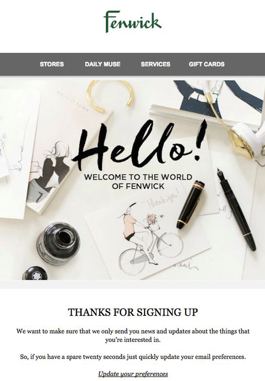
Preference-Led Welcome Email by Fenwick
Fenwick uses the welcome moment to encourage subscribers to shape the emails they receive by updating their preferences. The approach makes the signup feel like the start of a more personalized relationship with the brand, while the “Welcome to the world of Fenwick” message and editorial imagery reinforce a sense of belonging.
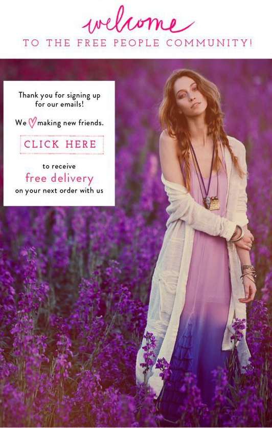
Community-Led Welcome Email by Free People
Free People welcomes subscribers directly into its “community” and reinforces that idea with friendly language about “making new friends.” The free-delivery incentive gives readers a reason to shop, but it sits within a message primarily framed around belonging and joining the brand’s wider community, making this a better fit here than under Brand Personality.
Community-Centered Welcome Email by DEED
DEED welcomes new users around a shared interest in volunteering, then quickly emphasizes participation and connection through new opportunities, inviting friends, and giving feedback. The message explicitly positions users as part of what makes the community valuable, so the strongest takeaway is belonging and involvement rather than simple onboarding.

What the Best Welcome Email Designs Have in Common
The examples above take very different approaches, but the strongest welcome emails tend to get a few important things right. They make the purpose of the message obvious, give the subscriber a clear next step, and use the design to support that goal rather than distract from it.
A Clear Visual Priority
A new subscriber should understand what matters most within a few seconds. That might be a welcome discount, a product benefit, an invitation to explore, or the first step in using a service. Strong welcome email design gives that primary message the most visual weight instead of making every section compete for attention.
One Obvious Next Step
The best welcome emails rarely leave readers wondering what to do next. A prominent CTA such as Shop Now, Start Exploring, Set Your Preferences, or Get Started creates a natural path forward. Secondary links can still be useful, but they should not compete with the main action.
A Design That Feels Like the Brand
Welcome emails are often a subscriber’s first real experience of a brand in the inbox. Color, typography, photography, illustration, and tone of voice should therefore feel consistent with the wider brand experience. The goal is recognition, not decoration for its own sake.
Enough Context to Build Confidence
Some subscribers are ready to shop immediately. Others need to understand the product, learn how the service works, or see what they can expect from future emails first. The best welcome designs give people enough information to move forward without turning the message into a complete brand manual.
A Reason to Stay Engaged
A welcome email should also give subscribers a sense of what comes next. That could mean exclusive offers, useful content, personalized recommendations, new products, community participation, or simply a better experience with the service. The strongest examples make the first email feel like the beginning of something rather than an isolated message.
Frequently Asked Questions
When should you send a welcome email?
The first welcome email should usually arrive immediately after someone subscribes, while the signup and the brand are still fresh in their mind. If you are using a welcome series, additional emails can follow over the next several days rather than putting everything into the first message.
How many welcome emails should you send?
One email may be enough for a simple welcome or first-order offer, but a short series gives you more room to introduce products, benefits, useful content, or the brand itself. If you use Klaviyo, our guide to building a Klaviyo welcome flow covers how to structure the sequence and decide what each email should do.
What is the difference between a welcome email and a confirmation email?
A confirmation email usually asks someone to verify an action, such as confirming an email subscription or account. A welcome email comes after signup and starts the actual relationship with the subscriber, whether that means delivering an offer, introducing the brand, or guiding them toward a useful next step.
What is a good subject line for a welcome email?
A good welcome email subject line should make the sender recognizable and give people a clear reason to open. Simple options such as “Welcome to [Brand]” can work well, while offer-led emails can make the benefit more specific with wording such as “Welcome — Here’s 15% Off Your First Order.”
How do you automate welcome emails in Klaviyo?
In Klaviyo, welcome emails are typically built as an automated flow triggered when someone joins the relevant subscriber list. Before building the flow, make sure your signup source is sending subscribers to the correct list and, for ecommerce stores, that your store integration is working properly. Shopify users can start with our guide on how to connect Klaviyo to Shopify, then explore the other Klaviyo flows worth setting up alongside the welcome series.
Create a Welcome Email That Feels Like Your Brand
The best welcome email design is the one that makes the right first impression, gives subscribers a clear reason to engage, and feels consistent with the experience they will get from your brand afterward.
If Klaviyo is part of your email strategy, we can help you turn that first welcome into a complete flow built around your customers and ecommerce goals.