25 Excellent Examples of Transactional HTML Emails
Reading Time: 4 minutesIf you run a website or a blog, chances are you are using transactional emails to notify your users when they sign up for your service, place an order or to remind them for abandoned cart.
The transactional emails are different from standard marketing emails in terms of both content and design. So, to help you create your own transactional emails, we put together this list of 25 Excellent Examples of Transactional HTML Emails.
Welcome Emails
1. Steven Alan
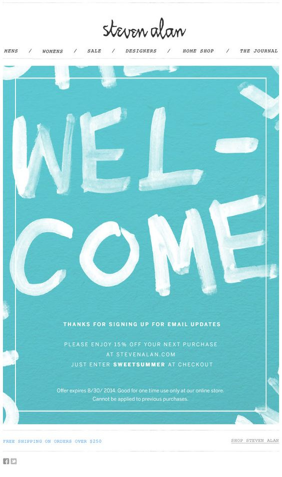
Here is a perfect welcome email that says it all. You have signed up with Steven Alan and you are notified with a clear message. Plus, you will enjoy 15% off your next purchase. Nice touch!
2. Starbucks
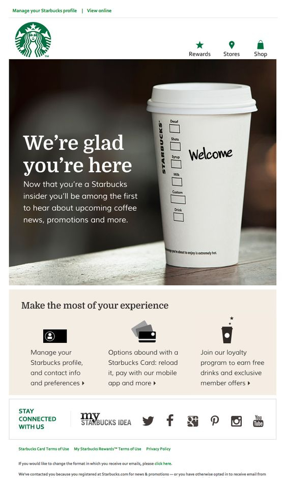
A Welcome email to all Startbucks coffee insiders. A large image with a clear message and three quick links underneath: manage your account; get a Starbucks card; join the loyalty program.
3. Airbnb
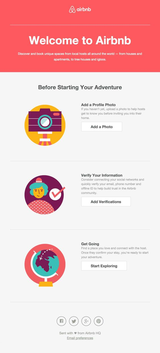
Airbnb acknowledges your registration with them with a big red Welcome to Airbnb banner on the top. The greetings message is followed by an account set up instructions in three steps, each accompanied by an illustrated icon.
4. Sur la table
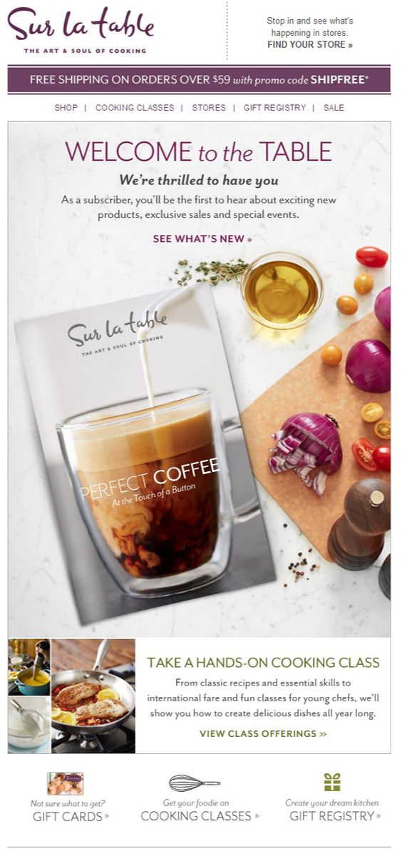
Sur la table welcomes you with a visually appealing transactional email and the promise to be the first to hear about new products, sales and special events.
5. Tory Burch
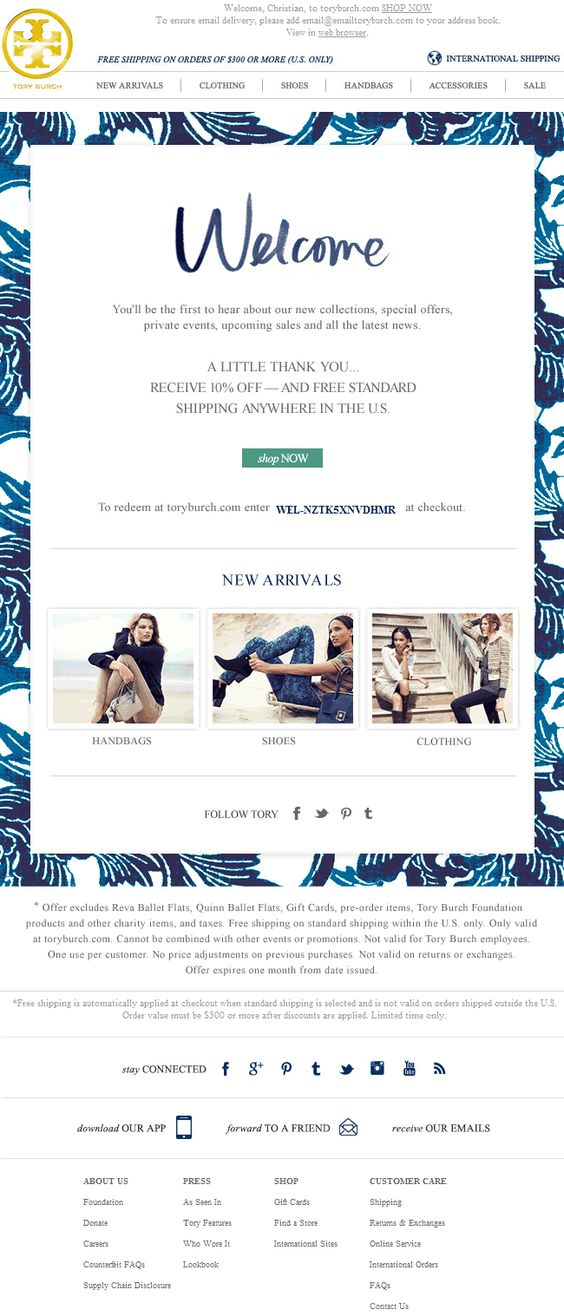
Tory Burch welcomes their clients in style. The welcome message is placed in a beautiful, blue frame and complimented by a little thank you gift – 10% off your purchase.
6. SAXX
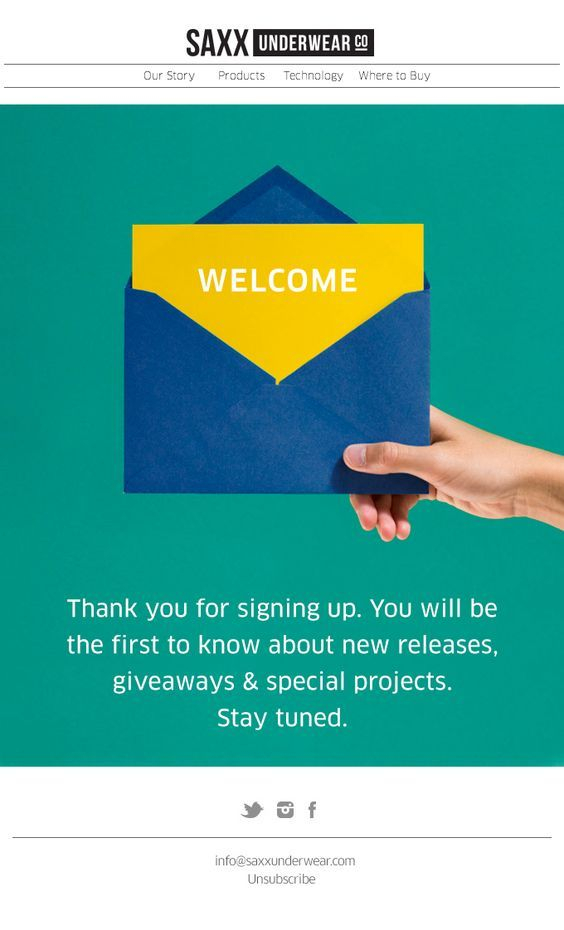
The SAXX Underwear welcome email is a reminder of the old days of mailing postcards. The point-of-view shot makes you feel like holding the envelope yourself.
7. UGG
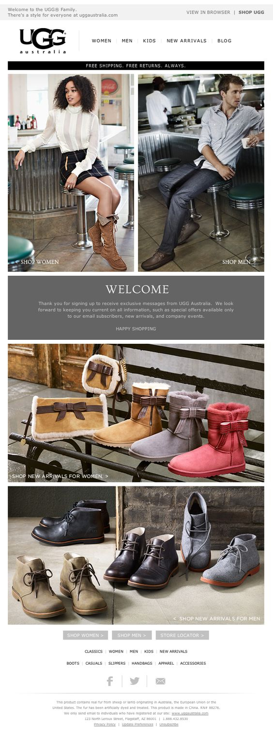
UGG welcomes their clients with this beautiful email. You still see the welcome message clearly in the centre of the email, but there are also a lot of product examples around it.
8. Everlane
In a clean and stylish design, Everlane combines their welcome message with three, short testimonials and a Shop Now button. There is navigation menu on the top of this transactional email too.
Order Confirmation Emails
9. Huckberry
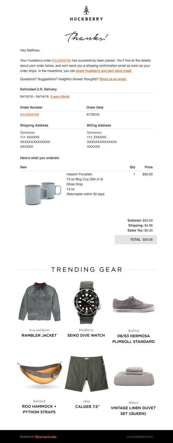
Here is a transactional email for order confirmation from Huckberry. Along with the order number and details for the purchased item, the email features a trending gear section.
10. Expressionery
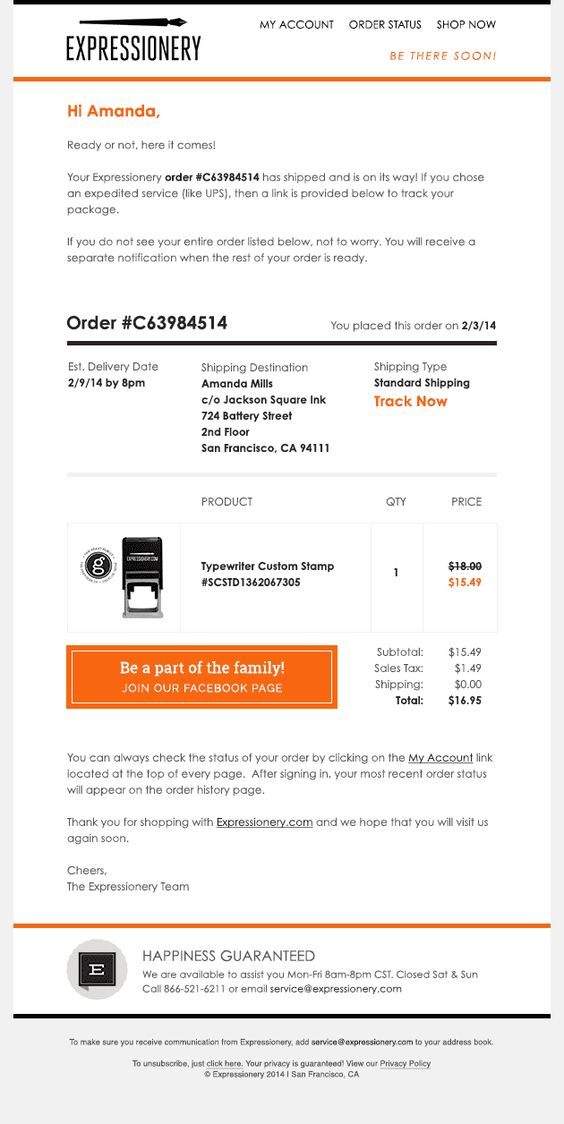
A confirmation email sample from Expressionery, displaying the item information, but featuring also a big orange button prompting the recipient to join their Facebook page.
11. Trumaker
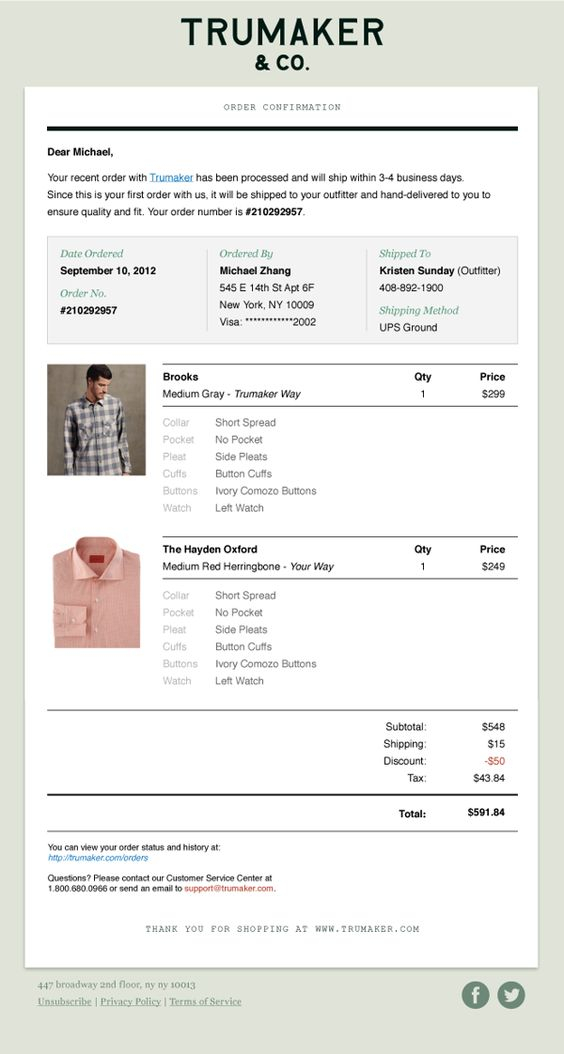
The Trumaker order confirmation email displays a layout for two products, client details confirmation section and no marketing messages at all. This is a very good example of transactional email for order confirmation.12. Teespring
A lovely Teespring order confirmation email with the purchased product on top and payment information underneath. The email also shows some seller information and a couple of recommendations for similar products.
13. Fitbit
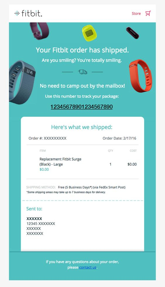
The Fitbit order confirmation email is short and to the point. It features Fitbit’s products hovering on top, plus information about the item that has been shipped.
Abandoned Cart Emails
14. FiftyThree
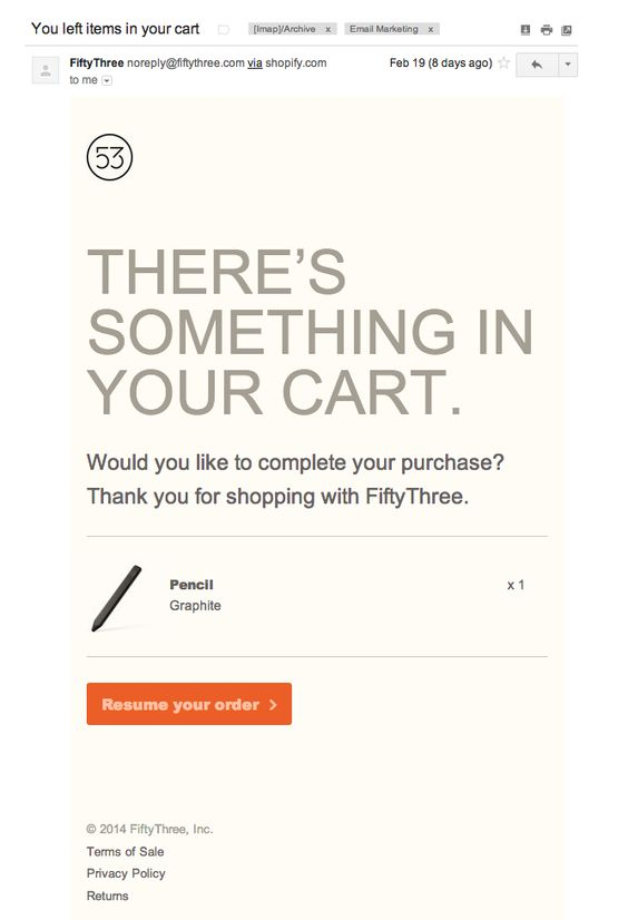
The abandoned cart email from FiftyThree directly says what it is about – There’s something in your cart. Then you see the product they refer to and an option to continue with its purchase, an orange button – Resume your order.
15. Levi’s
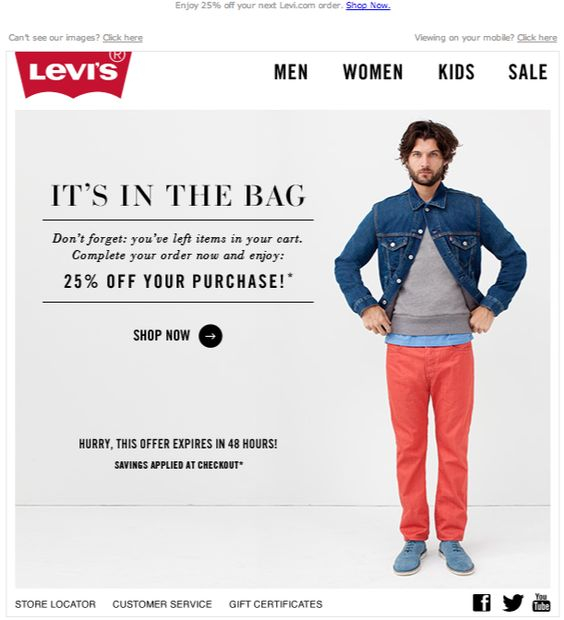
Levi’s reminds you about the purchased items you’ve left behind with a transactional email. They don’t say what exactly are these, but they give you a 25% discount, if you complete your purchase in 48h.
16. Warby Parker
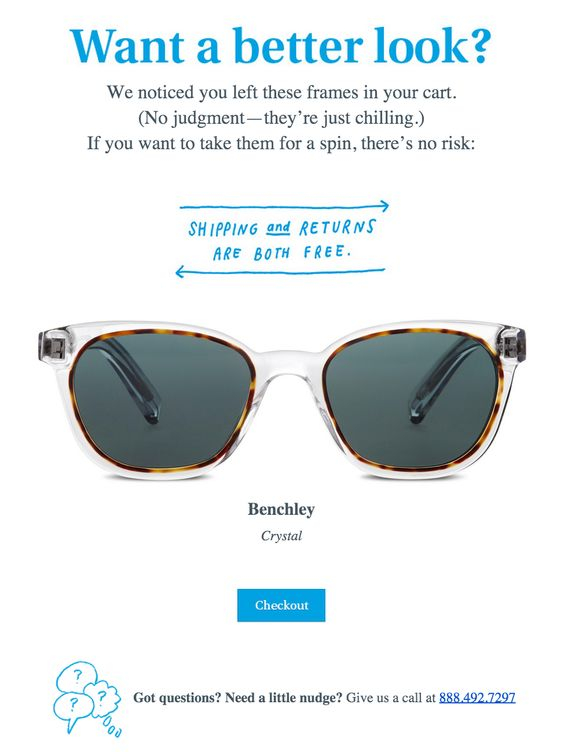
A beautiful Warby Parker abandoned cart email. The white background helps the abandoned item to stand out and also highlights the message Shipping and Returns are both free.
17. NARS Cosmetics
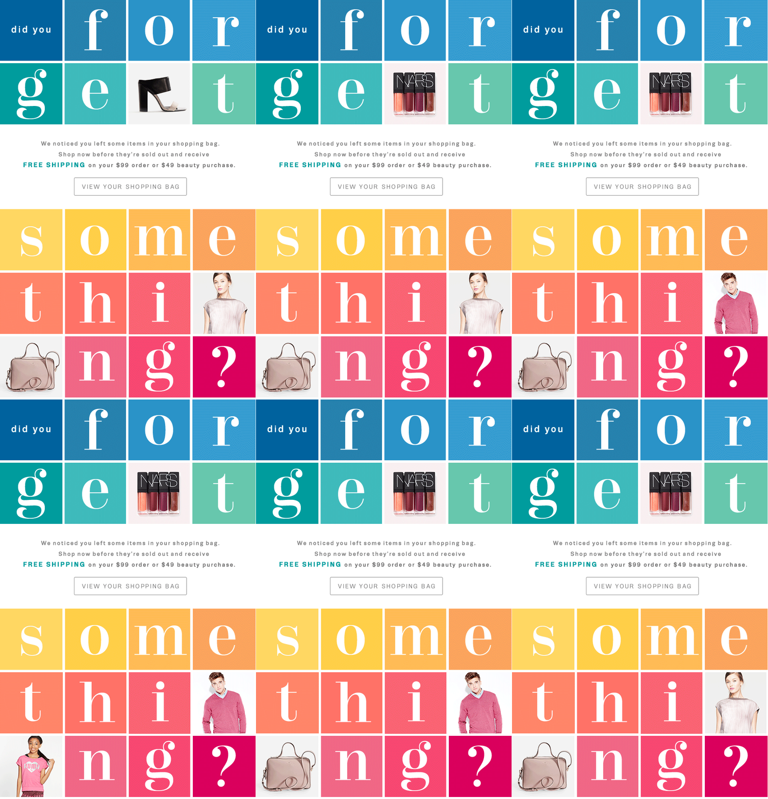
A special one for the GIF lovers. An abandoned cart email from NARS Cosmetics, big and colorful. No specific information about the items left behind, but they give you a free shipping if your purchase is over $99.
18. ASOS
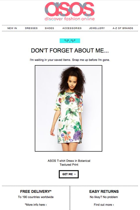
ASOS prefers to show you the exact item you’ve left behind. They start with a Don’t forget about me… message, followed by an image of that summer dress you selected, but you never purchased.
19. Birchbox
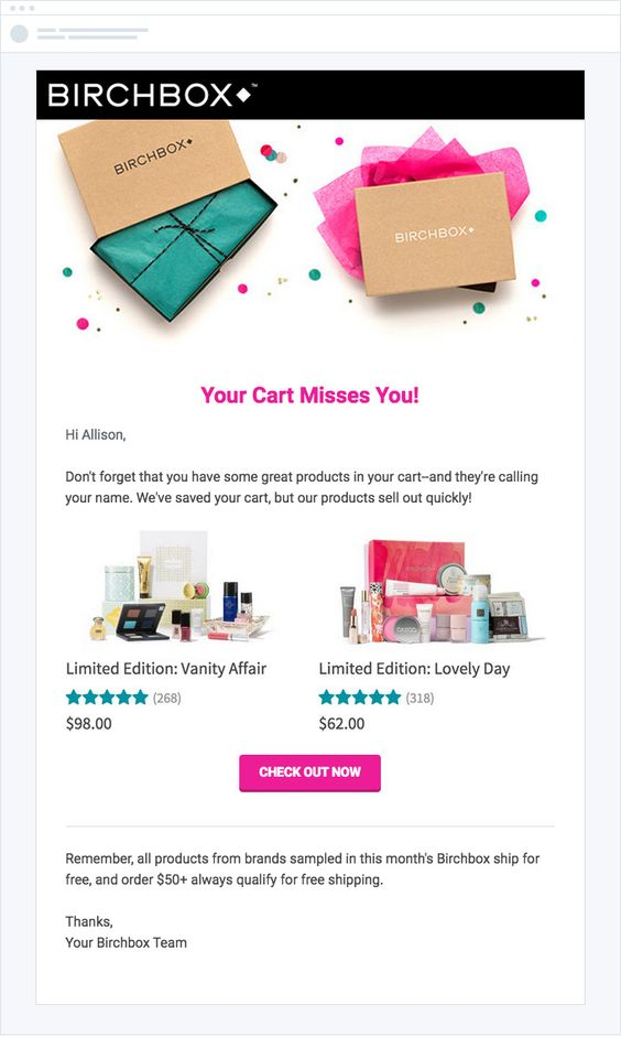
Your cart misses you! is the message Birchbox chose for their abandoned cart email. The email features light design with a couple of limited edition products placed on top of the pink Check Out Now button.
Cold Lead Activation Emails
20. Duolingo
Duolingo reminds its subscribers that they have not attended a lesson on their website for some time. Suggesting that they Take a 5 min lesson right now.
21. Bonobos
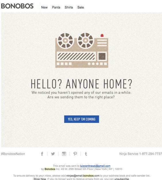
Bonobos’ activation email features an illustration of an old voice recording machine, accompanied by the line Hello? Anyone home? Along with that they are asking for confirmation, if their transactional emails are send to the right email address.
22. jetBlue
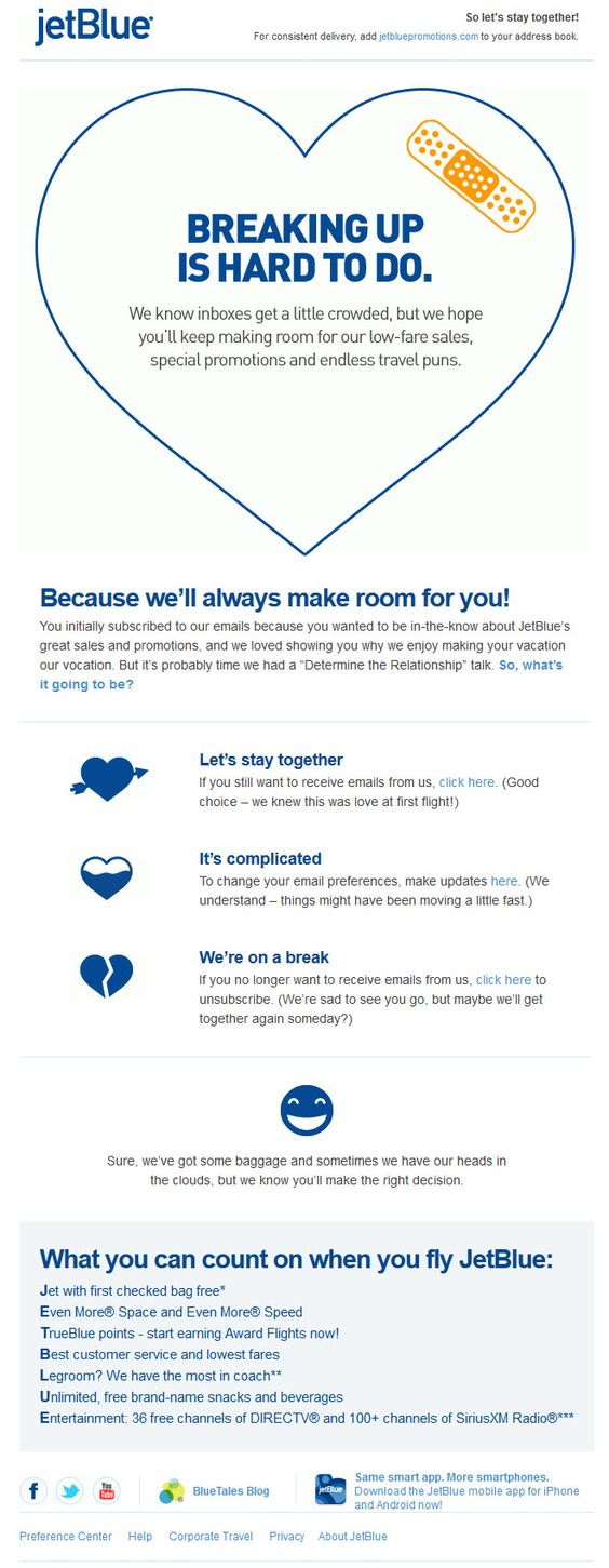
jetBlue send this email when they feel things are not working well between them and a client. They know Breaking up is hard to do, but they don’t want to intrude into the client’s inbox, sending unwanted emails.
23. Carter’s
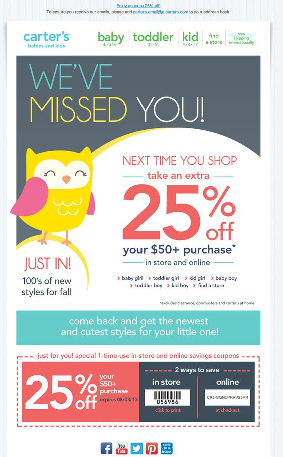
Carter’s say they missed you in a cute way and offer you 25% off next time you shop with them. The colors of this transactional email are very fresh and it features a funny illustration that gives it a very friendly feeling.
24. Loft
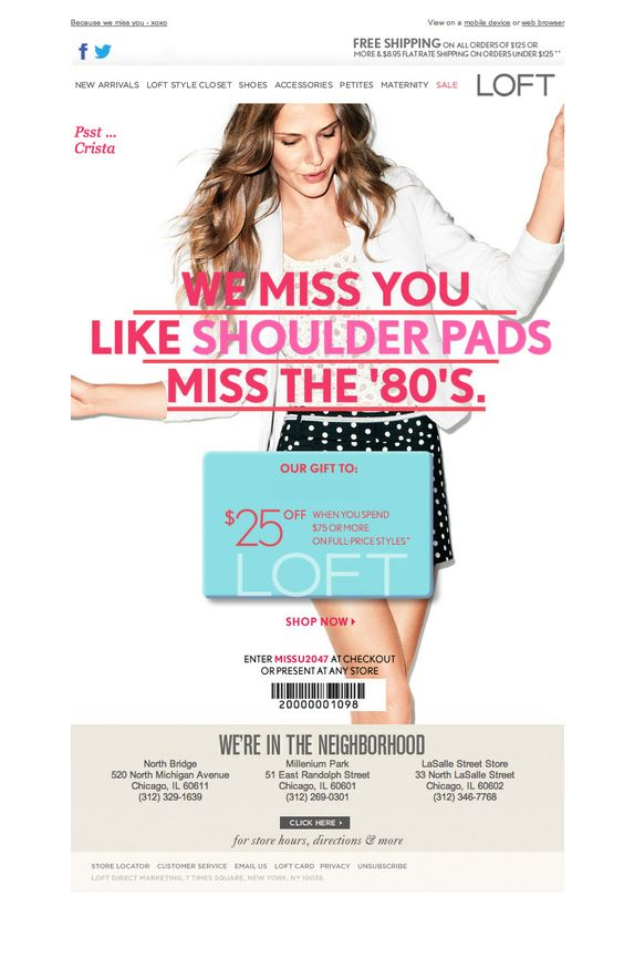
Loft have a special way to tell you how much they miss you, like the shoulder pads miss the 80s. The email features a big image with the main message displayed over it, so you can’t really miss it when you open this cold lead activation email.
25. Kate Spade
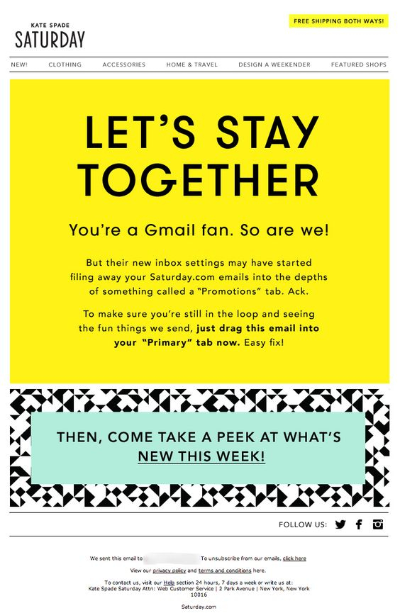
A very open and friendly lead activation email from Kate Spade. With few graphics, but a smart and informative message, they do their best to stay in touch with their clients.
Keen to look at samples of email templates we worked on? You may check our Samples section.

