25 Excellent Examples of GIF Animations in Email Marketing: The Sequel
Reading Time: 8 minutesThis article was last updated on November 1, 2022
Ever since our first collection of gif images in email templates came out, we’ve been witnessing a huge interest and buzz about it. It turned out – creative animation effects in designs are a great inspiration booster for many of us.
Having that in mind, there was nothing left for us to do, but to roll up our sleeves and gather up for you another 25 examples of gif motions in newsletter designs.
1. Brit+Co
Brit+Co cleverly fitted a gif image into their email marketing campaign as a way to present their newest book. The intention of the gif usage in this case is to let the potential buyers peek into the content of the book and arouse their interest. Combining the gif with the provoking text, this email template has certainly raised its chance to lead into a conversion.
2. LOFT
This email template of LOFT is fun and highly effective at the same time. The creative design leads the user’s eyes towards to the desired call-to-action buttons, by using the advantage of a gif image. The watermelon seeds, which resemble rain drops, make the user scroll down and reveal the key word “Sale” right before the call-to-action section. The gif increases the visibility of the buttons and therefore, their chances to be clicked.
3. Kate Spade New York
This shiny Kate Spade New York email template catches the eye and provokes curiosity in the users while they wait for the gift to unwrap. This effect couldn’t have been achieved without the usage of a gif image. The clever design nails the user’s attention and makes them read the message after the wrapping paper has been torn.
4. Boden
Boden uses the power of gif to make an accent on their lead products in their mini Boden email campaign. The design grabs the attention in a playful way by using different techniques to show off their products. The presentation starts with a rotating backpack, providing a thorough 360-degree view of the item. The two secondary accents on the pencil box and lunchbox show off their functionality in a fun way. Boden made sure to keep the users intrigued to browse down the products and they wisely made each section of the design clickable.
5. American Eagle Outfitters
American Eagle Outfitters embedded gif in their email marketing campaign to present their winter accessories collection. The variety of different models shift very cleverly in a clockwise direction. This way the gif effect unconsciously conveys a sense of urgency. Combined with the appealing “Get cozy” message, the design is a true prerequisite for a successful email campaign.
6. Ann Taylor
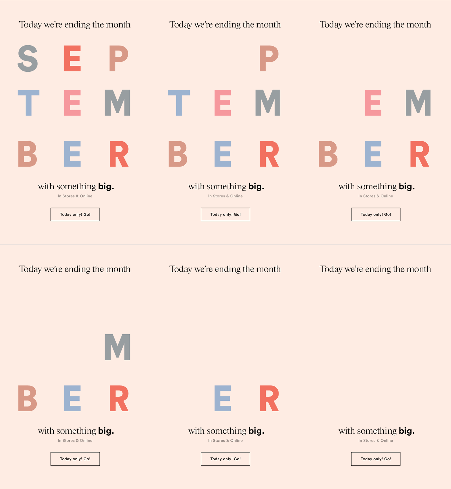
The gif effect in this Ann Taylor’s email template serves two purposes. Firstly, by hiding the letters one by one, the design depictures the ending of the month and conveys a sense of urgency. Secondly, dividing the word “September” in three rows and hiding the letters one by one is a technique which successfully leads the user’s eyes down to the call-to-action section. Two birds with one stone!
7. Bonobos
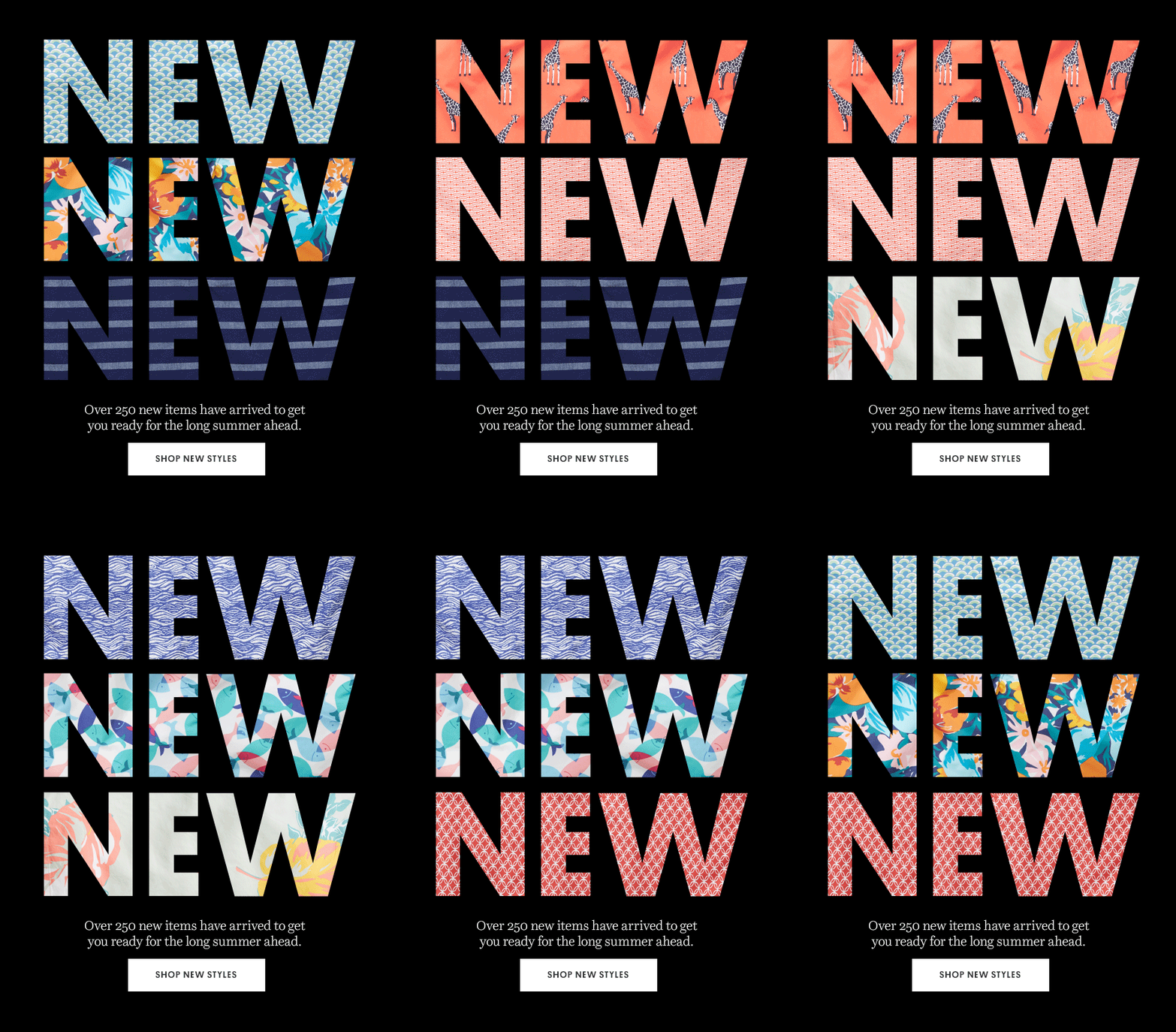
Bonobos used gif in their email campaign to present their newest summer collection. They applied simple but effective eye-catching technique. They used their new clothing prints as shifting font patterns in the 3 huge words “NEW”. This way they provoke their users’ interest and put them in happy, summer mood. Therefore, making them more likely to click.
8. Banana Republic
Although Banana Republic used quite a direct message in their email campaign, “Good Things Come To Those Who Click”, they managed to make it unobtrusive and fun, by using gif. The effect is achieved by hiding and then revealing the message in a word puzzle. Although quite direct, they made it look like a game, which most likely made a lot of users smile. The gif ends up with a glittery accent on the key word “Click”, which clearly shows what is expected from users to do.
9. J Crew
J Crew used a playful gif image in their “Summer Sale” email marketing campaign. The gif visualizes the very typical for the summer act of… eating an ice cream. Most people associate this one with pleasure and happy feelings. Putting people in good mood is the first purpose of using this image. The second one influences the users on an unconscious level. The quickly finishing ice cream creates a sense of urgency and scarcity. It indirectly sends users a message that the sale is now and the quantities are going quickly, so they wouldn’t want to miss it.
10. American Eagle Outfitters
Seems like American Eagle Outfitters are big fans of using gif images in their email campaigns. With the help of a gif image, they applied another great marketing technique. They clearly understand psychology: the fear of losing something that you own is bigger than the pleasure of gaining something new. So, they used this insight very wisely. The gif depicts putting the clothes in the bag, which unconsciously conveys the users the feeling of already owning the products. The effect has been fortified with the campaign message and turns out to be quite a prerequisite for a success. Nobody gives up easily what they already own, right?
11. Anthropologie
Anthropologie used a non-literal gif illustration to present their newest clothing collection, by associating it with nature. At first sight, the email design has nothing to do with clothes: drops and letters are raining, flowers are growing… But there is a hidden message the design conveys. Anthropologie prompts the users to “soak up” the raining freshly cuts, which represent their new clothing line, the same way the ground soaks up the falling rain. Clever, huh?
12. Boden
Boden used a gif image in their email design to strengthen their campaign message. It depictures a fast finishing lemon juice which implies that their offer will expire very soon. The copy and the gif image successfully convey users a sense of urgency. Also, the headline message, “Squeeze The Day”, perfectly matches with the lemon juice they chose for a gif image. Good job, Boden!
13. Kate Spade Saturday
Kate Spade Saturday used the power of a gif image in their email campaign “The Weekender Bag”. The gif effect switches different viewpoints of their product and makes an accent on its functionality. Along with that, the email template designers used a contrasting background color to make the bag pop even more.
14. LOFT
This LOFT email campaign certainly catches the eye with its multi-color design. The designers used a gif effect to reveal the key text “Flash Sale”, followed by three blinking exclamation marks. The template design was supposed to nail the user’s attention right away and the gif image made its huge contribution. In spite of the flashy gif, the call-to-action section couldn’t be missed due to its bright yellow color choice. Well done!
15. LOFT
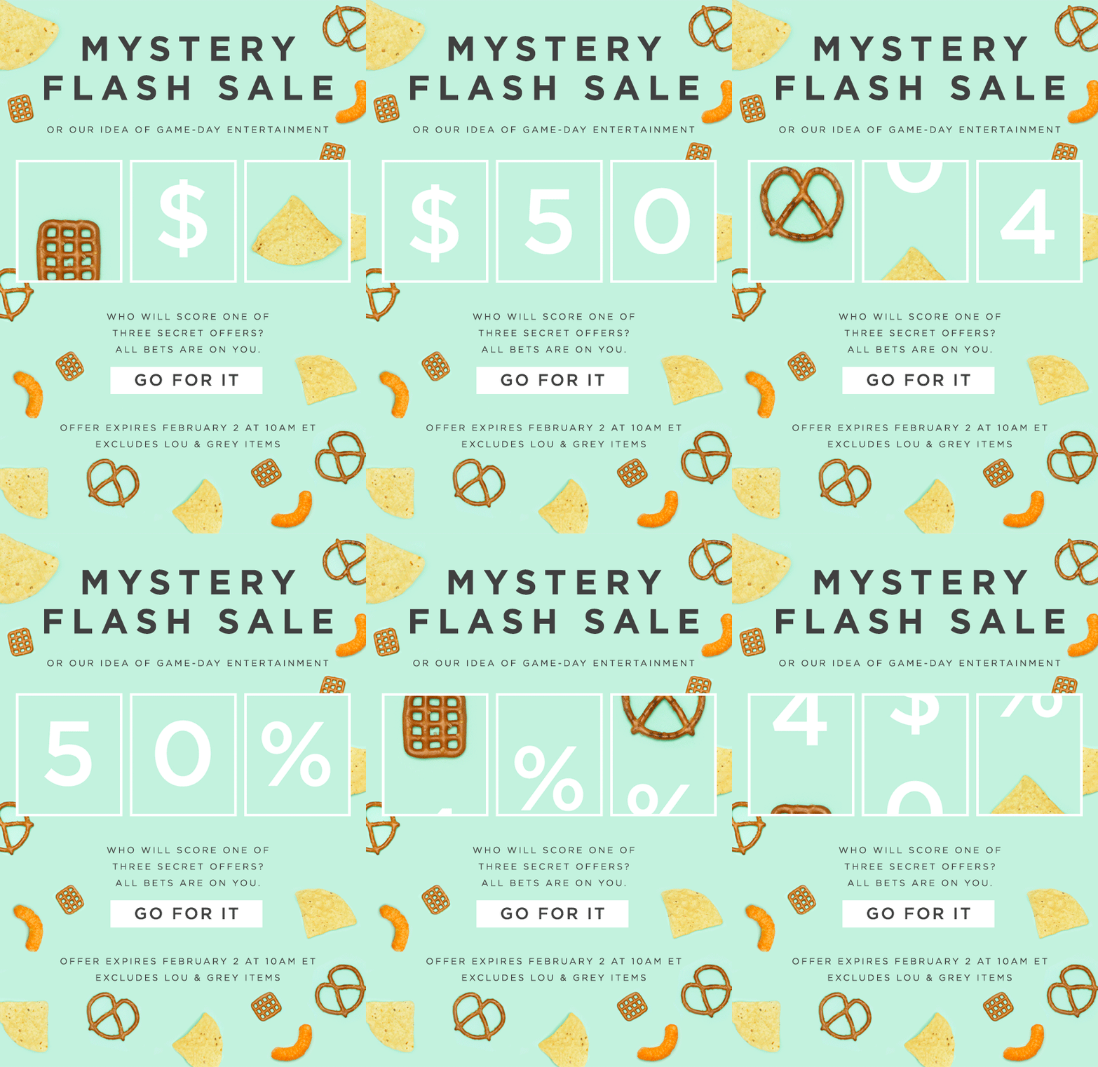
LOFT keep on surprising us with great email template ideas. In this one, “Mystery Flash Sale”, they used a gif image to represent a slot machine. The three reels continuously spin and reveal what are the possible prizes you might get: $50, 50%, or 40% discount off the price. The copy itself also prompts you to try your luck and see what you’ll get. Everybody loves to win and apparently LOFT know that. Psychologically, when you win your prize, you would be more likely to use it. The catch? In this email template you win in all three cases. Awesome!
16. Ban.do
In this email campaign Ban.do used a cute gif image to depict the effect of confetti. The email template was aimed to put the users in a happy and celebrating mood. Тhe cheery design was also complemented by the font and the copy of the text. Ban.do wanted to convey the message that the weekend is time to celebrate and also, time to shop. The usage of the festive gif here was right on the spot!
17. J. Crew
J. Crew animated their email template design to make the users even more curious about their mystery offer. They used a simple but effective gif effect to provoke the interest in their subscribers. Under four of the candies J. Crew hid the secret sentence “What will it be?”. By removing them one by one and, at the same time, dramatically revealing the question, they managed to increase the curiosity and lead the viewer’s eyes right towards the call-to-action button. Sweet!
18. Net-a-porter
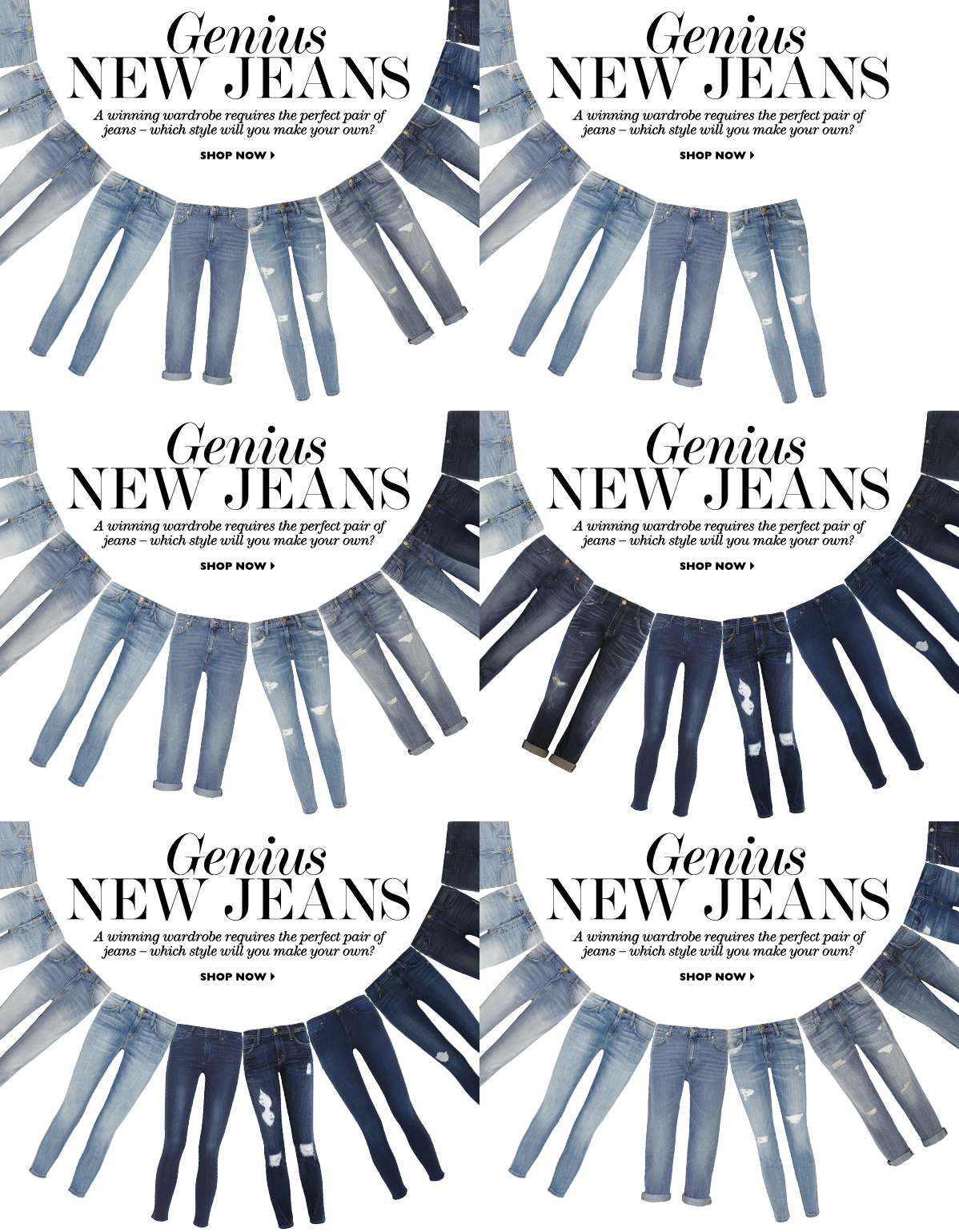
Net-a-porter used a gif image in their email template to show their newest jeans collection. The design is really simple and complete at the same time. Net-a-porter wanted to make an accent on their huge variety of models and presented them in quite an interesting way. The jeans are arranged in an U-form line, outlining the copy of the campaign. The call-to-action button, although really small, catches the eye, due to its centered position and generous white-space around it. Great job, designers!
19. Banana Republic
Banana Republic used an animated design template for their Valentine’s Day email campaign. Their design consisted of a huge title “Love” with the “O” letter being a heart. Using gif, they continuously replaced this same letter with various products – bracelets, necklaces, underwear, a scarf, a jumpsuit and even socks. The point was to show off some of their products, make an accent on their variety, and eventually provoke their users to click!
20. LOFT
In this email marketing campaign, the gif image helps LOFT impress their subscribers by creating a wow effect. The unfolding cocktail umbrellas, along with the fading in words “Bang!”, “Boom!”, and “Pow!”, represent a fireworks finale in a really impressive and creative way. This attention nailing effect perfectly complements the headline “More impressive than a fireworks finale.” The moment when the umbrellas fold and the words disappear, the focus automatically adjusts to the key campaign copy “60% OFF”, which stays permanent all the time, and of course, the transparent but eye-grabbing red call-to-action button “Shop now”.
21. LOFT
LOFT just love gif animations in their newsletters. In this one they applied a cute effect using gif – falling nuts! Simple but corresponding to all other design elements. How? The first and most obvious association of this animation is the fall itself. Secondly, the falling nuts represent the dropping prices by leaving the main campaign message “30% OFF” being a permanent front layer. Thirdly, it matches the line “You have our permission to go nuts” in a fun, playful way. One gif animation, three purposes!
22. Forever 21
Forever 21 used a scratch card design in their Black Friday email campaign. They achieved a cool realistic effect, using a gif animation. The effect itself represents scratching three possible gold fields with different prizes underneath: 15%, 20%, or 25% off the user purchase. Because of the mystic element, this marketing technique is incredibly effective. A lot of users would click just to see which one of the three prizes they would get. After all, clicking on the call-to-action button is the purpose of an email template, right?
23. Cusp
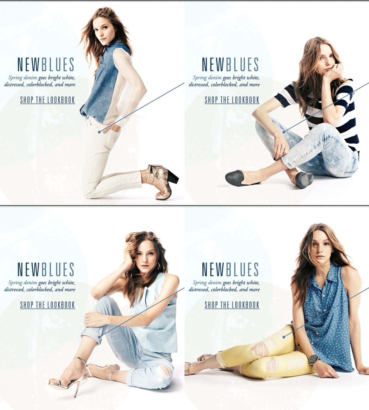
Cusp used a gif image in their spring email campaign to present their newest clothing collection. The gif effect shifts different shots of a model, showing off the variety of their spring clothing line. The campaign copy, though, is permanent, and the call-to-action button is underlined to grab the attention. This email design focuses entirely on the product, i.e. the marketing technique here is: if you like what you see, just click.
24. Kate Spade Saturday
Kate Spade Saturday used a gif image in their email marketing campaign to promote their “30% OFF” offer. The gif effect here switches different poses of the same model with balloons, clearly showing that this girl is having a lot of fun. With the usage of this gif animation Kate Spade wanted to put their subscribers in a festive, happy mood. Their color choices (red, yellow, gold) were also very eye-catchy. The overall design turned out to be very cheery and attention grabbing.
25. Nasty Gal
Nasty Gal applied quite simple but really effective and glamorous gif animation in their “Blackout Sale” email campaign. The enchanting black-and-white design perfectly matches the headline. Nasty Gal left the call-to-action section still in order to encourage the viewer’s eyes to move away from the hypnotic background. This way they make the user focus on the main message and, of course, the call-to-action button. Cool!
Do you need some more inspiration? Check out actual email templates we have designed and coded for clients at our Samples section.


