25 Great Email Automation Examples To Inspire Your Next Campaign
Reading Time: 9 minutesThis article was last updated on June 7, 2021
If you’ve been staying up to date on our latest blogs, you have probably picked up on the hot topic of email automation. Today, we are here to share some of our favorite email automation examples.
Contents:
- What is Email Automation?
- Welcome Email Automation Examples
- Cart Abandonment Email Automation Examples
- New Product Launch Email Automation Examples
- Sales Announcement Email Automation Examples
- Get Started With Email Automation
What is email automation?
Email automation is an automated email that is triggered by an action. Some examples include a welcome email that is sent when someone subscribes to your email list, or a quick reminder that the customer left something in their shopping cart without checking out.
Email automation is a helpful tool for marketing teams as it takes repetitive tasks off the marketer’s to-do list. With email automation, your marketing team can focus on other important elements such as customer service or building relationships with customers.
Email automation also enhances relationships with existing customers. Prior to email automation, businesses would have to manually send out emails to each customer, which is very time-consuming.
When emails are sent to the right person at the right time, it can help customers to learn more about your brand, keep them engaged, and help boost customer retention.
Not sure where to start with email automation? We’re here to share our favorite email automation examples so you can have some inspiration.
Welcome Email Automation Examples
1. Starbucks
Tons of people sign up for Starbucks emails simply for convenience and discounts. A welcome email is very important for several reasons. For Starbucks, it gives them the opportunity to connect with their new email subscriber and share links to their site. For the customer, it shares information that you would want to know as a frequent customer such as latest deals, specials and more.

2. Kate Spade
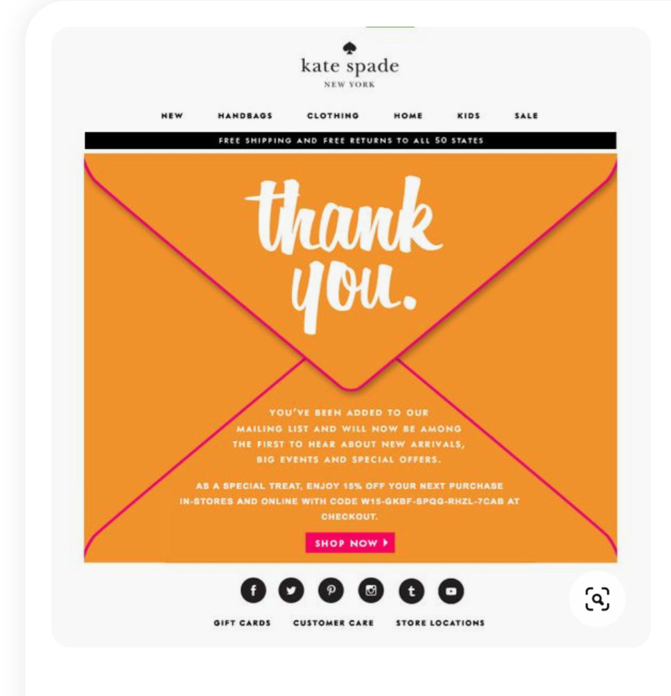
The example below is a welcome email from Kate Spade, a popular retail brand. This is a prime example that the design of an email can be simple and still be engaging.
There are two things we love about this welcome email:
- The small discount offered to new subscribers
- The call-to-action button at the bottom of the email.
If you are able to, offering your new subscribers a small discount or special is always a good idea because it will give them an incentive to shop and spend money.

3. Ann Taylor
The call-to-action button is also a very important part of the email. The purpose of any email is to get the subscriber to take action. Many times, marketers make the mistake of including several call-to-action buttons, which then becomes confusing to the customer because they are unsure of what you want them to do, so they end up taking no action at all. Pick one call to action statement and have it stick out to your readers.

4. Airtable
You just created an account for new software to help you manage your spreadsheets and you don’t know where to start from. Well, the guys from Airtable will send you (an automated) welcome email on how to get started. In this email design, we can see lots of breathing space and a few lines of copy. Straight to the point. Instead of sending long and boring emails on how to use their platform, they send an email with a video tutorial. Far more engaging and exciting, isn’t it?

5. APTO
Here’s another welcome email automation example. APTO Skincare offers a coupon for free delivery on your first order. Check out how they use strangely shaped figures to add more interest into their emails.

6. Lush
Hey Lushies – you get that nickname when you sign up for Lush’s newsletter. Their welcome email focuses on making you a part of their community, hence the nickname you get, along telling you their story. It’s a fact – when you love a product, you want to know more about them and become part of their culture.

7. Tattly
If you haven’t heard of Tattly – that’s a company for temporary tattoos. From children to grownups, they offer huge collections of temporary tattoos.
When you sign up to receive updates from them you get their welcome email that offers you an incentive for your first order with Tattly. The offer is enforced with an example of a woman having their tattoos. Watch out, you may get addicted as well!

Cart Abandonment Automation Email Examples
1. RedRokk
The email below is a great example of a cart abandonment email. It shows the email subscriber the product and cost of the item they have in their cart, with a link to their shopping cart.
A nice touch to cart abandonment emails is to add similar products the customer might be interested in. This is a nice way to personalize the email and use this email as an opportunity to increase the sale.

2. NARS Cosmetics
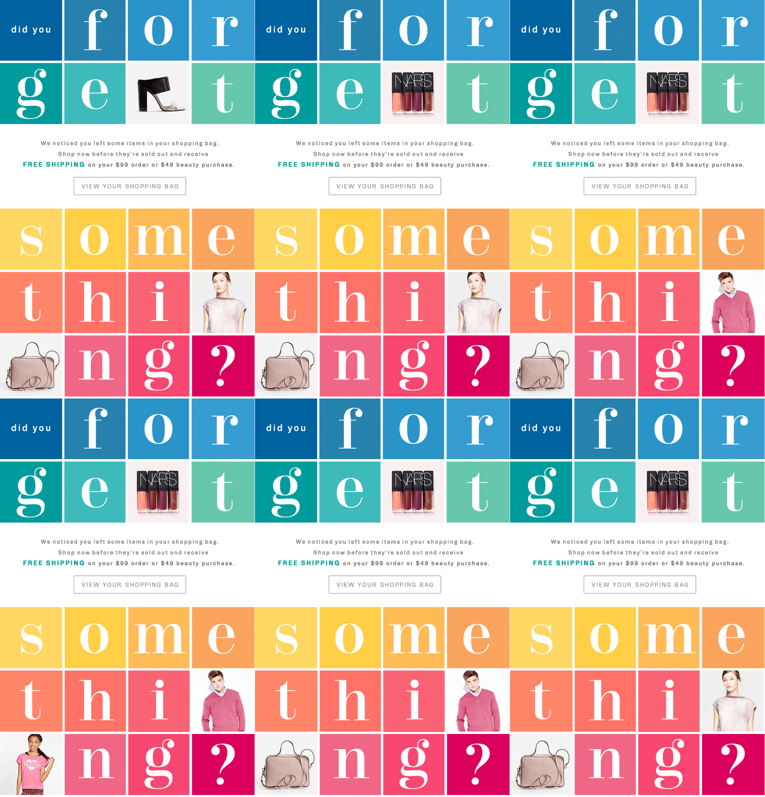
The French brand for cosmetics and skin care – NARS – displays a more interesting way of letting you know that you forgot something in your shopping back. This abandonment email automation example features colored tiles with three of them being animated.
Compared to other brands, they don’t show you what you’ve forgot to buy, but they focus more on the visual appeal of their email. There’s also a reminder about the free shipping they offer.

3. Native
The following example comes from Native – a Canadian shoe company. Their motto says Live Lightly ™ and their emails are light as well. Just a few colors, enough breathing space.
Here’s what we loved:
- The language they use
- The overall clean and easy to scan email
- Offers product recommendation under the cart items

4. Chubbies
Choosing the right words to message your customers allows you to be closer to them and influence them in taking an action. Chubbies, the US company for shorts does that very well. Being cheerful and a little bit of hyped goes a long way.
The email design itself is very simple, however, the wording and one simple image can make you buy the shorts you were looking at but suddenly left their website.

5. Doordash
In the following abandoned email automation example, the US food delivery company Doordash uses a combination of a nice creative image and catchy text to make their customers complete their order.

New Product Launch Email Automation Examples
1. Target
When you walk into a retail store, what is the first thing you see? Typically, stores have items on display of their newest or best-selling items. The email below, created by Target, is a way to share new items with customers.
This is huge for retailers as we shift towards an online shopping experience. Fewer people are going into brick-and-mortar shops which is why email marketing is so important for businesses. Without email marketing, there is no easy way to share the latest products with your customers.
From this example, you can also notice how organized the email is. If customers want to shop the new collection, there is a link for it. Or, if customers want to shop other categories, there are links for each one, which makes the online shopping experience simple.

2. Burberry
Our next favorite email automation example comes from the luxury clothing brand Burberry. Using an animated GIF they are introducing their latest sneaker addition – Arthur, named after Arthur Wellesley.

3. Apple
There’s always an excitement build-up at the beginning of September each year. The long-awaited Apple’s presentation for new iPhones.
Some are lucky enough to be present at the keynote. Others watch it online. We, the email geeks, are patiently waiting to see how their email would look like. 🤓
The simple, yet elegant and informative Apple’s recap of new products launch is an email automation example we love sharing with you. It features simple headlines, a descriptive copy, CTA and a product image in a single column layout.

4. Lyft
Here’s another great email automation example using an animated GIF to announce a new product launch by Lyft. If you have never used a scooter from Lyft, you can see in the example below how easy it is in 5 simple steps (actually 4).

5. On
In the following example, On, a running shoe company introduces its latest product – The Cloudflash. Using a dark theme for their email they are adding an air of sophistication, elegance and mystery, though with much bolder confidence.

6. Casper
The pet industry is growing and growing every year. You can reward your favorite animal with almost anything. In the example below, the rising star in sleep mattress company Casper is launching dog mattresses. If you have invested in a high-end and quality sleep you are very likely to do the same for your best friend. After all, who doesn’t want their pet to be happy? A night of good sleep can make great things.
Casper’s single-column layout email design wants to introduce you to their latest addition – the dog mattress. There’s nothing superfluous and it’s short and straight to the point. Want to learn about the mattress – just click on the CTA.

Sale Announcement Email Automation Examples
1. Avocode
Orange is the new black. Huh?! Avocode’s sale email design bets on a warm summer-like orange color to highlight their offer. The discount amount is highlighted in black. You can’t miss it. Typography and colors can play a huge role in sending the right message to your subscribers.

2. Postable
Here’s another summer sale email automation example. Nice and catchy way to offer sale using “dog days of summer” phrase. Did we say that using illustrations in your emails is a hot trend?

3. Barebones
Marking the end of the season with a clearance is also a good way to increase your revenue. The following email starts with a last day discount opportunity followed by some featured products and a CTA to browse all the clearance.

4. Artifact Uprising
This is a Father’s Day sale announcement email automation example from Artifact Uprising. To highlight this event they are using a nice combination of visually rich images for background and white text on top of it.

5. Moo
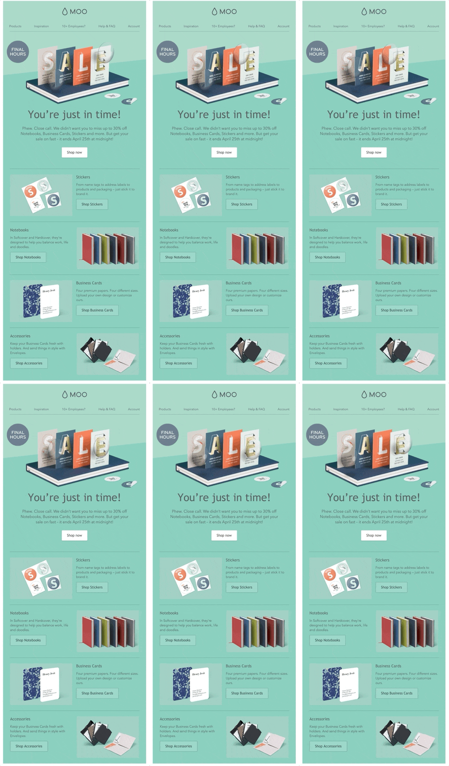
The next sale announcement email automation example comes from Moo and they’re enforcing their sale with scarcity – the “FINAL HOURS” circle highlight. On top of that they’re using an Animated in the above the fold to grab the viewers’ attention.

6. Design Modo
A dark-themed sales email automation by Designmodo featuring a character illustration in hero section with a huge 50% discount sign back in the bushes. The sale is valid with a coupon code again for a limited time. They have also broken down their products into categories so you can quickly jump into what you’re looking for.

7. TunnelBear
On the contrary, here’s alight-themed, this time with a bear character. This email uses different font combinations and families from light and serif to bold and san-serif. The emphasis on this one fall on the SALE word, followed by the amount of discount colored in a contrasty green background ribbon.

Get Started With Email Automation
If you are not using email automation, you’re missing out! Take these email automation examples into consideration and connect with the right customers at the right time.
Email automation is easy with our help! At MailBakery, we will help you to create the perfect email design to capture your reader’s attention in the right moment.

