7 Hot Email Design Trends for 2022
Reading Time: 6 minutesThese days, trends come and go so quickly that it can be difficult for brands to keep up. And just as fads evolve around social media, fashion, and technology, email marketing transforms as well. For marketing creatives, these changing tides mean a fresh source of inspiration, and email design trends for 2022 have never been more exciting!
From zany animation to jaw-dropping gradients and stunning 3D imagery, the possibilities for your next email marketing campaigns are endless.
Are you ready to boost your engagement with eye-catching email designs? Let’s dive in with seven of the hottest email design trends for 2022.
In this blog:
1. Dark Mode Compatibility
This year, dark mode is everywhere. As our excessive exposure to device screens increases, it has led to a great strain on people’s eyes, and dark mode is here to save the day. Data from Android Authority has concluded that 91.8% of people use dark mode for their emails.
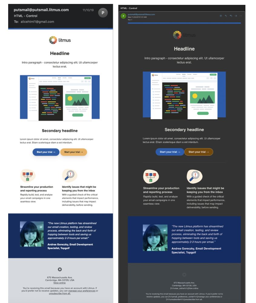
Not familiar with this function? Dark Mode is a feature that reverses the color scheme on your device. So instead of appearing on a stark white display, the text, icons, and other elements of UI are on a dark background that’s gentler on the eyes.
Creating a campaign that can be viewed beautifully in dark mode is a great way to appeal to consumers, but it can also be tricky, so you might want to call in the email design experts for this one. The campaign below from Litmus is a perfect example of a campaign that’s still effective even when subscribers choose to use dark mode.

2. Use Animation
Animation was extensively used in 2021, and it looks like this trend is here to stay. As video marketing grows in popularity, it’s no wonder that animation is such an effective email design trend in 2022. For one thing, the human brain processes images 60,000 times faster than it processes text.
So why not just send a video directly? Although video marketing is effective, embedding a video in your email marketing campaign will land it directly in the spam folder. That’s why the most straightforward solution available is animation. Most designers use GIFs, but you could use APNGs as well. APNGs may be less popular, but provide more color choices than GIFs.
Best of all, animation can serve a purpose beyond just being fun or gimmicky. For example, the email campaign below from Serena & Lily uses animation to tell a story. It visually explains how their products work together to create a chic and sophisticated ambiance in a room. Consider ways that you can use animation to demonstrate how your products or services are valuable.

3. Gradient
A touch of the gradient effect is a great way to help your email campaign stand out. We can attribute the meteoric rise of this trend to the psychedelic influences of the 1960s, which creates a nostalgic, groovy vibe that your subscribers will love! After all, vintage is never out of style.
If you’re interested in cool, creative ways to use this effect, try adding gradients to your call to action. Or if you really want to push the envelope, consider spicing up your email campaign with animated gradients in the background.
BAGGU created this stunning campaign with gradient shades of blue, green, pink, and yellow. However, they were careful to keep their campaign minimalistic so as not to overwhelm their subscribers. The images they chose compliment the gradient effect and create a similar effect as the gradient background.

4. Monochromatic Layouts
Depending on your brand, a monochromatic layout may be the perfect email design trend of 2022 to bring your goals to life. The beauty of a monochrome email design is that virtually every brand can use it at one point or another. However, monochromatic layouts aren’t required to be black and white. When it comes to monochromatic layouts there are many different options to choose from. For a great monochrome layout, choose one or two colors that fit your brand and check out the elegant results.
The cosmetics brand Ilia created this campaign with monochrome hues from a peachy pink and sienna color palette to support its impactful message. Despite the fact that they used a blend of bold shades, they ensured their products were the primary focus of this campaign. Take after Illia and create a monochrome campaign that is clear and easy to read for increased engagement.

5. Emotional Design
When most designers approach their email marketing design, they remain focused on the functionality of the design itself. While this isn’t a bad approach, remember that your subscribers are people, not just numbers on a screen. They are highly emotional beings, so use this to your advantage in 2022. Consider the effect of the colors that you use on the reader’s emotions. Shades of blue might make the reader feel calm or peaceful. In contrast, red might evoke feelings of passion and urgency.
The self-care brand Harry’s used bright red and an expertly placed countdown timer to cultivate feelings of FOMO from the moment subscribers open their email. When you can use marketing tactics to create a sense of urgency, it increases the overall success of your campaign. Emails with countdown timers average at least 14% higher conversion rates than campaigns without them.

6. Muted Colors
Urgency aside, now may be the time to say goodbye to bright, bold colors. The collective tastes of the general public have transformed into a preference for gentler colors. Muted tones have grown in popularity, typically entailing a color palette that has been desaturated and partnered with complementary colors, black, or white.
Quizlet did a wonderful job of incorporating soft, muted colors into this relaxing campaign. When subscribers open their email, it’s easy for them to imagine spending a tranquil day studying with their educational brand.

7. 3D Imagery
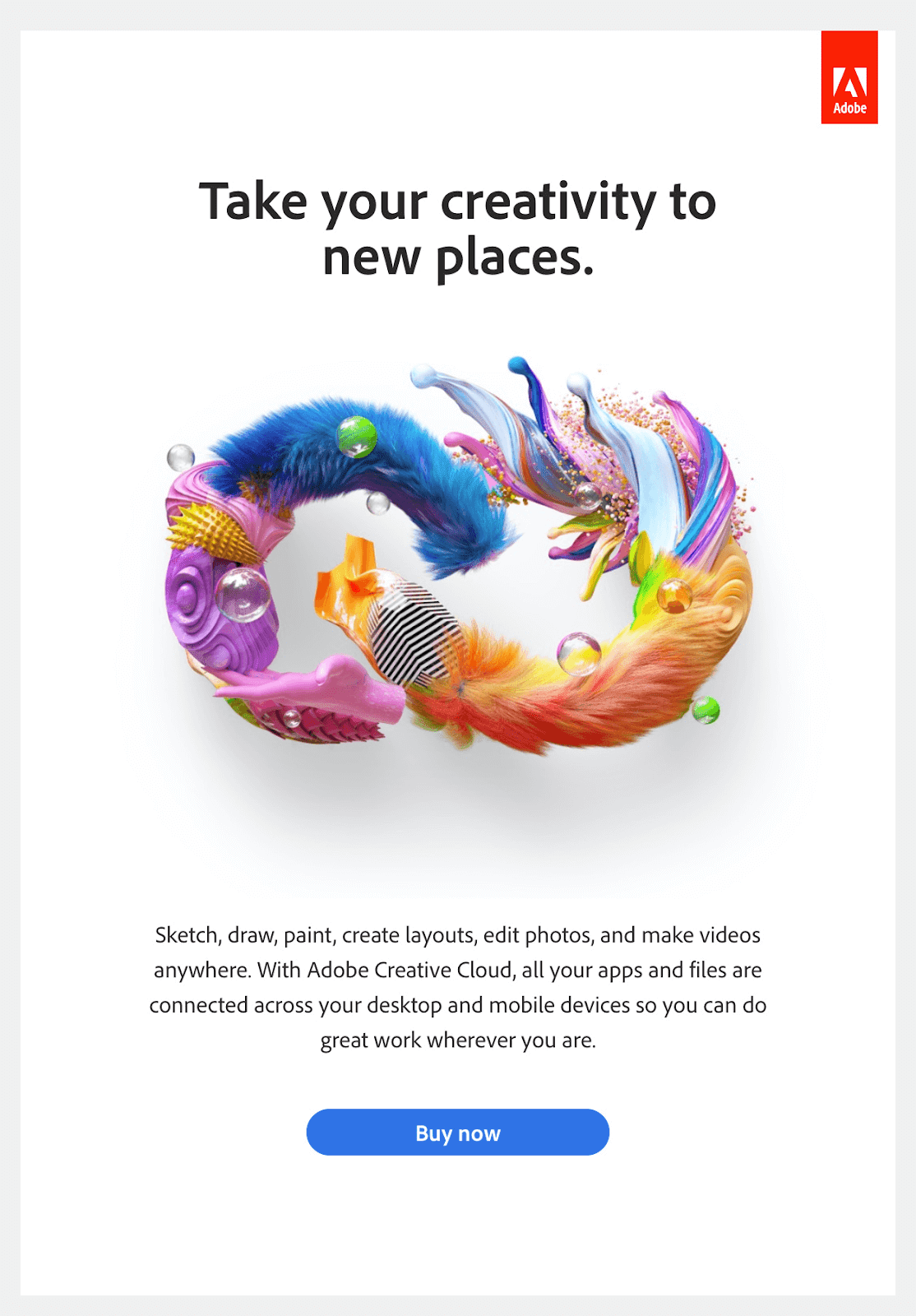
When it comes to different graphic styles, 3D images are arguably one of the most exciting styles that you could use. There is something undeniably eye-catching about a well-rendered 3D image, especially if you’re promoting in a creative or innovative industry.
Creating 3D images for your email marketing campaign can be challenging, but it can add depth and vibrancy to a lackluster campaign. Adobe took advantage of this email marketing trend to demonstrate the capabilities of their Creative Suite and encourage subscribers to engage with their campaign.

MailBakery

This year, make your campaigns the best they’ve ever been with these cutting-edge email design trends for 2022. And if you need help creating trendy, captivating email campaigns, MailBakery can help you along the way! We partner with your business to design and code jaw-dropping, brand-specific email templates that are sure to convert.
Want to create something great? Contact our team today, and let’s work together to cook up the campaign of your dreams.
