25 Brilliant Email Marketing Campaign Examples From the Pros
Reading Time: 8 minutesThis article was last updated on November 1, 2022
Planning an email marketing campaign? We’ve put together 25 email marketing campaign examples that will surely inspire you for your own. Crafted by talented email marketing gurus, a lot of thought was put into these templates to turn them into result-generating machines.
We’ve highlighted the strength of each campaign and we hope that these ingenious templates will inspire you to re-think your next campaign.
1. Campaign provoking emotion.
Missguided crafted a brilliant reactivating campaign for their inactive users. They chose to go minimal with their newsletter design and focus on the message itself. They made it sound personal, fun and emotional at the same time. We love the emojis! So simple but still enhancing the effect of the message.

2. Email template with no images. Just copy.
This email offer from The Limited is another example of a successful marketing campaign without any images. Do you see the big picture here? While you go through the different discount offers written in white, the big black lettering screams to you “You Know You Want To”, leading you to the desired call-to-action button at the end.

3. Campaign throwing a fun pun.
Loft made a super simple and fun email campaign design by using a banana image and a simple copy on top saying “Don’t Let This Sale Slip Away”. You know, you can easily slip on a banana. Don’t let this offer slip away from you as easily. Fun and creating a sense of urgency!

4. Giving a free product as incentive.
Pinkberry came up with a great idea to reactivate their “sleeping” users. They surprised them with a gift – a free yogurt waiting for them in their Pinkcard. This way Pinkberry did not only remind their clients about them but surely motivated a lot of users to go check their accounts to see if the free product was really there and order additional products along with their gift.

5. Campaign provoking temptation.
J. Crew has nothing to do with ice creams but this doesn’t mean ice cream can’t be the trump card of their campaign. This brand cleverly uses the sweet bait to convey the recipients that their sale is as tempting as ice cream. Also, the ice cream puts the viewer in a good mood and the effect is enhanced by the long scroll. Eventually the viewer is more likely to click on the call-to-action at the end. Good job!

6. Email template copy provoking curiosity.
Holy Guacamole! What is this about? We don’t know. Do you know? Well, we guess we’ll have to click to find out.
Spoiler alert: It’s about a 24-hour sale but it made you curious, right?

7. Campaign with a touching message.
This heartbreaking email from jetBlue is actually a very clever reactivating campaign aiming to touch the recipient’s feelings. The campaign copy was written in a very personal manner, implying that the brand was obviously heartbroken that they had lost you as a client. This campaign surely touched us. How about you?

8. Survey email campaign with money reward.
Artifact Uprising conducted a great email survey campaign to learn more about their clients. They offered $10 as incentive in exchange for their recipients’ time. The design of the campaign itself is also propulsive – a hand holding an old headphone, looking like someone is waiting for you on the line.

9. Copy that brings up a familiar song.
Yes, you heard us right – a song! Loft used a very familiar song to break the ice with their new subscribers and get their attention, along with providing them with an incentive for their first purchase. Cool! The brand also gave the recipients the opportunity to use the coupon both in physical stores and online.

10. Template that looks like a PM.
What can be more personal than a personal chat message? This is exactly what Urban Outfitters thought of when they conducted a reactivating campaign trying to bring back their inactive subscribers. The design of this campaign was made fun, catchy and perfectly relatable to their target audience.

11. Using something familiar to attract attention.
An ingenious idea by J.Crew was to compare their sale with something very well familiar and widely used – sliced bread! It doesn’t matter that the brand has nothing to do with bread. Familiar things simply appeal to people better.

12. Campaign motivating you to add more info.
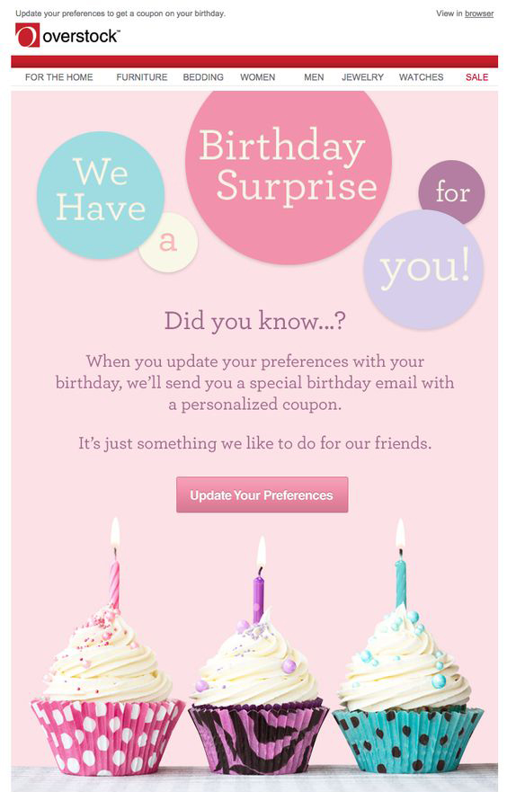
Discounts and coupons are great tools to prompt your uses to take a certain action. Overstock cleverly motivated their customers to update their profile information by telling them they would receive a special personalized coupon on their birthday. In case they add it to their profile information, of course.

13. Campaign prompting you to invite friends.
How to win customers and their friends – give everyone free stuff! This is the formula Starbucks used in one of their campaigns. You wouldn’t have to worry about spamming your friends because they would win a free drink. You, on the other hand, get more “stars”. And Starbucks, of course, gets more clients and popularity. A win-win-win situation indeed!

14. Campaign offering free product testing.
A great strategy for brands that sell highly priced products is to offer testing as a proof of the high quality products they manufacture. This is exactly what Estee Lauder did in one of their email marketing campaigns. The template itself is quite fun, catchy and also contains a pun with the number 4 representing both the number of products they offer for testing, and the word “for”.

15. Email message about missing your birthday.
You might receive tons of messages in your email box on your birthday. But would you expect to receive a birthday message after your birthday? This is exactly what Need Supply did to stand out. They sent a copy-only email campaign written in a very personal manner, almost looking like they were speaking to their very close friend, apologizing for missing their birthday.

16. Linking romance to company products.
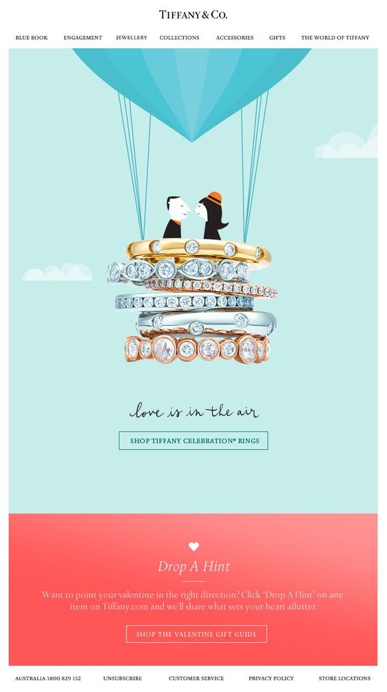
This template from Tiffany & Co. can easily put you in romantic mood which makes you more likely to hit the call-to-action button. The short copy “Love is in the air” is literally depicted with an illustration of a couple in a hot air balloon made of Tiffany & Co. rings. This way the brand builds a mental connection between their products and romantic feelings. Who wouldn’t want to feel the romance?

17. Email campaign provoking the answer “Yes”.
As an attempt to make their subscribers open their email messages, Bonobos crafted a simple but very clever template “Hello? Anyone home?”. These are questions most people would answer positively. In addition, Bonobos asks if they are sending the messages to the right place, which they probably are. After several positive answers you are more likely to click on the CTA.

18. Making your offer look really major.
How to achieve this effect? Simple! Loft listed a few familiar objects known to be really hot and claimed that their offer was even hotter than these. Your mind is instantly made to think that this must be really major, thus making you more likely to check it out.

19. Email reminder about abandoned cart.
How to cleverly remind your clients about their unfinished order? Well, here is one of the great email marketing campaign examples by Topshop. They did not only remind their recipients about forgotten items in the cart but they also made it look like they kept it safe all this time: “We’ve got your bag (back)”. Cool!

20. Announcing discount for abandoned items.
Such marketing campaigns do not even require images in order to be successful. The offer itself is powerful enough. Why?
First of all, you were already interested in the item.
Secondly, the price was the most probable factor to have stopped you from buying it. Now it’s 50% off.
Moreover, the item itself is “talking” to you which makes the copy even more appealing.

21. Email template like a familiar game.
Games make us happy and happy people are more likely to convert. The campaign from Marc Jacobs is one of the email marketing campaign examples making a reference to a game – the classic Tic-Tac-Toe. Тhis template would most likely appeal to international recipients, since the game is known world-wide.

22. Campaign with dramatic copy.
Email marketing campaign examples like this make the recipients excited and thrilled. They almost give you the feeling that you are in a movie and you have to take action. The following campaign is even designed in a movie manner. The yellow tape makes it look like a crime scene and the copy is absolutely thrilling!

23. Campaign that gives solutions.
People love brands saving them time. This is exactly what this J.Crew campaign was about. They gave their customers a ready solution for what to wear in early summer, along with the option to buy these items right away and not waste time to match clothes.

24. Campaign that looks like an actual conversation.
Personalized email marketing campaign examples are some of the best ideas you can apply for your own marketing campaign. Check out how Kate Spade announced their discount offer, designing it like a dialogue with their recipients.

25. Campaign just revealing half of it.
And leaving you curious for the rest. This is what Loft did in one of their sale campaigns. What do we know from this template? There certainly is a sale. But how much is the discount? We’ll have to click to find out. Cool!

Feeling inspired?
Awesome! Us, too. Now, go roll your sleeves and create a killer email marketing campaign. You are more than welcome to share your creation in the Comment’s section below, or simply add more brilliant email marketing campaign examples to inspire other people.
If you seek more inspiration, check out these 10 sources of email design inspiration.


