Our Favorite Email Designs For Summer

Summer is officially here and with that being said, people are stepping away from their computers and phones to enjoy the beautiful outdoors!
This means that the emails you send must quickly capture the attention of your readers. Capturing the attention of your readers has always been important, but especially during the summer season.
So, how do you do this? With email design!
Here are some of our favorite summer email designs to give you some inspiration!
1. Less is more

Summer is the time where people are spending less time checking their emails. If they are at work, they want to focus on work so they can get things done so they can get out of the office and enjoy the beautiful weather or time with their friends and family.
With that being said, you don’t need a whole lot going on in your email design. The example above for instance is a plain background with a picture of a popsicle. A popsicle! But we will admit, this simple imagery does the trick. A simple image with a clear call to action button- that’s all you need in your emails this summer!
2. Background images to set the tone

In the summer, we don’t have a whole lot going on. People are away from work or school, and there’s not too much going on holiday wise- unlike the Christmas holiday season.
But, with good email design, you can give them a reason to shop! Take this example by J.Crew for instance. Consumers didn’t have a valid excuse to shop, but they do now with the “The it’s the sunny somewhere event.”
The background image of the palm tree sets the tone for the sale event. If you were to open this email in your office or at home, you would instantly feel as if you were somewhere with palm trees, by the ocean. This simple image puts you in the mood for their sale event and makes you want to shop.
3. Creating a way for your products to stand out

If you were to create an email and place pictures of your products randomly throughout the email, chances are, it would not look good. But the email above created by New Look looks good, doesn’t it?
This email by New Look tells a short story with a heat scale of summer products that you need. When looking at the email, the design forces you to think about how hot it gets in the summer. When thinking about the hot weather, you begin looking at the summer products listed and chances are most people will think ‘wow, I do need this.’
A scale like this is a great way to place pictures of products while keeping the email design clean and organized.
4. Use GIF Images

GIFs are a great way to encourage engagement and it’s a nice way of switching your email design up. Pictures and background images are great, but who wouldn’t love to see a new design once in a while?
When most people see a GIF, they want to watch the entire clip. Then naturally, their eyes move on to read the message.
The example above is an email with watermelon being chewed. With each bite into the watermelon, a word is uncovered. This GIF is a fun addition to the design of an email. In your emails this summer, consider using bright colors, with GIFS related to summer. This will grab the attention of your readers and encourage them to read through your emails.
5. Use Emojis
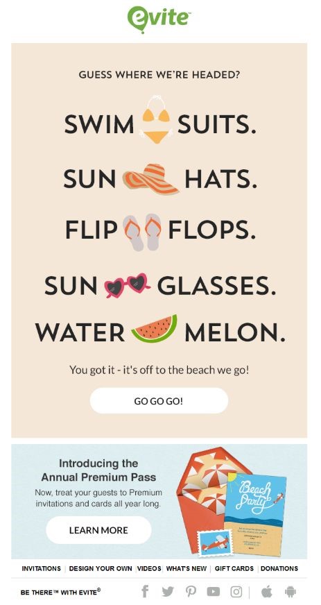
Thanks to texting and online communication, emojis have in a way become a part of our communication. Emojis are a nice way of adding emotion to your message. That’s why emojis are so popular with email marketing. With the help of emojis, you can use less words to communicate a message and express your feelings.
Emojis are a great addition to subject lines, but they can also be used in your email design.
The example by E-Vite, uses emojis as a touch of design to its email. Without the emojis, the email would be a simple text design, but the emojis add a pop of color and simple imagery.
Another reason you might want to consider using emojis in your email design is that according to studies, emojis are able to increase open and click-through rates. Try using emojis in your emails this summer and see if your numbers increase!
6. Take Advantage of Summer Colors

The good thing about email design is it doesn’t have to be anything wild and crazy and you don’t need a graphic design expert to create beautiful emails.
This summer use bright colors such as yellow and blues in your email design. With the right colors and template, you don’t even need imagery to capture the attention of your readers. Check out the example above to see how summer colors make a beautiful email.
7. Use Images to Evoke Emotions

We talked about GIFs being used in email newsletters, but you can also use still images.
The example above by J.Crew if a fun, yet simple design that evokes emotion. By looking at their email design, you instantly feel what the image wants you to feel. You can picture yourself being hot on a hot summer day and can imagine the feeling of ice cooling you off. That feeling paired with a clear call to action is a recipe for engagement! A simple, yet effective design is sure to boost click-through rates.
MailBakery: Baking Engaging, Unique Emails This Summer
Generally speaking, summers tend to be the slow season for most businesses; but it doesn’t have to be!
Focus on creating an email that appeals to your readers this summer. If you are not sure where to start, don’t worry! Our team at MailBakery has tons of samples to choose from. Or, if you have a design in mind, your first coding is free!
Spend this summer baking fun and effective emails this summer with MailBakery!


