30 Promotional Email Examples That Make the Offer Hard to Ignore


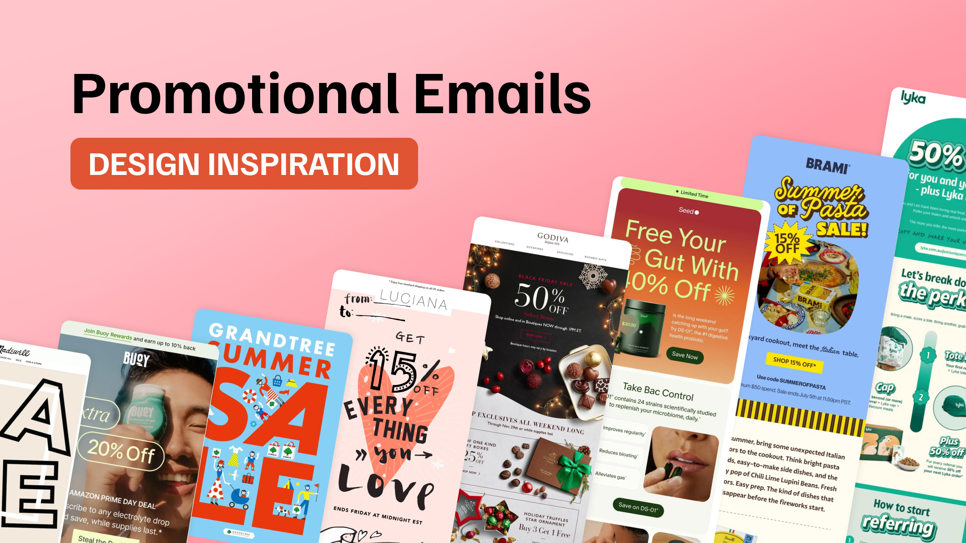
Promotional emails can take a lot of different forms. Some lead with a big discount, others focus on a new product, a limited-time offer, or a seasonal campaign. What they have in common is that the message needs to be clear enough to understand quickly and interesting enough to earn the click.
The design plays a big part in that. Typography, product imagery, layout, animation, and CTA placement can completely change how a promotion feels, even when the offer itself is fairly simple.
Below, we’ve collected 30 promotional email examples from different brands and campaign types, with a quick look at what makes each one work and which ideas are worth borrowing for your own campaigns.
If you want to explore more campaign types, browse our 150+ promotional email examples, including ecommerce offers, flash sales, B2B promotions, and campaigns that don’t rely on discounts.
Quick links:
→ Sale & Discount Email Examples
→ Limited-Time & Special Offer Email Examples
→ Product Launch & New Arrival Email Examples
→ Holiday & Seasonal Promotional Email Examples
What Is a Promotional Email?
A promotional email is a marketing message designed to encourage a specific action, usually a purchase, sign-up, booking, or visit to a website. It can promote a sale, discount, new product, seasonal offer, limited-time deal, or another campaign tied to a commercial goal.
Unlike transactional emails, which are triggered by actions such as purchases or password resets, promotional emails are sent to generate interest and drive engagement.
The strongest promotional emails combine a clear offer with focused copy, appealing visuals, and an obvious call to action. The design should help readers understand what is being promoted within seconds.
Promotional Email Examples
There is no single formula for a good promotional email. A flash sale needs a different approach from a new product launch, while a holiday campaign gives brands more room to experiment with seasonal visuals and creative concepts.
The examples below show how different brands use layout, typography, imagery, offers, and calls to action to turn a promotion into an email people actually want to explore.
Sale and Discount Email Examples
Discount emails have one major job: make the value of the offer immediately clear. The strongest designs usually put the discount near the top of the email, create a clear visual path toward the CTA, and avoid surrounding the promotion with unnecessary information.
The discount should stand out, but the design still needs enough structure to lead the eye toward the next step.
The examples below take very different approaches, from oversized typography to playful illustrations, while keeping the promotion at the center of the email.
1. Seed Makes a 40% Discount Part of the Product Story
Seed puts its 40% discount front and center, pairing the offer with a bold gradient background and a clear product shot. Instead of stopping at the sale message, the email continues with concise product benefits and lifestyle imagery that explain why the supplement may be worth trying in the first place.
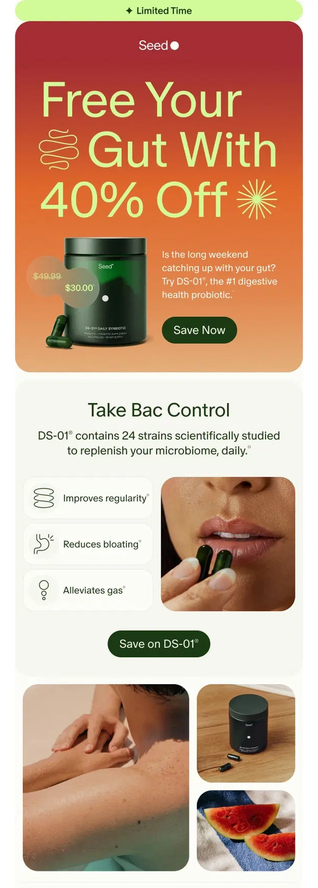
Design takeaway: A discount can attract attention, but supporting it with clear product benefits gives readers a stronger reason to act beyond the lower price.
2. Brami Builds a Summer Sale Around a Full Campaign Theme
Brami turns a 15% discount into a complete summer campaign with bold typography, bright colors, product photography, and recipe inspiration. The “Summer of Pasta Sale” concept carries through the entire email, while repeated CTAs and product sections make it easy to move from inspiration to shopping.
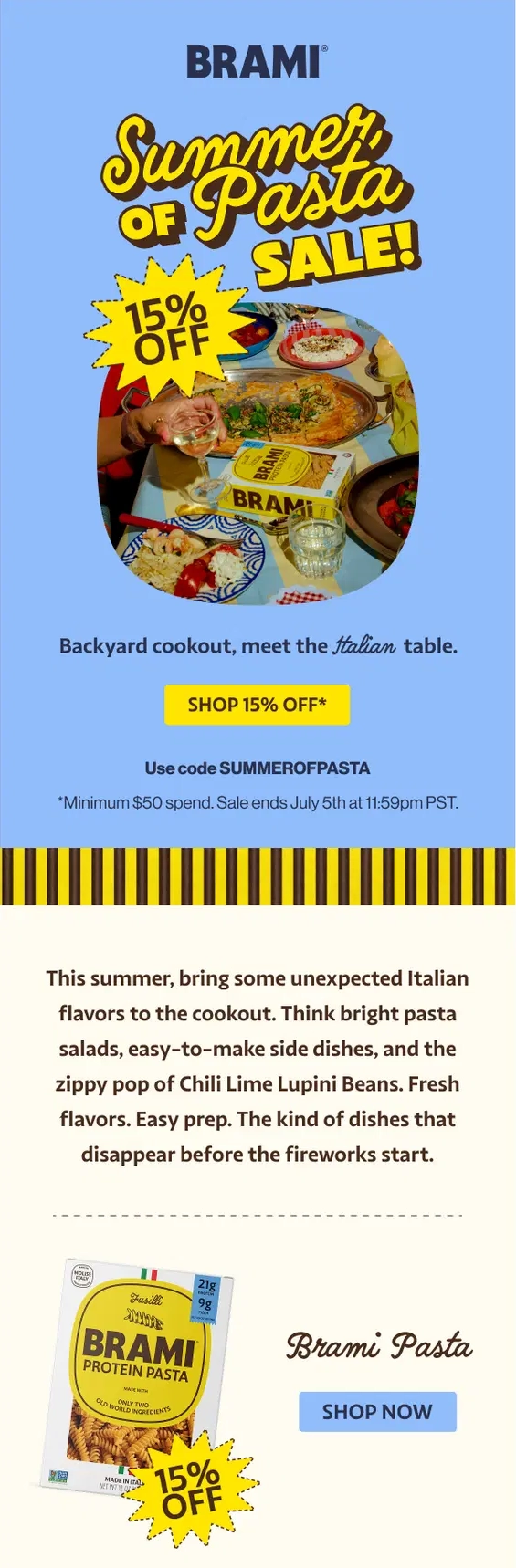
Design takeaway: A sale becomes more memorable when it has its own creative theme. Carrying the same visual idea through product and content sections can make a longer promotional email feel cohesive.
3. Buoy Keeps a Multi-Layered Prime Day Offer Easy to Follow
Buoy combines several incentives in one compact email: an extra 20% off for Prime Day, savings for subscribers, and rewards credits on future purchases. A large lifestyle image and oversized discount message establish the main offer first, while the additional benefits are introduced separately below.
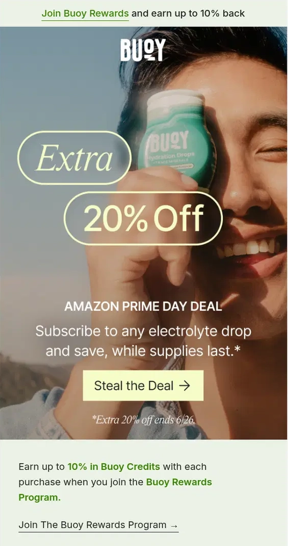
Design takeaway: When a promotion includes several incentives, establish one clear primary offer before introducing the secondary benefits. This keeps the message valuable without making it difficult to understand.
4. Luciana Makes the Discount the Hero
Luciana turns a simple 15% discount into the main visual idea of the email. The oversized percentage, hand-drawn typography, and heart-shaped graphic make the promotion feel playful rather than generic. The deadline at the bottom adds urgency without competing with the offer.

Design takeaway: A discount does not always need product photography to stand out. Strong typography and a distinctive visual concept can carry the entire promotion.
5. Madewell Builds the Design Around One Big Word
Madewell makes the word “SALE” part of the layout itself, using oversized outlined letters to frame the offer in the center. The extra 40% discount, promo code, deadline, and CTA all sit together in a compact block, so readers get the important information without searching for it.

Design takeaway: When the promotion is the main message, oversized typography can create visual impact while a smaller central block handles the practical details.
6. Free People Gives a Summer Sale an Editorial Look
Free People takes a softer approach to a summer sale, combining large typography with botanical elements and a muted seasonal palette. Instead of leading with a percentage, the email builds the promotion around the idea of a limited summer collection and then guides readers toward different sale categories.

Design takeaway: A sale email can still feel strongly connected to the brand when the visual style takes priority over standard discount graphics.
7. Diane von Furstenberg Turns a Sale Into Seasonal Artwork
This Memorial Day email keeps the promotion simple with a large “SALE” headline surrounded by expressive artwork. The 30% discount, promo code, and CTA sit directly underneath, creating a clear path from the visual hook to the offer.
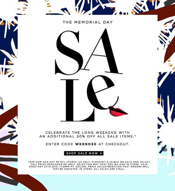
Design takeaway: Decorative elements can give a seasonal sale its own identity as long as the discount and CTA remain easy to find.
8. Grandtree Uses Illustration to Make the Sale Memorable
Grandtree builds its summer sale around a bold illustrated concept rather than a traditional product grid. The oversized lettering immediately communicates the campaign, while the small characters and summer details make the design more memorable and invite a closer look.

Design takeaway: Illustration can turn a familiar sale message into a campaign with its own visual personality, especially when the headline remains simple and prominent.
9. An Animated Summer Sale Makes the Offer Feel Playful
This animated email turns a simple summer sale into a playful visual story. The moving boat catches the eye first, while the bold “up to 60% off” message makes the value of the offer clear right away. The orange CTA stands out against the blue background and gives the reader an obvious next step.
Design takeaway: Animation works best when it supports the promotion instead of becoming the main attraction. Here, the movement adds personality while the discount and CTA stay easy to notice.

Limited-Time and Special Offer Email Examples
Special offers can create urgency without relying on a standard percentage-off sale. Mystery deals, short deadlines, bundle offers, and other incentives give brands more room to build curiosity around the promotion.
The best designs make the value of the offer easy to understand while giving readers a clear reason to act now rather than come back later.
10. Mammut Uses Early Access and a Countdown to Create Urgency
Mammut gives members early access to its Winter Sale and makes the deadline a central part of the design. A prominent countdown reinforces that access ends soon, while the promo code, 40% discount, and separate shopping paths for men, women, and equipment make the next step easy to choose.
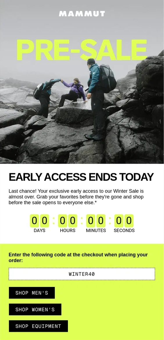
Design takeaway: Exclusive access can create urgency before a public sale even begins. Pairing it with a visible deadline makes the advantage of acting early immediately clear.
11. Candy Kittens Builds Curiosity Around a Mystery Deal
Candy Kittens deliberately keeps part of its offer hidden, promoting a mystery bundle of five bags instead of revealing exactly what customers will receive. The bold pink design, repeated mystery messaging, and TikTok Shop launch give the campaign a playful sense of discovery while the fixed £15 price keeps the value clear.
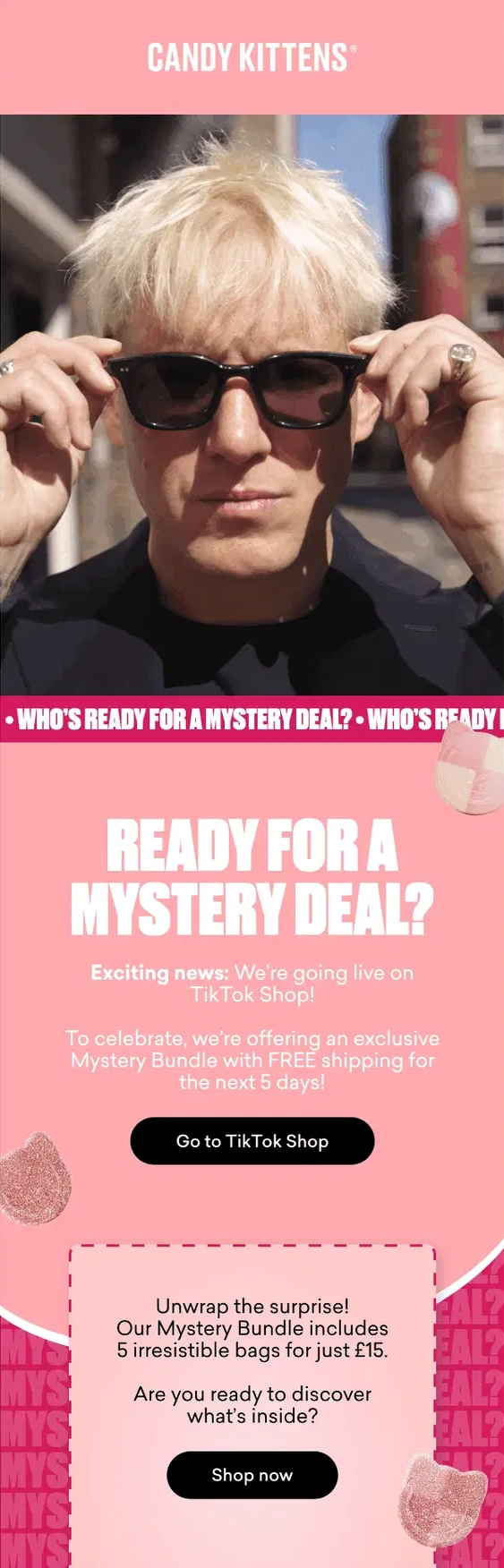
Design takeaway: Mystery offers work by withholding the right information, not all information. Keep the contents surprising while making the price, value, and next step easy to understand.
12. Ann Taylor Turns an Empty Closet Into the Visual Hook
Ann Taylor builds the entire email around a playful “Nothing to wear?” message, using empty hangers to make the idea instantly recognizable. Instead of revealing every detail upfront, the CTA invites readers to “get the offer,” adding a small element of curiosity while keeping the design focused.

Design takeaway: A special offer can become more memorable when the design starts with a familiar problem and lets the promotion provide the solution.
13. Whistlefish Combines a Countdown With a Last-Chance Offer
Whistlefish makes the deadline impossible to miss by placing a live-style countdown directly below its buy-one-get-one-half-price offer. The autumn illustrations frame the message without distracting from it, while the promo code and CTA sit together in one clear action area.

Design takeaway: When time is part of the offer, make the deadline visible. A countdown can reinforce urgency without needing aggressive copy throughout the email.
14. A 10-Hour Offer Uses Animation to Reinforce Urgency
This animated email puts the deadline at the center of the creative with an oversized “10 hours only” message. Small color changes add movement to an otherwise simple layout, while the acorn imagery gives the “make like a squirrel and scurry” copy a playful visual connection.

Design takeaway: Animation does not need to be elaborate to be useful. Even a subtle change can draw attention back to the most important part of a time-sensitive offer.
15. Dollar Shave Club Makes the Price the Entire Proposition
Dollar Shave Club leads with an unusually specific offer: an entire starter set for just $2.50. The price dominates the opening section, while the product shot immediately shows what subscribers are getting for it. Repeating the offer further down the email reinforces the value without introducing a competing message.
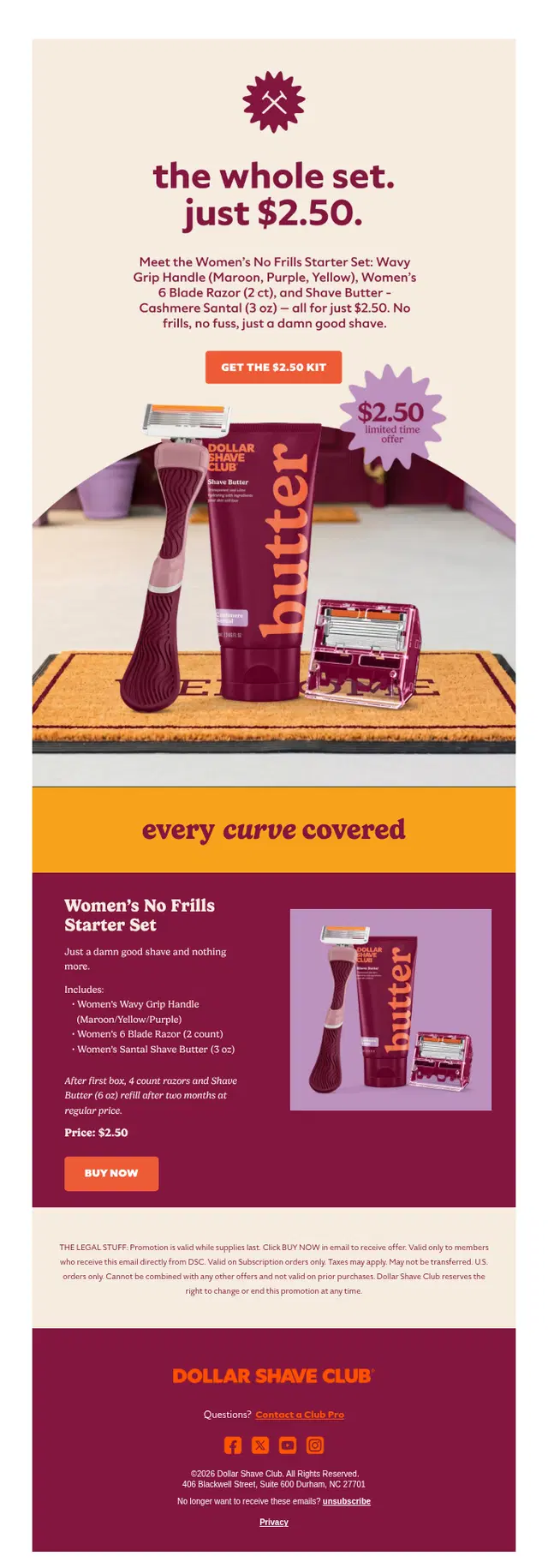
Design takeaway: When the offer itself is unusually strong, make it the centerpiece. A clear price paired with a visual of everything included can communicate value faster than a long explanation.
16. Lyka Turns Referrals Into a Layered Reward
Lyka combines several rewards in one referral offer, giving customers 50% off while unlocking branded merchandise as more friends sign up. The email breaks the rewards into clear stages, making a potentially complicated promotion much easier to understand.
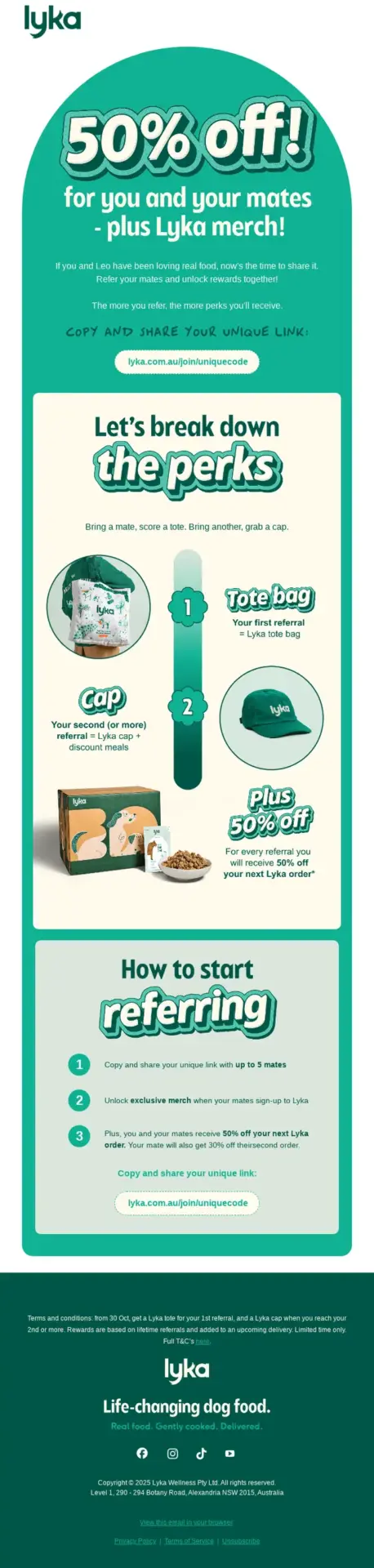
Design takeaway: Multi-step offers need strong visual organization. Showing each reward separately helps readers understand what they can earn and what they need to do next.
Product Launch and New Arrival Email Examples
New product emails need to do more than announce that something has arrived. The design should give the product or collection a clear identity, show readers what is new, and make it easy to explore without overwhelming them with too many competing messages.
These examples use photography, animation, and campaign concepts to turn a simple product announcement into something worth clicking.
17. Free People Turns a New Collection Into a Visual Escape
Free People introduces its May collection through layered photography, tropical foliage, and an editorial-style layout that gives the email the feel of a fashion campaign. The “100+ brand-new styles” message communicates the scale of the launch, while the imagery does most of the work of establishing the collection’s mood.

Design takeaway: When launching a collection, build a visual world around it. Strong art direction can make new products feel connected rather than presented as a simple catalog of arrivals.
18. Bonobos Uses Animation to Show More Without Adding Length
Bonobos keeps the layout almost completely still while the shirt pattern changes around the model. The animation supports the “Not for wallflowers” message and shows several styles within the same space, without turning the email into a long product grid.

Design takeaway: Animation can showcase multiple product variations without adding visual clutter. It works especially well when the movement directly reinforces the campaign idea.
19. An Animated Watermelon Reveals the New Arrivals
This new-arrivals email uses a playful watermelon illustration as the centerpiece of the design, with animation revealing different product categories inside it. The large headline explains the purpose of the email immediately, while the unexpected visual gives an otherwise familiar announcement more personality.

Design takeaway: A simple reveal animation can make browsing new arrivals feel more playful while still keeping the main CTA and message easy to understand.
20. Away Turns a Collaboration Into a Full Collection Story
Away introduces its Disney and Pixar Toy Story 5 collaboration with a bold campaign concept built around the collection itself. The colorful luggage gets plenty of space to stand out, while lifestyle photography shows how the pieces work for both kids and adults. The email then expands into individual product recommendations and personalization options without losing the main theme.
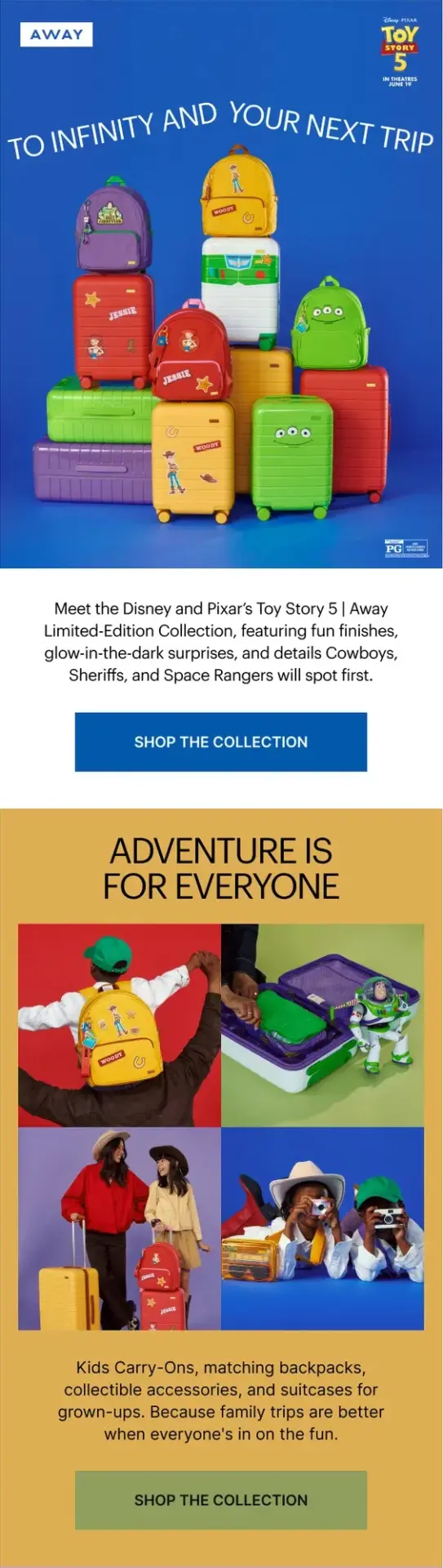
Design takeaway: A collaboration launch works best when the creative idea connects every part of the email. Consistent colors, imagery, and messaging can make a multi-product collection feel like one cohesive campaign.
21. FlavCity Builds a Product Launch Around One Clear Benefit
FlavCity gives its new Grapefruit Superfood Lemonade plenty of room to lead the email, introducing the product with a simple summer-focused message and a prominent product shot. The sections that follow explain the ingredients, reinforce the benefits with social proof, and show where the drink fits into everyday life.
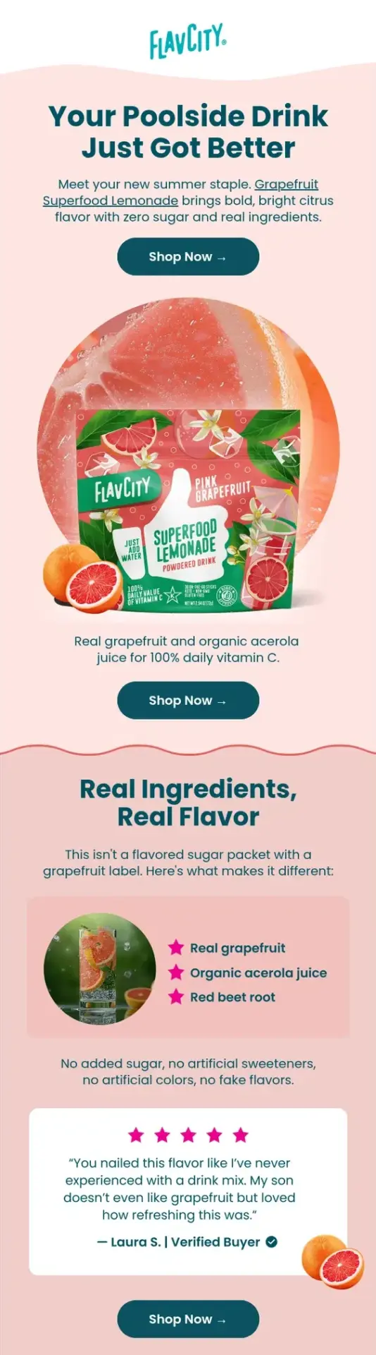
Design takeaway: A single-product launch can go deeper than a collection email. Use the extra space to explain what makes the product different, answer likely questions, and reinforce the main benefit before repeating the CTA.
Holiday and Seasonal Promotional Email Examples
Seasonal campaigns give brands a built-in creative theme, but the strongest ones do more than add a few holiday colors or decorations. They connect the occasion to the offer, product, or visual concept so the campaign feels intentional.
These examples show how brands use seasonal imagery, gifting ideas, playful concepts, and timely promotions without letting the theme take over the message.
Seasonal promotions can look very different depending on the occasion. Our collection of 150+ holiday email examples explores Christmas, Black Friday, Valentine’s Day, Mother’s Day, Halloween, and other seasonal campaigns, including promotional offers and holiday email sequences.
22. Terrain Turns the Fourth of July Into a Visual Countdown
Terrain builds its Fourth of July promotion around the numbers one through four, using each number as part of a different product scene. Tableware, drinks, party décor, and fireworks all become part of the countdown, creating a long email that still feels connected from top to bottom.

Design takeaway: A seasonal concept can organize an entire email, not just decorate it. Repeating one visual idea across several sections helps a longer campaign feel cohesive.
23. J.Crew Factory Turns a Halloween Sale Into a Trick or Treat
J.Crew Factory uses the familiar “trick or treat” idea to build curiosity around a mystery Halloween sale. The minimal black-and-white design and simple ghost image keep the concept instantly recognizable, while the offer is revealed further down the email.

Design takeaway: Seasonal campaigns do not need elaborate graphics to feel distinctive. A familiar idea, strong visual restraint, and a little curiosity can be enough to carry the promotion.
24. Tiffany & Co. Turns Its Packaging Into a Holiday Icon
Tiffany & Co. creates a holiday wreath from its signature blue boxes and finishes it with an oversized red bow. The visual does almost all of the storytelling, while the surrounding copy focuses on the practical Christmas delivery deadline.

Design takeaway: Use recognizable brand assets as part of the seasonal creative. When the brand identity is strong enough, familiar products or packaging can become the holiday decoration themselves.
25. Birchbox Makes Holiday Shopping Feel Like a Celebration
Birchbox leads with a festive blue-and-gold design that immediately signals the holiday season, then directs readers toward different gift categories. The email balances a broad gifting message with clear shopping paths for stocking stuffers, gift sets, and gifts for him.

Design takeaway: Holiday gift emails become easier to browse when the creative sets the mood first and the navigation then helps shoppers quickly narrow their options.
26. Godiva Blends Black Friday With Holiday Gifting
Godiva combines a prominent 50% Black Friday offer with several product-specific promotions below it. Seasonal photography ties everything together, while the individual modules make it easy to browse different deals without losing sight of the main campaign.

Design takeaway: When one seasonal email contains several promotions, use a strong hero offer and consistent visual treatment to keep the different deals from feeling disconnected.
27. Piknik Turns the Month of May Into a Playful Campaign
Piknik builds its “Play all May” campaign around bright illustrations and different activities for kids, using each section to introduce another game or experience. The 40% offer appears early, but the rest of the email focuses on discovery and play rather than repeatedly pushing the discount.
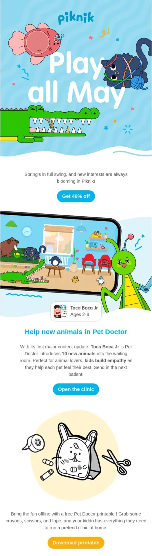
Design takeaway: Seasonal promotions can work around a broader theme instead of a single holiday. A recurring visual style can connect several products or activities while keeping the campaign playful and easy to explore.
28. A Black Friday Sale Uses Restraint to Make the Discount Stand Out
This Black Friday email keeps the design deliberately minimal, using a black-and-white palette that fits both the occasion and the formalwear being promoted. The oversized 70% discount becomes the clear focal point, while a single CTA and strong lifestyle image keep the rest of the message focused.

Design takeaway: A major sale does not need a visually busy layout. Limiting the palette and surrounding a strong offer with plenty of space can make the promotion feel more premium while keeping the discount impossible to miss.
29. ban.do Makes Black Friday Feel Like Its Own Brand
ban.do moves away from the usual dark Black Friday aesthetic with a soft pink background, oversized typography, and bright pops of color. The 20% discount and free shipping offer sit directly below the main graphic, keeping the practical details easy to find without disrupting the playful design.

Design takeaway: Seasonal promotions do not have to follow the expected visual formula. Using your existing brand style can make even a familiar event like Black Friday feel more distinctive and recognizable.
30. ESCAPE Turns Mother’s Day Into a Visual Gift Guide
ESCAPE builds its Mother’s Day email around a collage of gift ideas, combining lifestyle photography, product shots, florals, and handwritten-style typography. Instead of pushing one main discount, the email guides readers through several ways to “celebrate her,” giving the campaign a more editorial feel.

Design takeaway: Seasonal emails do not always need to lead with a promotion. A curated gift-guide format can make the campaign feel more thoughtful while still giving readers several clear product ideas to explore.
Promotional Email Design Best Practices
The examples above use very different styles, but the strongest promotional emails tend to follow the same basic principles. The offer is easy to understand, the design creates a clear path through the message, and every visual element supports the action the reader is expected to take.
1. Make the Offer Clear From the Start
Readers should not have to search for the reason behind the email. Whether you are promoting a discount, free gift, new product, or limited-time deal, make the main benefit visible near the top.
A strong headline, prominent offer, and supporting visual can communicate the message within the first few seconds.
2. Create a Clear Visual Hierarchy
Promotional emails often contain several elements competing for attention, from product images and prices to promo codes and CTAs. Use size, spacing, typography, and contrast to show readers what they should notice first.
The most important message should lead naturally into the supporting information and then the CTA.
3. Keep the Primary CTA Easy to Find
A promotional email can include several links, especially when it features multiple products, but there should still be an obvious primary action.
Use clear CTA copy that tells readers what happens next, such as “Shop the Sale,” “Explore the Collection,” or “Claim Your Gift.”
4. Let the Product Support the Promotion
Discounts can attract attention, but product imagery gives readers a reason to care about the offer. When the product is central to the campaign, give it enough space to stand out instead of surrounding it with unnecessary graphics or copy.
For product launches, the imagery can even become the main storytelling element.
5. Use Animation With a Purpose
GIFs and other animated elements can make a promotional email feel more dynamic, reveal different products, or draw attention to an important message.
The movement should support the campaign rather than compete with it. Keep essential information such as the offer and CTA understandable even if the animation does not play.
6. Design for Mobile Screens
Promotional emails need to remain easy to scan on smaller screens. Keep text readable, give buttons enough space to tap, and avoid layouts that depend on several narrow columns.
Important offers and CTAs should remain prominent without requiring readers to zoom or work through a crowded design.
7. Test Before You Send
An email that looks great in one inbox may behave differently in another. Fonts, images, spacing, animation, and responsive layouts can all render differently across email clients and devices.
Testing the final email helps catch broken layouts and display issues before the campaign reaches subscribers.
FAQ: Promotional Emails
Q1. What should a promotional email include?
A promotional email should include one clear primary message, a relevant offer or product, concise supporting copy, and a prominent call to action. Details such as discount amounts, promo codes, deadlines, or conditions should be easy to find without distracting from the main message.
Q2. How many CTAs should a promotional email have?
Most promotional emails benefit from one primary CTA that reflects the main goal of the campaign. Longer emails and product collections can include additional links or repeated CTAs, but they should support the same overall action rather than send readers in several competing directions.
Q3. What is the best format for a promotional email?
A promotional email typically works best with a clear headline and offer near the top, followed by supporting visuals or product information and an easy-to-find CTA. The exact format can change depending on the campaign, but the hierarchy should make the promotion understandable within a few seconds.
Q4. What is the difference between a promotional email and a transactional email?
A promotional email is sent to encourage an action such as a purchase, product discovery, or response to an offer. A transactional email is triggered by an individual action or account event, such as an order confirmation, shipping update, password reset, or receipt.
Need a Promotional Email Designed for Your Brand?
Great promotional emails start with a strong idea, but the design and build need to support it. MailBakery can create a custom promotional email around your campaign, brand, and content, then code it to work across major email clients and devices.