6 Beautiful Email Designs You’ll Want To Copy For Your Next Campaign
It wasn’t but just a few years ago that email design took a turn for the best. Think back to the day that brands first started using email to connect with consumers. Email design was bland as can be but in 2020 things have significantly changed!
For us email design guru’s, this change is exciting. We find it fascinating that we can entice customers with advanced layouts. From color schemes, images, unique and creative text to interactive emails, email marketing has never been so fun to experiment with!
With each brand having their own email marketing strategy, email marketing is now more competitive than ever before, and consumers are receiving tons of emails each day from brands, so it’s critically important that your email stands out.
To improve open rates, click-through rates and ultimately, increased engagement with your brand it’s important to pay careful attention to your email design. So, we are here to share 6 of the most beautiful designs to inspire you for your upcoming email campaign.
Keep it simple
Since there is so much you can do for email design, it’s easy to get carried away. But the truth is, the simplest designs grab the most attention. The science behind it? Brands have 11.1 seconds to get their message across to encourage a click. Otherwise, consumers are exiting out of an email and most likely won’t be returning!
Complicated emails with a tricky design do not work. When emails are created with a tricky design, it’s easy for the consumer to become confused about what you are asking them to do. When the time comes to send out your next email campaign, consider refining the layout, images and color over text, which oftentimes will distract your readers.
Having a simple email does not mean sacrificing style. In fact, this email by J. Crew is an excellent example of a minimal, yet chic layout.

Make emails easy to navigate
You can still have an eye-catching design without becoming confusing. Take this example by Office. The goal of your email campaigns should be to bring traffic to your website. Office keeps the design of the email easy, organized and easy to navigate. For instance, if readers want to shop boots, there’s a box that directs you to a page on their website where you can shop boots. If buyers want to shop heels there is also a link to a page with heels. Or, if you didn’t have any preference and simply wanted to browse the sale, there is a link that goes directly to the site.

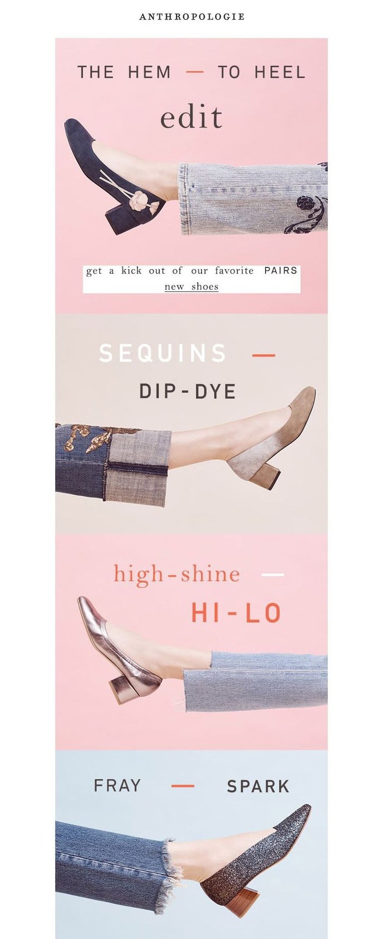
Use Images to your advantage
Rather than bombarding your readers with a bunch of text, consider using images to tell a story. A set of similar images encourages the reader to continue scrolling, and perhaps the greatest feature of the email is the segmented text. Naturally, our eyes will continue to read the email until the point is made, but if you’re looking to decrease your bounce rate, you may want to consider this email! Anthropology uses images in a unique and playful way for its readers.
Focus in on catchy headers
Many times, the header is the first part of the email once the subscriber opens it. This means that within a few seconds, the reader will determine whether or not they keep the email and click through the links, or if they will delete the email. That is why it is so critical to focus all your energy on the header. Consider different colors that will make the content of the header pop. Or, become inspired by this email from Birchbox that creates a visual impact with a strong header image, easy-to-read text and contrasting colors.

Make it relative
If you have no idea where to start when it comes to email design, consider the time of year and any upcoming events or holidays. By doing so, you are setting the tone for your readers and in a way, giving them a reason to shop. Take this example by Sunny Ventures. A simple design like the one that is used in this email, puts readers in a certain mood. A common example of this is holiday email marketing. During the holiday season, you will notice a lot of brands use colors such as red, green, silver or gold in their emails to make it more festive- and it actually works!

Welcome Emails- Short and Sweet
If you send new subscribers, you have made the right choice! Welcome emails are another opportunity to attract subscribers to your website. A welcome email is different from any other email because it’s an introductory email that only gets sent once. The content that goes into a welcome email is a bit different than the regular campaigns you send out. With that being said, it’s important to touch base on the email design for welcome emails.
Keep in mind that a welcome email is all about the content! Your new subscribers are looking to learn more about your brand and what you can do for them. With that being said, it’s best to keep the email design short and sweet! The goal is to provide readers with a warm welcome, a bit of introductory information and then, of course, a link to your website, otherwise known as a call to action button.
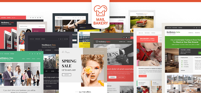
This email below is a sample page from MailBakery. This welcome email design is exactly what you need to accomplish a results-driven welcome email.
MailBakery: Proving you with innovative email templates
At MailBakery, we are the culinary experts of all things email design. Take these helpful tips as inspiration, or if you have no design and need some creative genius, we have plenty on hand. Let’s get started with a quick quote. We’ll start with what you have for ingredients, and we’ll give you a couple of designs to try. Once you pick your favorite, we will code your email for you, ready to plant right into your email service provider, and you can take it from there.