What’s The Best Email Template Height
Reading Time: 4 minutesThis article was last updated on July 27, 2017
When designing email templates, we usually make them a bit over 3000 pixels. Some clients add few more sections to our designs, others take a section or two out. It’s clear that email template height is different for every campaign, but it’s important to know which are the factors that determine this.
1. The email template height depends mostly on the type of email you are sending. Newsletters and e-commerce emails are usually longer, as they offer different content or products options. On another hand transactional messages are shorter and more direct, as they simply confirm an action you have taken (e.g. a registration confirmation) or request one from you (e.g. a password update).
2. Another factor determining the length of your email is the complexity of the product or the idea you present. The simpler the product or the more familiar your readers are with it, the shorter the body of your email. However, if you are introducing a new service or a new product feature, you will need a bit more space to explain how it works and what are the benefits for your clients.
3. As emails tend to follow website design trends, they are naturally getting higher. Due to the rise in mobile browsing, webpages are getting higher, allowing to accommodate more content on a single page. This allows the user to go through the content by simply scrolling down, instead of opening new pages/tabs on his phone.
As a rule of thumb, no matter the height of your email template, always publish your call to action above the fold. Discounts, promotions and best product features also go on top. If your users have no time to scroll down, they should be able to see your best offer and CTA on top.
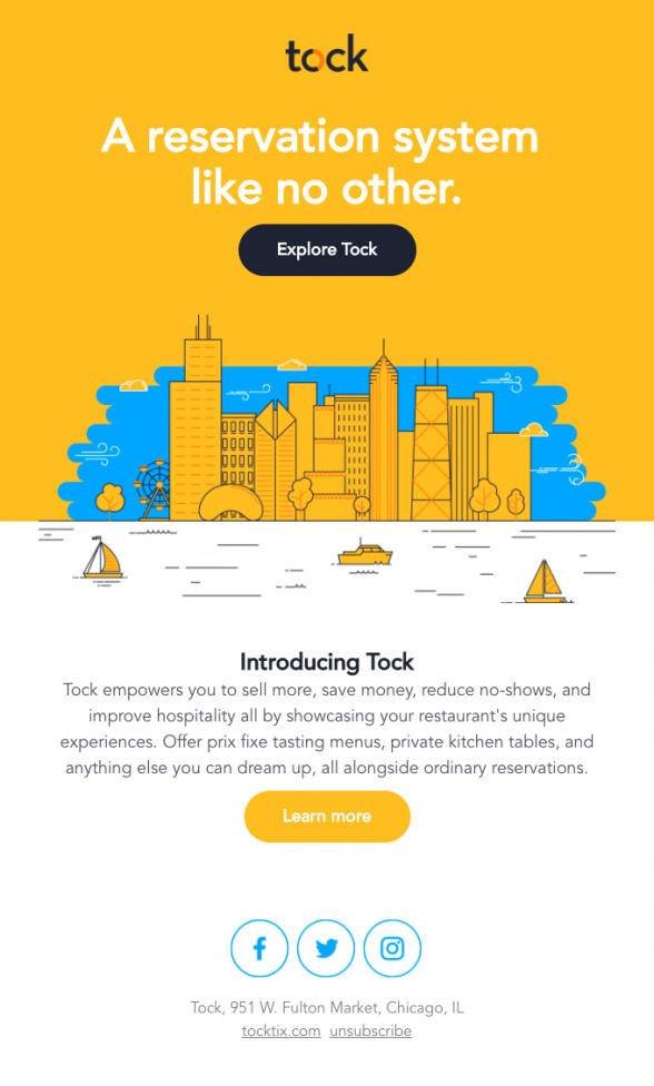
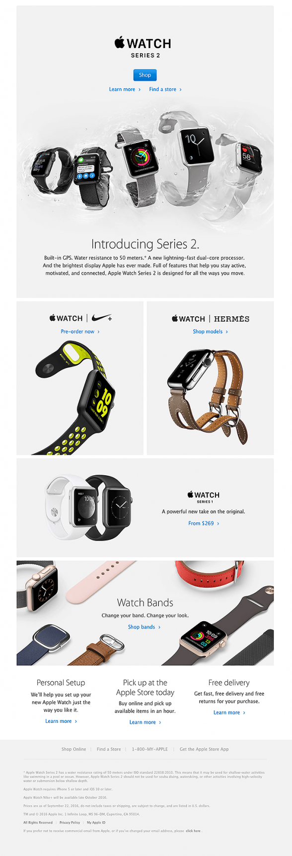
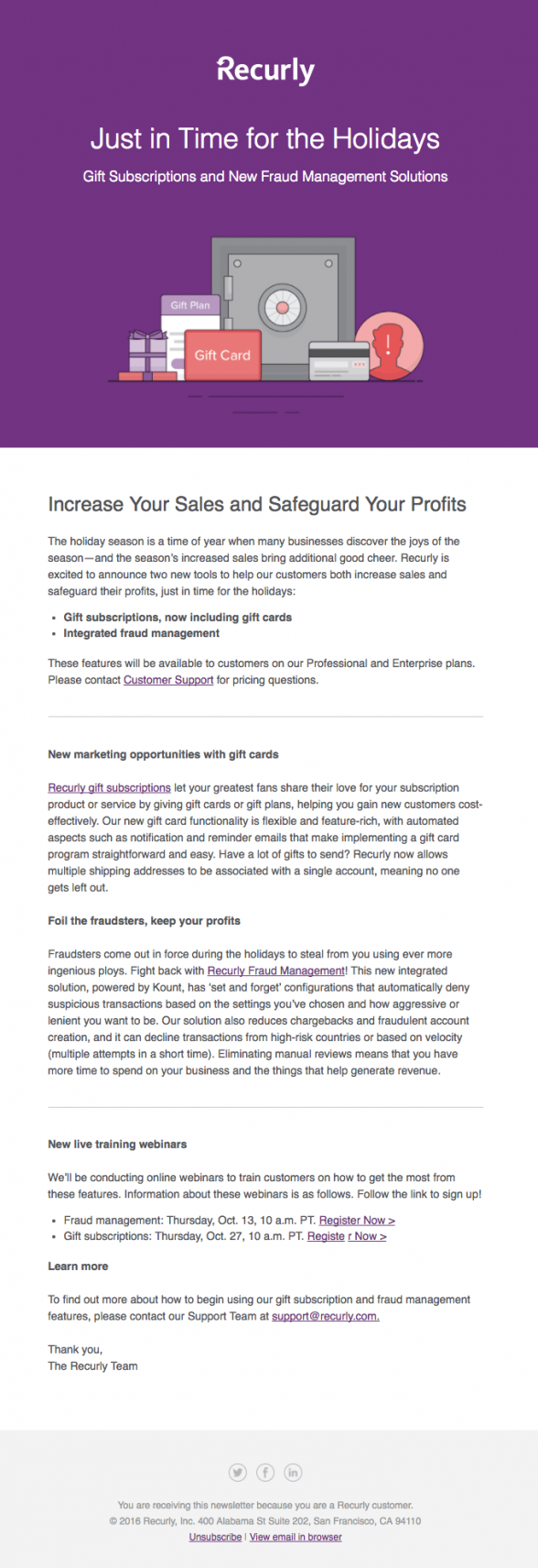
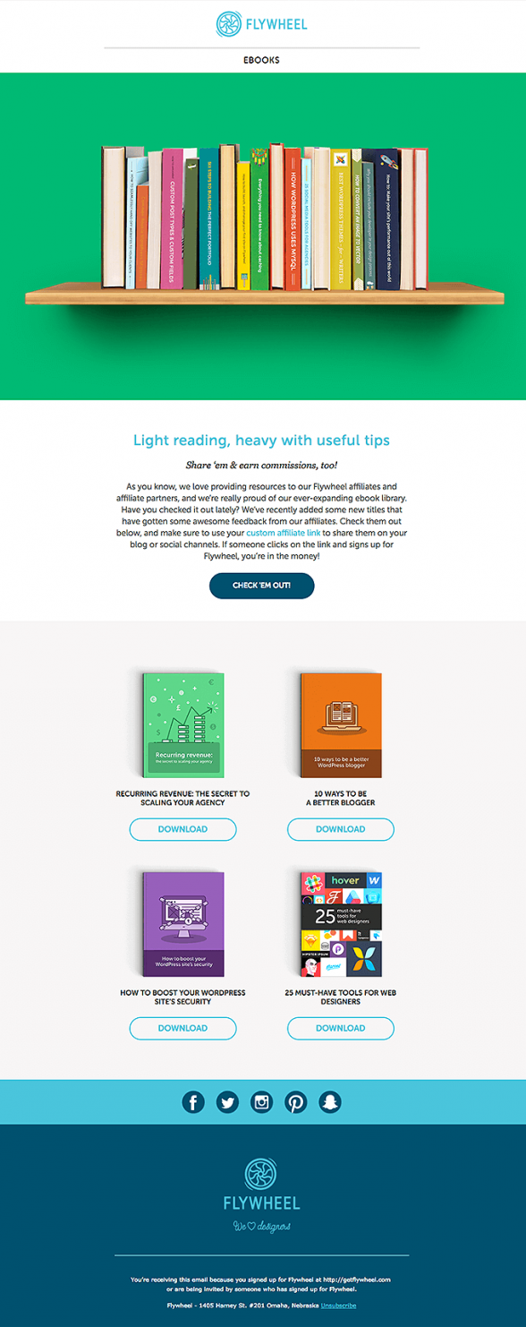
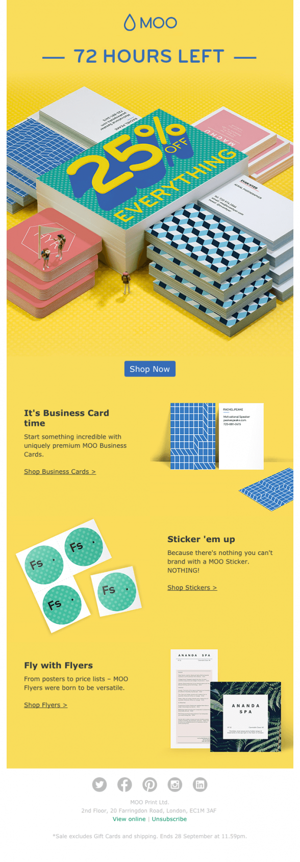
Although the height of your email templates really matters, it is equally important how you’re using the space in your email template. To illustrate this here are some examples of short, mid-sized and really high emails. Note the variety of sections they accommodate and the text/images ratio.
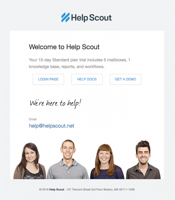
1. Very Short Email – Text and Image
Action triggered/transactional email layout. Short and non-intrusive message combined with a very friendly image.
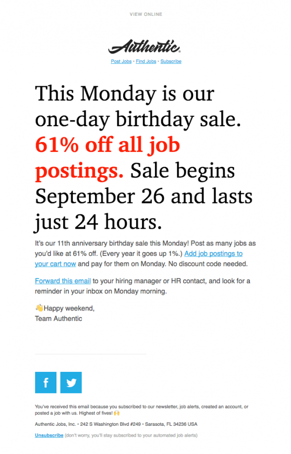
2. Short Email – Text Only, Font Styling is Key
This email shows you how you could emphasise your offer and draw your clients’ attention to a certain area in your email using just text. Playing masterfully with the font size, style and colours Authentic have achieved a great result.
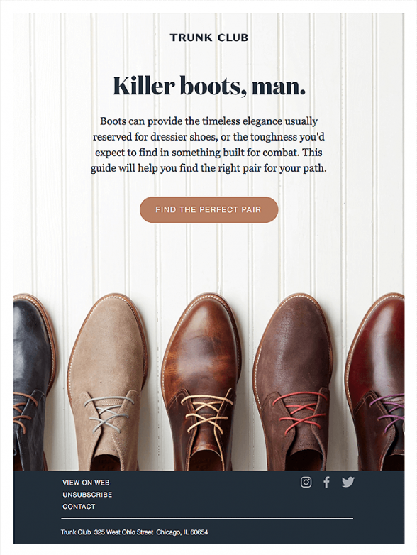
3. Short Email – Image With Text Over It
Using background images saves space, plus they look good. Although this is a short email it has everything it needs to make it work, a beautiful product image, short text and a call-to-action.
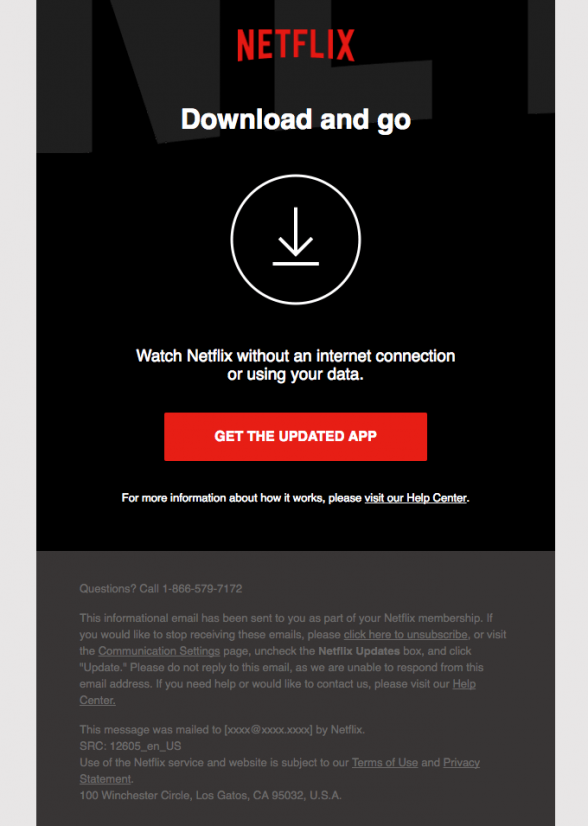
4. Short Email – Action-Oriented
This is a bold one. It doesn’t tell you much, nor it makes extra efforts to entice you with catchy images or punch lines. You know the brand, you see the message, now go ahead and download the app.
5. Short Email – Big Image and Short Text
This is a standard layout that works for every email size. The image here is the pivotal point that grabs the eye. Fit in an image your clients associate you with and then deliver your message.
6. Mid-Sized Email – Emphasise on Product Images
Brands like Apple don’t need any special tricks to catch our attention. In this case they simply displayed their product in an easy to digest size and layout, making it a central point for this email presentation.
7. Mid-Sized Email – Big Header and Plenty of Text
If you need to fit a lot of text in your email at least start with a nice, big header. Our advice, however, would be to include only teaser paragraphs in your emails, not the full texts, and then link to your website. A column of text will never look really appealing in the inbox.
8. Mid-Sized Email – Big Header, Short Text and Product List
Standard size with a standard layout. The product list could be a little longer or you could fit in a bit more text, but all in all this is how a standard email presenting a list of products looks like. Header, text and product list.
9. Mid-Sized Email – Big Header Combined with Colourful Background
Bright color designs always catch reader’s attention quicker. The big image on top illustrates what is the email about, with the rest of the template expanding on product options.
10. Mid-Sized Email – Multiple Product Offers
Offering multiple choices in a single email may make the design look a little overcrowded. You have to be confident that your readers will appreciate the choice you’re giving them, before you fit in several lines of products for them to choose from.
11. Very High Email – Big Product Images on White Background
Nike is one of those companies that are not bothered with email height or limitations on emailing frequency. Their fans will always open their emails and gobble quickly any content or offers provided. However, they will never allow themselves to design a sloppy email template and the one above is a great example of a masterful product presentation.
12. High Email – Big Product Images on Colourful Backgrounds
Another example of presenting products, by Sephora. This time the products are displayed over colourful backgrounds which adds a little to the overall noise, while attracting the eye in the same time.
13. High Email – Big Product Section Grids
Despite the height of the email, if you are a Tommy Hilfiger fan, you will scroll down to the bottom without a hesitation. The big images used in the email are very captivating and the lack of text allows for grasping the message effortlessly.
14. High Email – Long Product List on White Background
Another example of long, but catchy email template. Although the products are scattered around, the numbering helps to follow their order. The white background emphasises the product images without adding any noise to the email design.
Conclusion
Email design is not a science. Using the height of your email templates correctly is more a work of art than calculating proportions between text, images, call to actions and discount banners. One thing is clear though, if there was a golden number for the email height, all templates would have looked the same. So, better express yourself and curate your message carefully, than trying to fit it perfectly in the screen of the latest iPhone.

