23 Of The Best Email Signature with Logo Examples


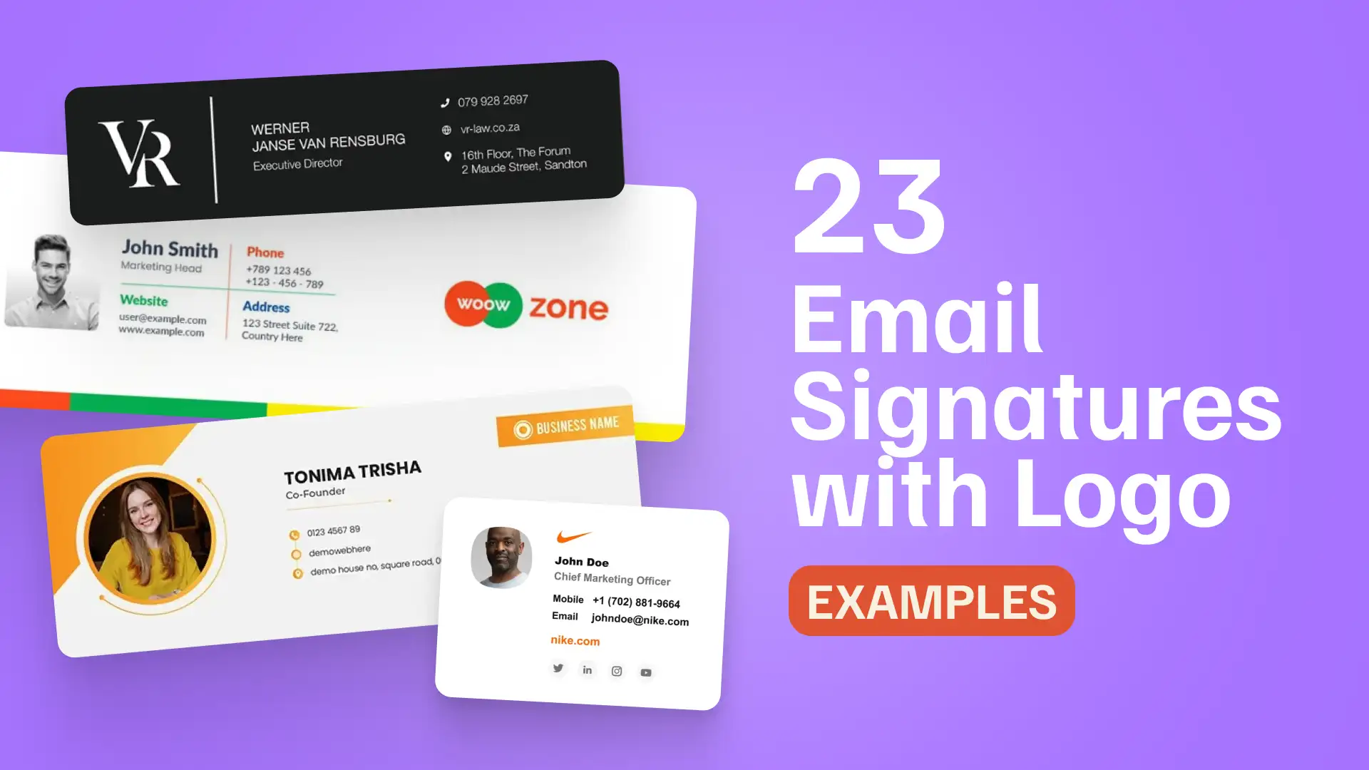
Logos can make an email signature feel more branded, recognizable, and professional, but they also need to behave well in real inboxes. Unlike website logos, email signature logos are affected by image loading, dark mode, screen size, and email client rendering.
The examples below show different ways to use logos in email signatures, from subtle inline branding to side logo blocks, stacked layouts, banner combinations, and minimal logo use. Use them as visual inspiration, but remember that inbox-ready signatures need more than a polished mockup.
For a logo-based email signature to work across Gmail, Outlook, Apple Mail, and mobile, the logo should support the layout without replacing important text, overpowering contact details, or disappearing in dark mode.
For a broader look at email signature styles across industries, platforms, and use cases, see our main guide: 100+ Email Signature Examples.
Quick links:
Email Signature with Logo Inspiration
→ Logo Next to the Name — Inline Branding
→ Logo Above or Below Contact Details
How Logos Behave in Real Email Clients
Email Signature with Logo Inspiration
The examples below are grouped by how the logo is used inside the signature: as a subtle inline accent, a side brand block, a stacked visual element, a banner companion, or a minimal brand marker.
Each style can work well when the logo supports the signature instead of replacing essential contact details or taking over the layout.
Logo Next to the Name — Inline Branding
Inline logo signatures place the logo close to the sender’s name, role, or company details. The logo works like a small brand cue, while the signature still reads primarily as contact information.
This layout works best when:
- the logo is small enough to support the identity area
- the sender’s name and role remain the main focus
- contact details stay readable as real text
- the logo adds recognition without dominating the layout
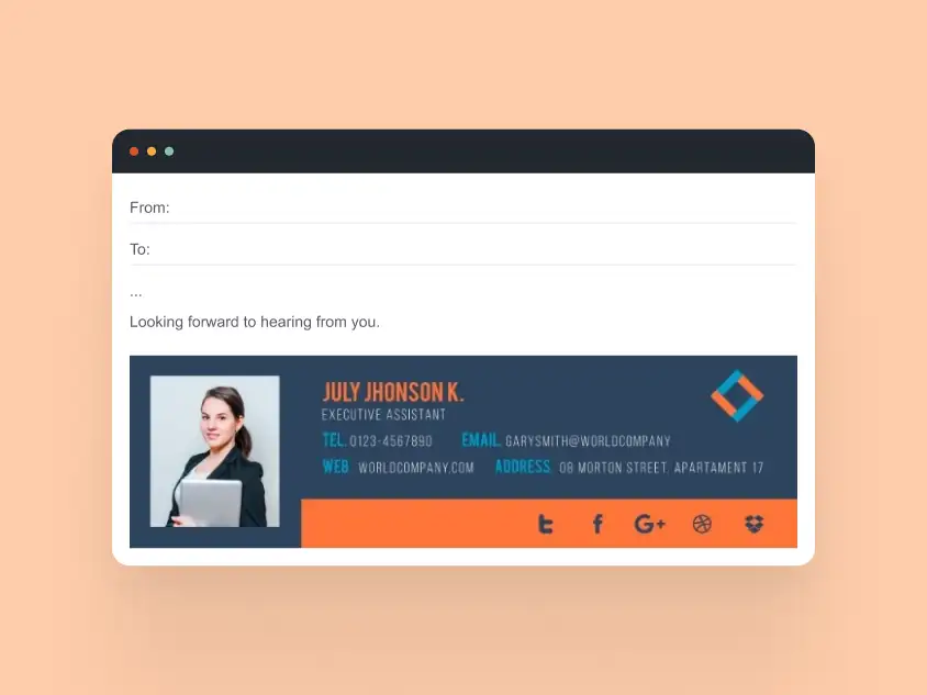
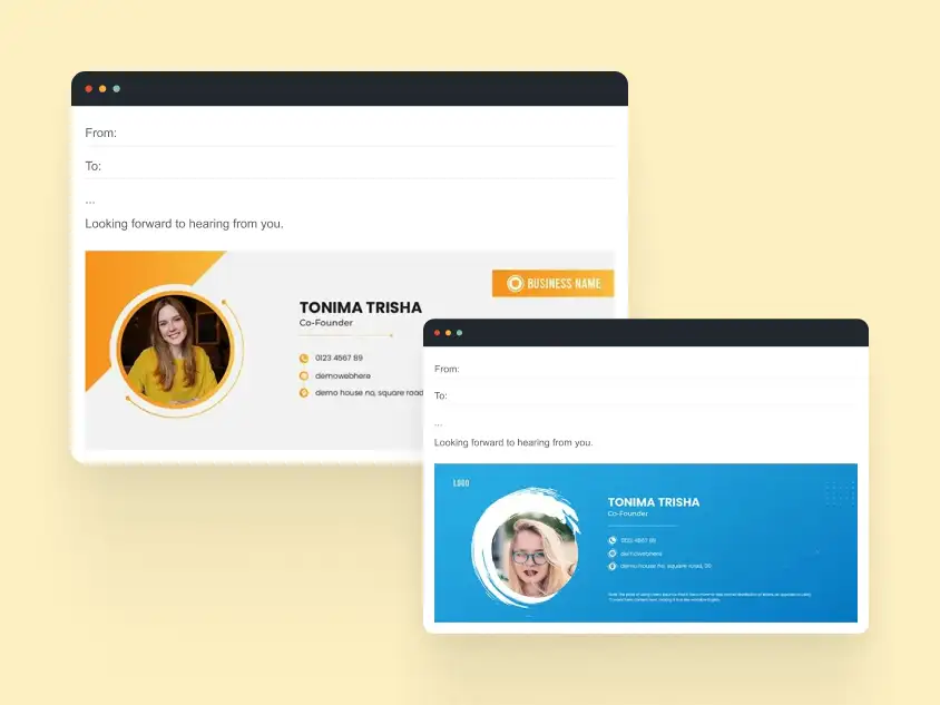

Takeaway: Inline branding is best when you want the signature to feel branded but restrained. The logo should reinforce who the sender represents without making the signature look image-heavy.
Logo as a Side Brand Block
Side logo email signatures give the brand its own visual zone, usually on the left or right side of the layout. This creates a stronger branded look while keeping the sender’s name, role, and contact details in a separate, readable section.
This layout works best when:
- the logo has enough space to stay recognizable
- a divider or spacing separates branding from contact details
- the sender’s information remains easy to scan
- the layout does not depend on overly tight alignment
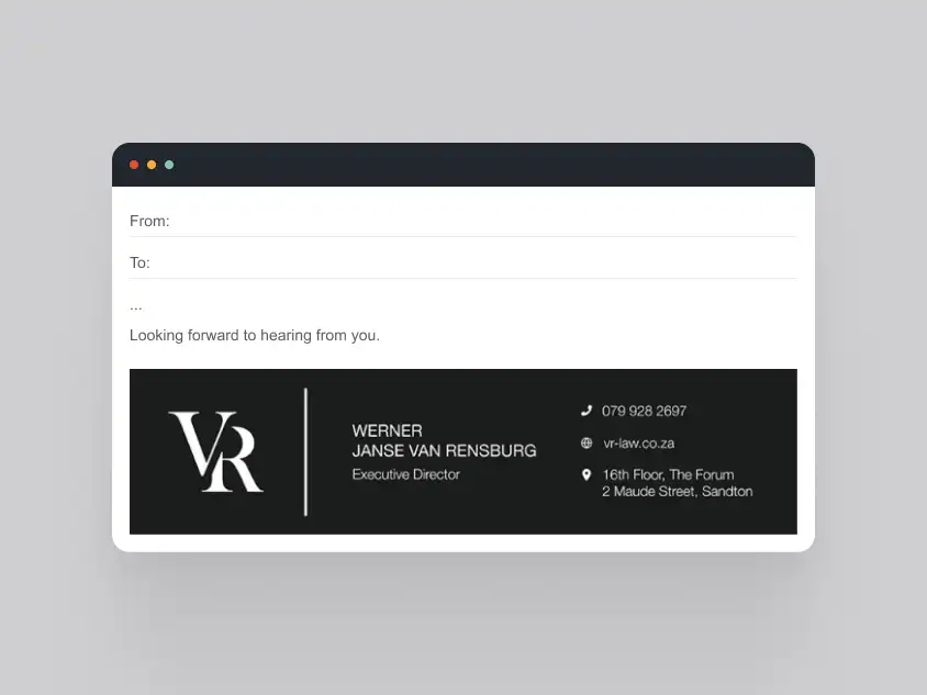
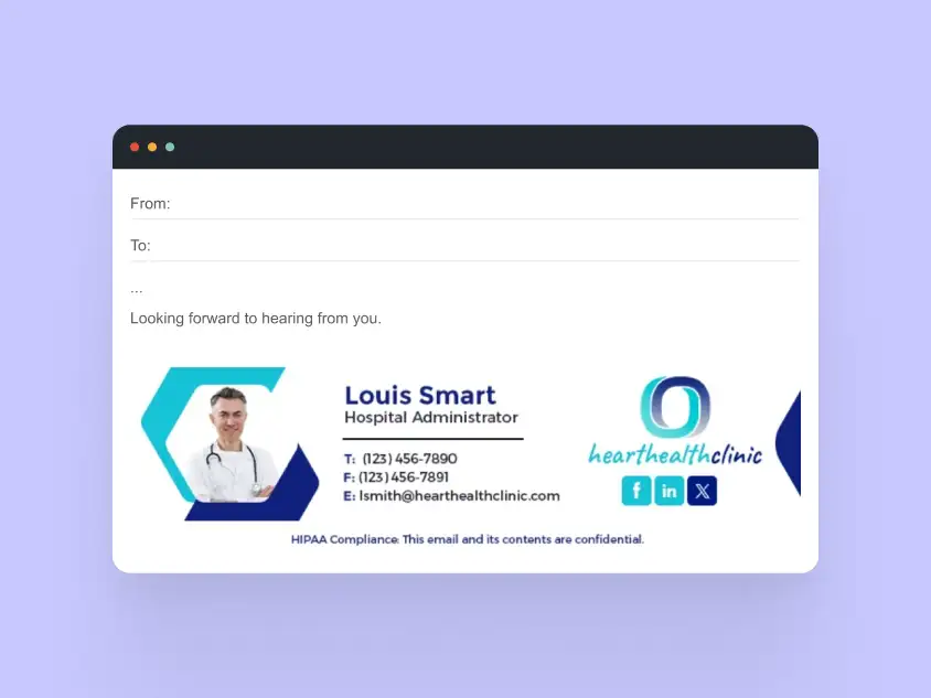

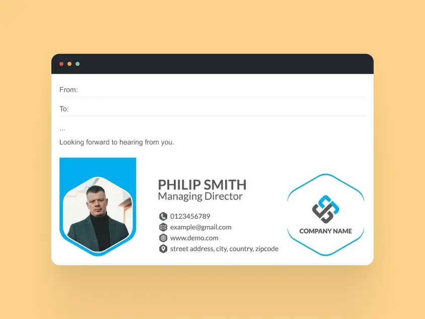
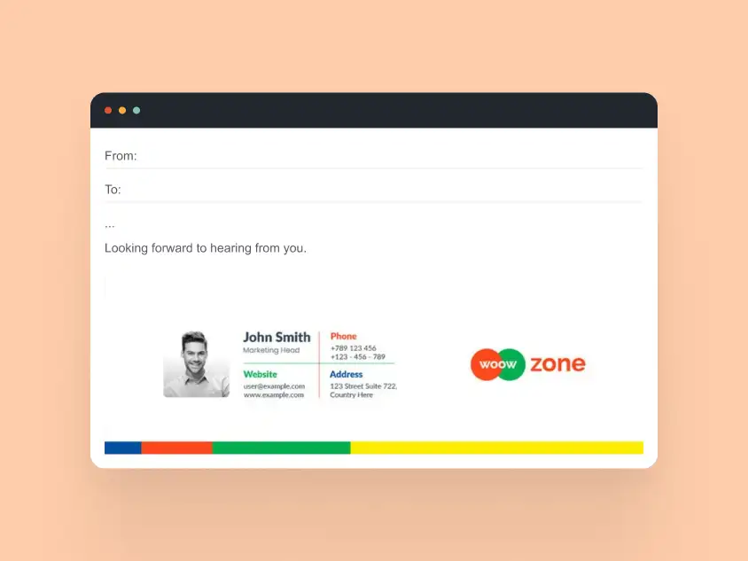
Takeaway: Side brand blocks work well for companies and teams that need consistent branding across many signatures. The key is balance: the logo should anchor the design, not compete with the person’s contact details.
Logo Above or Below Contact Details
Stacked logo signatures place the logo above or below the main contact block. This keeps the reading flow simple while still giving the brand a clear visual presence.
This layout works best when:
- the logo acts as a header or footer element
- contact details stay grouped in a clean vertical structure
- the layout needs to work well on mobile devices
- the design should feel branded without using a wide side block
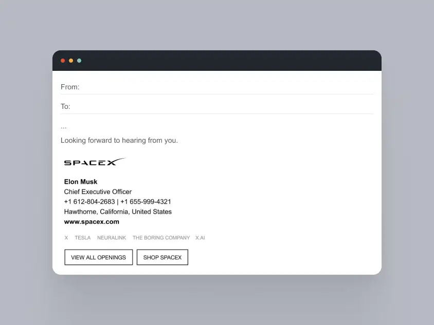
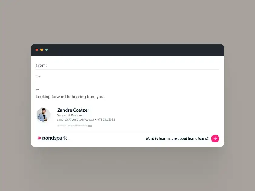
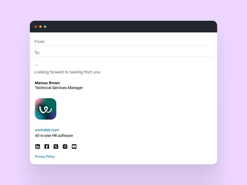
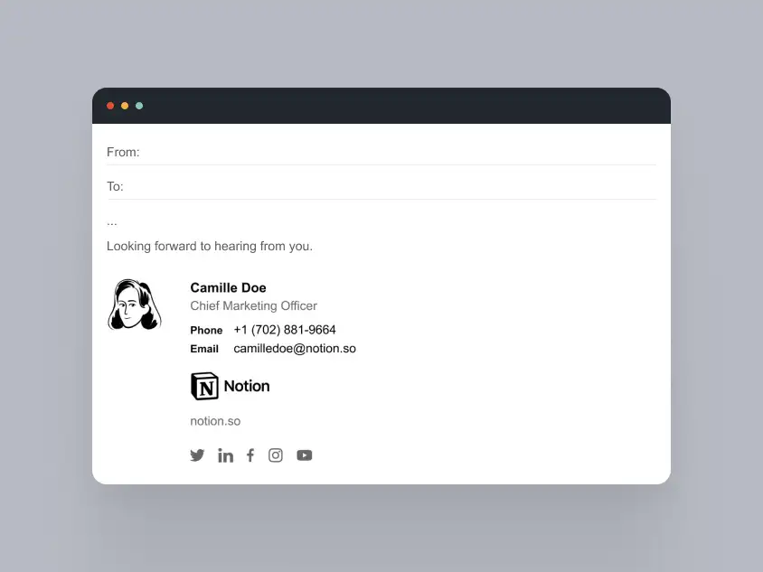
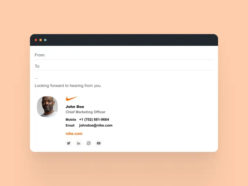
Takeaway: Logos placed above or below the contact details work well when you want a simple, flexible structure. Because the layout already follows a vertical reading order, it often adapts more naturally to narrow inbox views.
Logo + Banner Combination
Logo and banner email signatures combine a stable brand element with a secondary promotional message. The logo helps identify the sender or company, while the banner can highlight an event, offer, announcement, or featured content.
This layout works best when:
- the logo anchors the identity area
- the banner appears below the main contact details
- the promotional message stays focused on one clear action
- the banner does not contain essential contact information
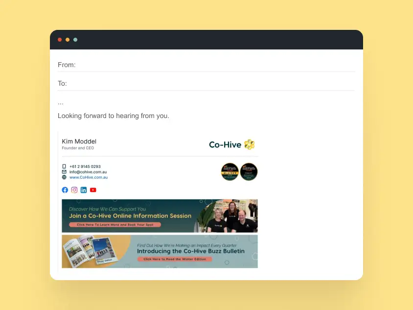
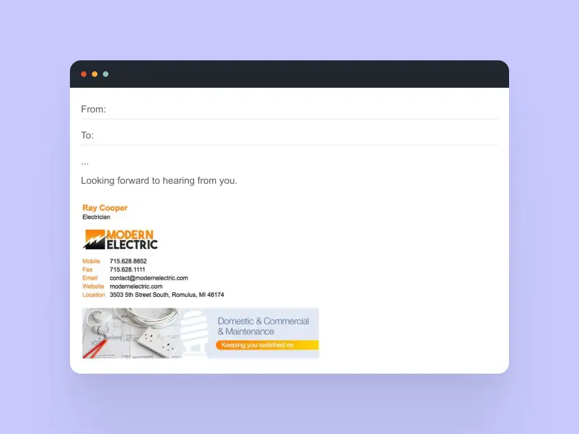
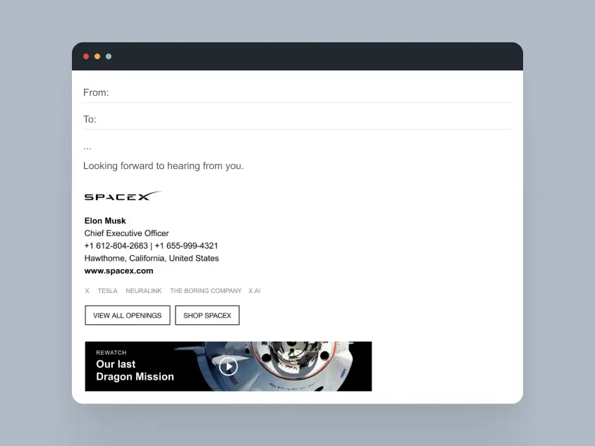
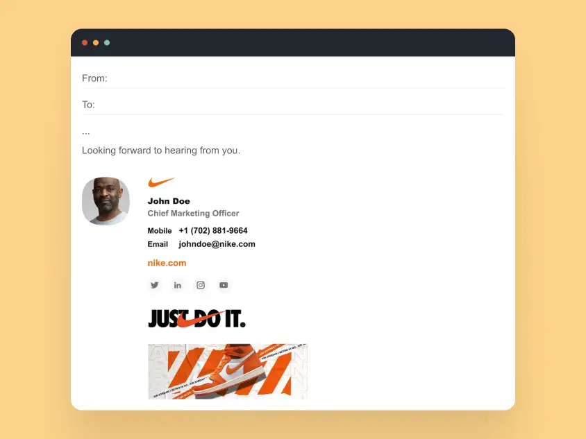
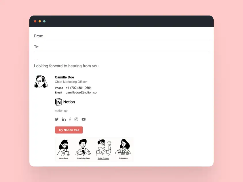
Takeaway: Logo and banner combinations work best when the logo supports recognition and the banner stays secondary. If both elements compete for attention, the signature can feel crowded and harder to use.
Minimal Logo Use
Minimal logo email signatures use the logo as a small brand marker rather than a dominant visual element. This style works well when readability, compact structure, and clean presentation matter more than strong graphic branding.
This layout works best when:
- the logo is small, simplified, or monochrome
- contact details remain the main focus
- the signature needs to stay compact in long threads
- the design relies on spacing and typography instead of large visuals
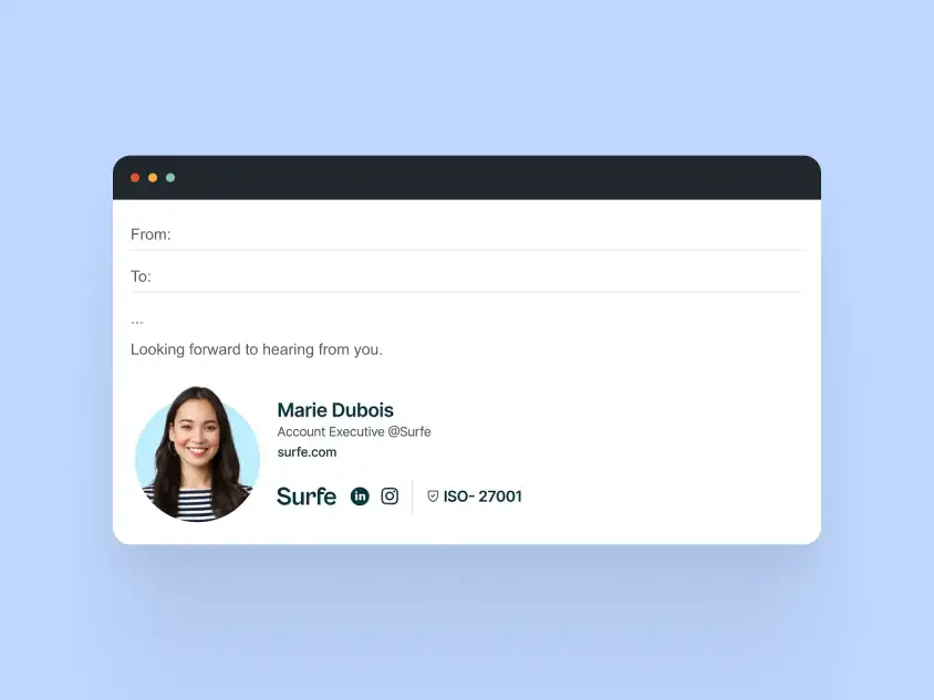
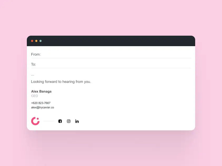
Takeaway: Minimal logo use is one of the safest approaches for everyday business email signatures. It keeps the brand visible without adding unnecessary visual weight or making the layout harder to read.
How Logos Behave in Real Email Clients
Logos in email signatures are image elements, so they do not behave exactly like logos on websites. A logo that looks crisp in a mockup can appear differently once it reaches Gmail, Outlook, Apple Mail, or a mobile inbox.
Common behavior to plan for:
- images may be blocked or hidden by default
- logos can scale differently across desktop and mobile
- alignment may shift between email clients
- transparent logos may lose contrast in dark mode
- large logo files can slow loading or look oversized in threads
A logo should support the signature, not carry the whole design. The safest logo-based signatures keep names, roles, phone numbers, and email addresses as real text, so the signature still works even if the logo does not load.
Logos in Dark Mode: What Changes in Email Signatures
Dark mode has become common across email apps and devices, and it can significantly affect how logos appear in email signatures. Unlike websites, where dark mode styles can be controlled through CSS, email clients often apply their own automatic adjustments — sometimes in unpredictable ways.
Logos that look perfect on a light background may lose contrast or blend into the interface when dark mode is active. This is especially true for logos that rely on light colors, thin lines, or transparent backgrounds.
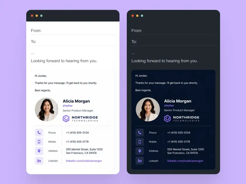
Here are the main dark mode considerations for email signature logos:
- Light-colored logos may disappear against dark backgrounds if no outline or contrast buffer is present.
- Transparent PNG logos can blend into the background differently depending on how the email client inverts colors.
- Fine details and thin typography may become harder to read when color contrast changes.
- Background fills inside logos can shift visually if the surrounding email interface changes tone.
The safest approach is to treat logos in email like adaptive assets. Many brands use alternate logo versions with stronger contrast, subtle outlines, or simplified shapes to maintain visibility in both light and dark environments.
Even when a single logo version is used, proper spacing and surrounding layout help ensure it remains recognizable across modes. A logo should support the signature visually without depending on a specific background color to stay visible.
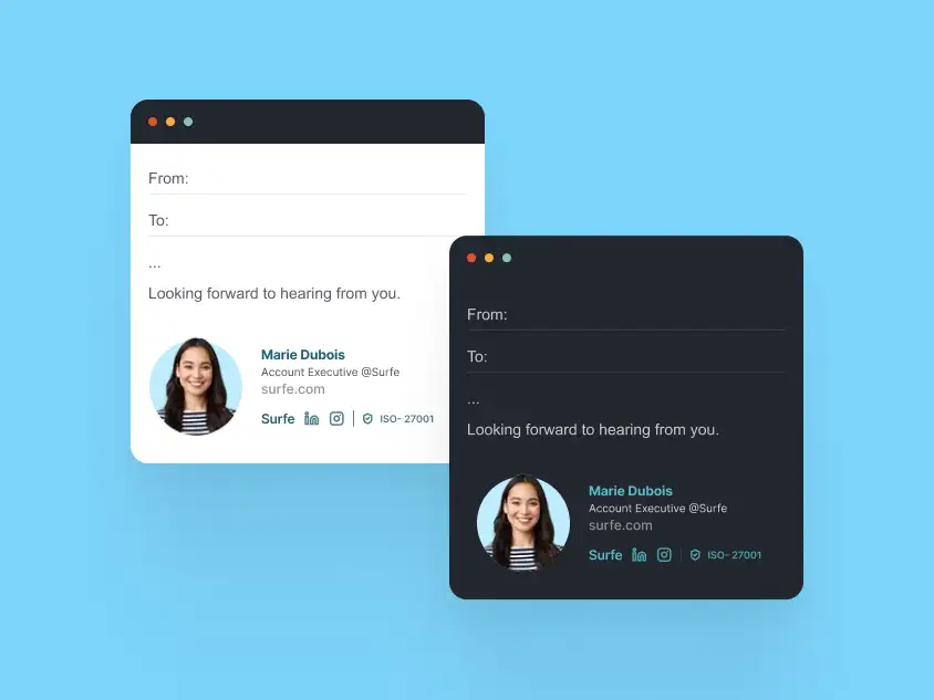
Common Logo Mistakes in Email Signatures
Logo-based email signatures can look polished in a mockup but become harder to use in real inboxes when branding takes priority over readability. The table below highlights common logo mistakes and how to avoid them.
| Logo Mistake | Why It Causes Problems | Better Approach |
|---|---|---|
| Logo is too large | It dominates the signature and pushes contact details into the background. | Keep the logo recognizable but secondary to the sender’s name and contact details. |
| Logo replaces real text | Important information may disappear when images are blocked or fail to load. | Keep names, roles, phone numbers, and email addresses as real HTML text. |
| Multiple logos compete | Company, partner, certification, or campaign marks can make the signature feel cluttered. | Choose one primary logo and move secondary marks to a smaller supporting area if needed. |
| Transparent logo disappears | Transparent PNG logos can lose contrast in dark mode or blend into the email background. | Use a logo version with enough contrast, padding, or a subtle background buffer. |
| Logo only appears inside a banner | Brand identity becomes tied to a promotional image instead of the main signature structure. | Keep the logo in the identity area and let banners support secondary messages. |
| Low-resolution logo file | The logo can look blurry or unprofessional on high-density screens. | Use optimized logo assets with clean edges and appropriate display dimensions. |
A strong email signature treats the logo as a brand accent, not the foundation of the entire layout. The logo should make the signature more recognizable without replacing the details people need to read, click, or save.
FAQ: Email Signatures with Logos
Q1. Should my logo be clickable in an email signature?
Yes. Making the logo clickable is common and useful, especially if it links to your company website, homepage, or main landing page.
The logo should not be the only clickable element, though. Important links like email address, phone number, website, or booking links should remain clear and easy to access as text.
Q2. What file type works best for logos in email signatures?
PNG is usually the safest choice for email signature logos because it is widely supported and can preserve transparency. JPG can also work for simple logos or image-heavy designs, but it may not look as sharp around text or edges.
SVG is not consistently supported across email clients, so it is usually better to avoid SVG logos in production email signatures.
Q3. How big should a logo be in an email signature?
A logo should be large enough to recognize but small enough that it does not overpower the sender’s name, role, and contact details. In most email signatures, the logo works best as a supporting brand element, not the main focus.
Exact dimensions depend on the layout, but oversized logos can make signatures feel heavy, especially on mobile devices and in long email threads.
Q4. Where should I place a logo in an email signature?
A logo can sit next to the sender’s name, inside a side brand block, above the contact details, below the contact details, or near a banner. The best placement depends on how much brand emphasis the signature needs.
For most business email signatures, the safest approach is to keep the logo close to the identity area while leaving contact details easy to scan as real text.
Q5. Will my logo look the same in dark mode?
Not always. Dark mode can affect how logos appear, especially if the logo uses light colors, thin lines, or transparent backgrounds. Some email clients may also adjust colors automatically.
To improve dark mode visibility, use logo versions with enough contrast, add spacing around the mark, or prepare alternate assets for light and dark backgrounds.
Q6. Why is my logo not showing in my email signature?
A logo may not show if images are blocked, the image is not hosted correctly, the file path is broken, or the email client restricts external image loading.
Even when a logo does not load, the signature should still make sense. Keep the sender’s name, company, role, phone number, email address, and website as real text instead of placing them only inside the image.
Q7. Can I use multiple logos in one email signature?
You can, but it should be done carefully. Multiple logos can make the signature feel crowded, especially when company logos, partner marks, certifications, and campaign graphics all appear together.
If multiple brand marks are necessary, choose one primary logo and keep the others smaller, secondary, and clearly separated from the main contact information.
Q8. Can I use a logo and banner together in an email signature?
Yes. A logo and banner can work together when they have different roles. The logo should anchor the identity of the sender or company, while the banner should support a secondary message such as an event, campaign, offer, or announcement.
The banner should not replace essential contact details, and it should stay visually secondary to the sender’s name and contact information.
Q9. Should the company name be part of the logo image or real text?
The company logo can include the brand name, but the signature should not rely only on the image to communicate important information. Company name, role, phone number, email address, and website should remain readable as real text whenever possible.
This helps the signature stay useful when images are blocked and improves readability across Gmail, Outlook, Apple Mail, and mobile inboxes.
Q10. How do I make a logo-based email signature look professional?
A professional logo-based email signature keeps the logo balanced with the rest of the layout. The logo should be clear, sharp, properly sized, and supported by readable contact details.
The best logo email signatures use clean spacing, text-based information, optimized image assets, and simple structure that works across real email clients.
Ready to Use a Logo-Based Email Signature Like These?
A logo-based email signature needs more than a sharp brand asset. It needs the right size, clean spacing, real text for essential details, and reliable rendering across Gmail, Outlook, Apple Mail, and mobile inboxes.
MailBakery designs and codes custom HTML email signatures that keep logos clear, balanced, and brand-consistent in real inboxes.