Email Design Trends You Can’t Ignore in 2026


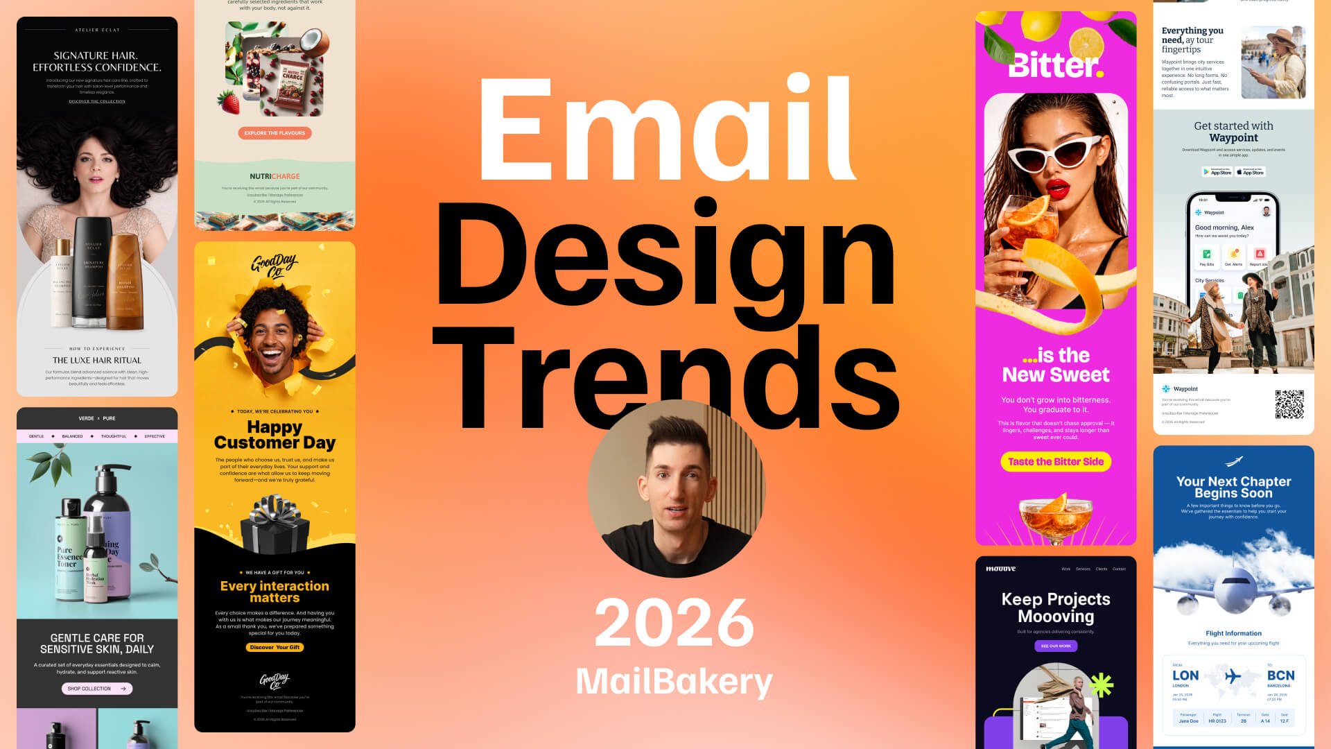
Email design isn’t changing. It’s maturing.
What used to work is no longer enough on its own. Not because everything has changed, but because expectations have.
People open emails across different devices, screen sizes, and email clients, each one affecting how your design behaves. Dark mode shifts colors. Mobile apps compress layouts. Some clients rewrite your code altogether.
So email design in 2026 is not just about how it looks. It’s about how it holds up when things are messy.
Many design choices that once felt optional are now the baseline for emails that need to perform.
In this article, we break down the most important email design trends as practical approaches that improve clarity, reduce friction, and make the next step obvious.
Quick links:
→ Glance Design in Email Marketing
→ Dark Mode-Aware Email Design
→ Lightweight Motion in Email Design
→ Modular Personalization in Email Design
Supporting Email Design Trends
→ Accessibility-First Email Design
Broader Email Marketing Trends
→ Privacy and Data Transparency
→ Sustainability and Performance Efficiency
Email Design Patterns to Use as Reference
Email Design Trends That Are Often Misused
→ Interactive emails (limited support and overuse)
→ Over-animation in email design
What High-Performing Emails Have in Common
A Simple Framework for Evaluating Email Design
Email Design Trends FAQ (Email Marketing & Design Best Practices)
Core Email Design Trends
If we have to narrow it down to the most important email design trends today, here are the few key trends that are shaping how emails perform in your modern inbox:
These are the core ideas covered in the video above.
The rest of the article builds on them with supporting patterns like accessibility-first design and single-focus emails, showing how these concepts work together in practice.
Together, they reflect a broader shift in how email design and email marketing are evolving side by side.
Core Email Design Trend 1
Thumb-First Email Design
Mobile-first isn’t new. What’s changed is how people actually use their phones.
Emails aren’t opened in perfect conditions. They’re checked one-handed, on the move, and often without full attention. In 2026, precision is the exception, not the default.
That’s why the focus in modern email design is shifting from layout to interaction. It’s not just about how an email looks, but how easy it is to tap, navigate, and act.
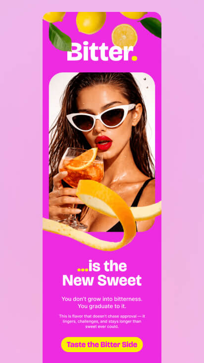
The high-contrast CTA stands out immediately against the background, while its size and spacing make it easy to tap without precision.
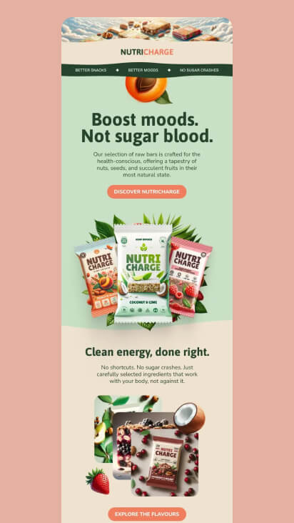
Clear spacing between sections and a well-defined CTA make interaction easier, even on smaller screens.
In today’s email design trends, thumb-first design reflects this shift. It prioritizes tap-friendly elements, clear spacing, and layouts that work in real-world conditions, not ideal ones.
In practice, this means that designers will design for imperfect interaction. Users won’t tap precisely, so the layout needs to do the work for them. Here are a couple more examples where the button is perfectly placed and easy to tap.
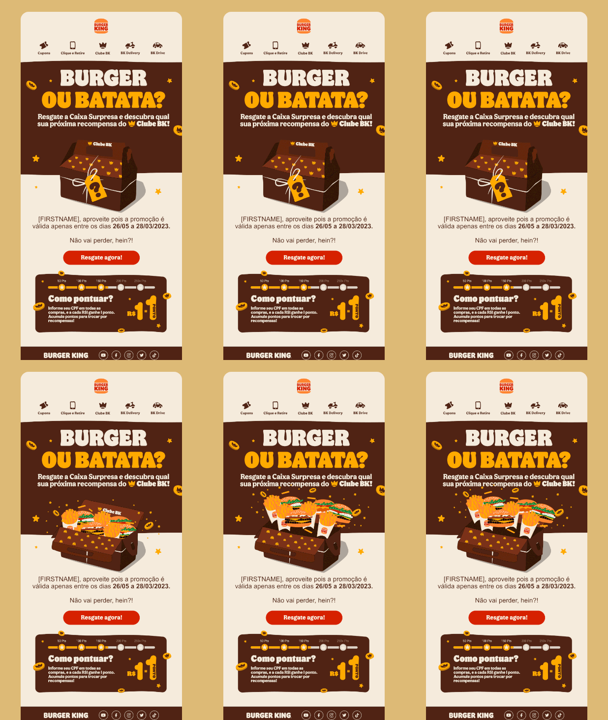
This Burger King email uses an animated box reveal to highlight the offer, focusing attention within the thumb zone and leading naturally to the primary CTA.
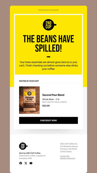
The abandoned cart flow is built around a clear, easy-to-tap CTA that drives users back to checkout.
How to apply thumb-first design in your next email campaign:
- Use larger CTAs that don’t require precise tapping
- Increase spacing between clickable elements
- Avoid placing multiple actions too close together
- Keep the main action within easy thumb reach
- Reduce the number of competing touchpoints on one screen
Core Email Design Trend 2
Glance Design in Email Marketing
Emails are often opened but not understood quickly enough to drive action. In most cases, users don’t spend time figuring things out. If the message isn’t clear right away, it’s ignored.
Glance design focuses on making the purpose of the email obvious within the first few seconds. Instead of relying on scrolling or detailed reading, it helps users understand what the email is about at a glance. Are you getting the purpose of this next design? Are you craving popcorn now?
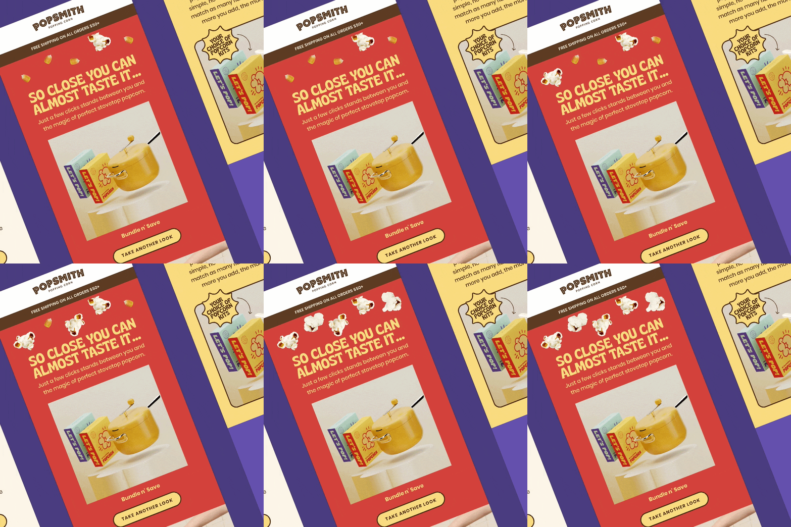
Subtle popcorn animation adds movement around the headline, reinforcing the product theme while keeping the main message clear and easy to grasp at a glance.
When applied in practice, glance design is all about quick recognition, not careful reading. Users don’t read emails from top to bottom. They scan, pick up a few signals, and decide almost instantly whether to click through. When looking at these next emails, you get the idea right away, don’t you?
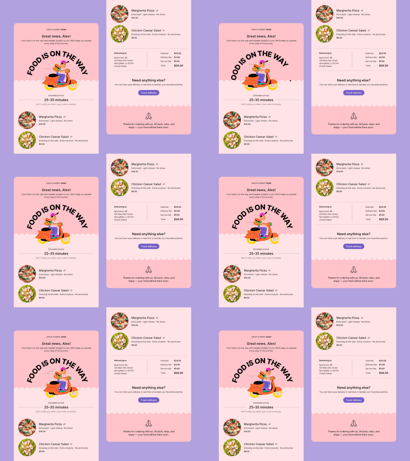
Key information like status and next steps is visible immediately, with the layout supporting quick scanning without reading through the full email.
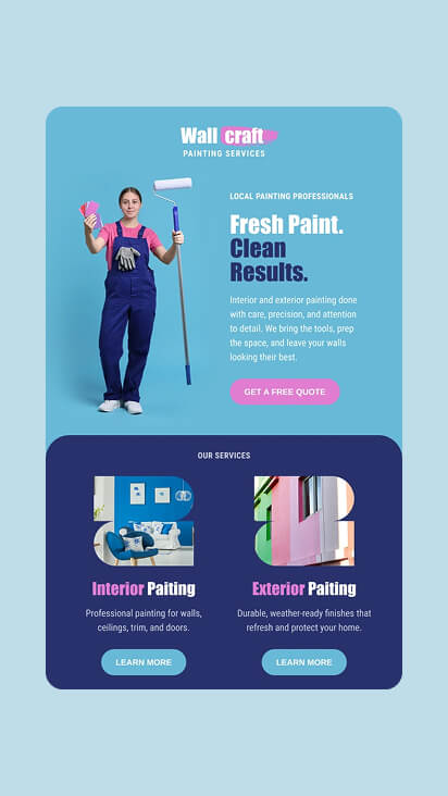
Clear headline and simple structure make the value easy to grasp at a glance.
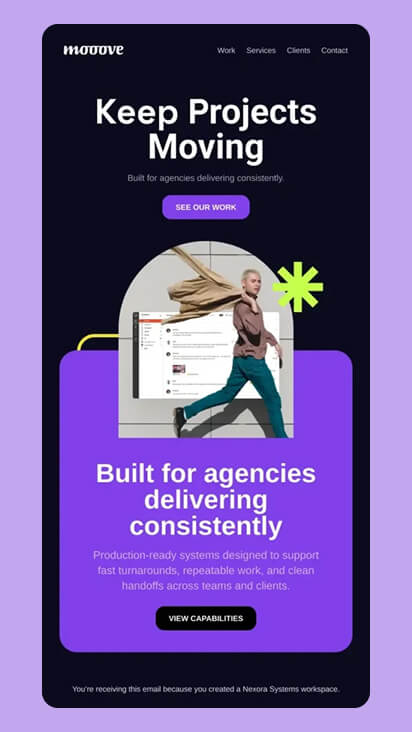
The large “Keep Projects Moving” headline communicates the core message instantly, with a single CTA placed directly below to guide the next action.
Let’s sum it up. To make your email understandable at a glance:
- Lead with one clear, dominant message
- Make the headline easy to understand at a glance
- Structure content so it can be scanned, not read
- Keep paragraphs short or remove them entirely if possible
- Use visual cues to guide attention toward the main action
Core Email Design Trend 3
Dark Mode-Aware Email Design
Dark mode is no longer a preference. For many users, it’s the default now. What started as part of email design trends in 2025, has become a baseline expectation in 2026.
What makes it tricky is that emails don’t render the same way everywhere. Different email clients apply their own rules, which means colors, backgrounds, and even logos can change in ways you didn’t expect.
Dark mode-aware design is about making sure your email still works in both environments.
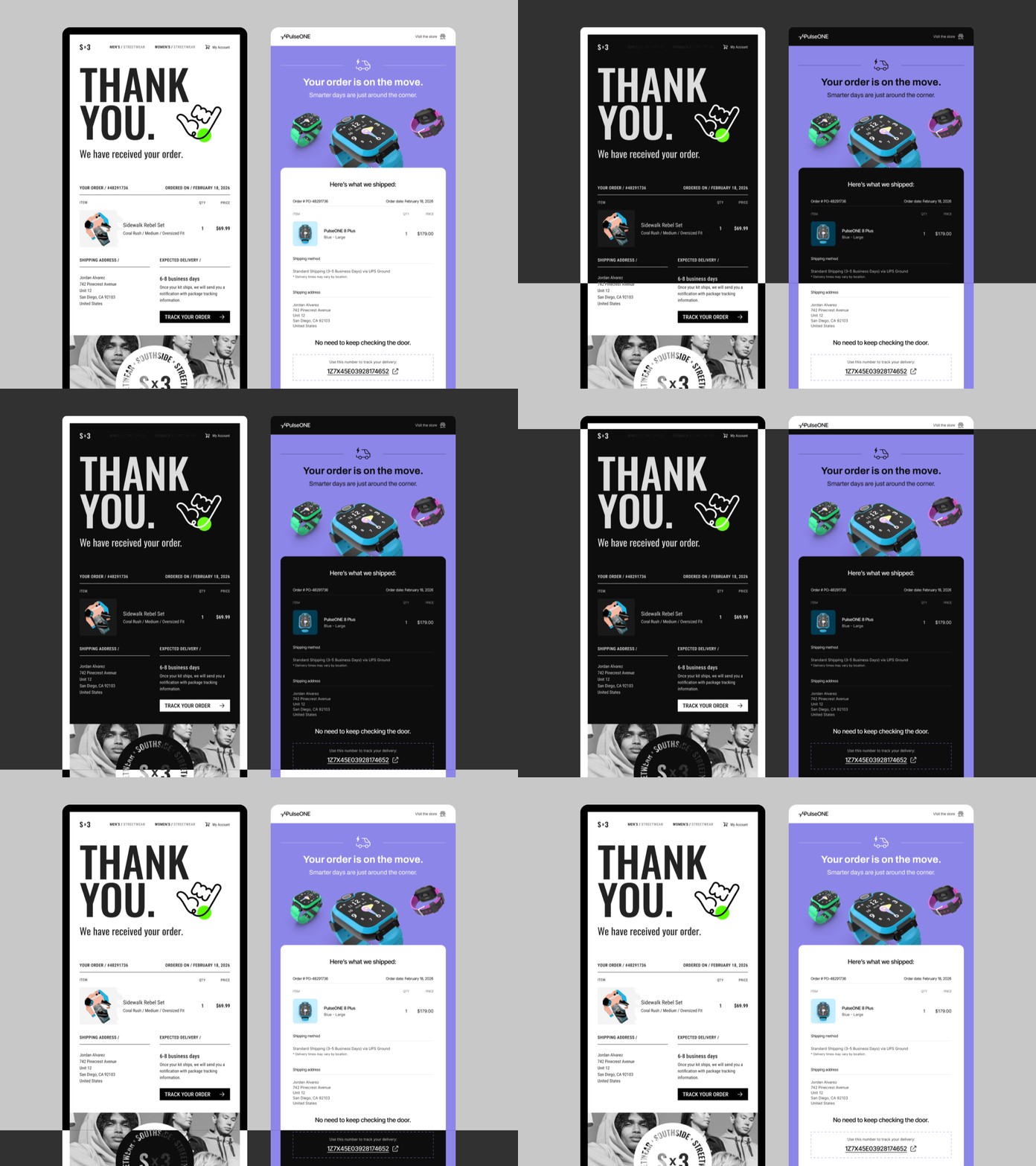
The same email is rendered differently in light and dark mode, with colors and surfaces adjusted to preserve contrast and readability across environments.
The goal is simple: keep content readable, maintain contrast, and avoid breaking your visual identity. Instead of relying on default behavior, you design with both modes in mind from the start.
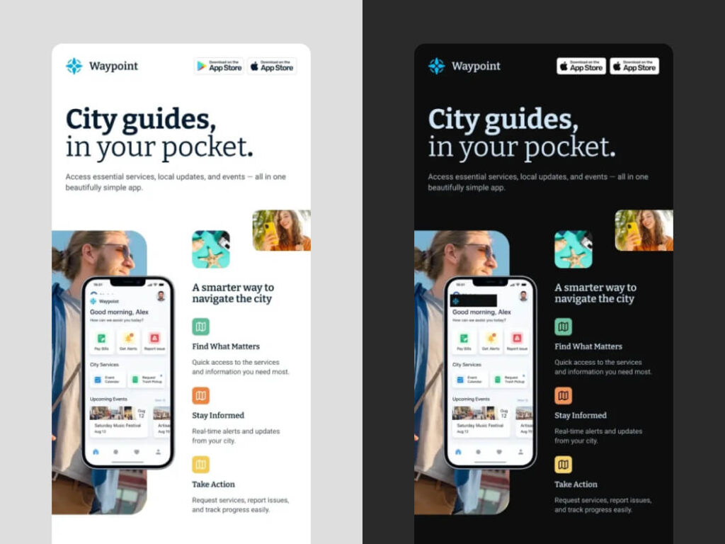
The same email adapts across light and dark mode, maintaining contrast, readability, and visual consistency in both environments.
Key points to check when designing for dark mode:
- Use colors that stay readable when backgrounds change
- Test logos and images on both light and dark backgrounds
- Avoid relying on pure white or pure black
- Use background colors intentionally instead of leaving them to default behavior
- Keep layouts simple to reduce rendering issues across clients
Need help implementing modern email design trends?
MailBakery designs and codes custom HTML email templates built for today’s inboxes, including dark mode support, mobile-first layouts, accessibility, and advanced personalization.
Core Email Design Trend 4
Lightweight Motion in Email Design
Earlier email trends often used animation for visual impact. Now, in 2026, the approach is more intentional. Motion is used to support the message, guide attention, or add depth without getting in the way.

Sequential motion helps guide the attention towards the CTA.
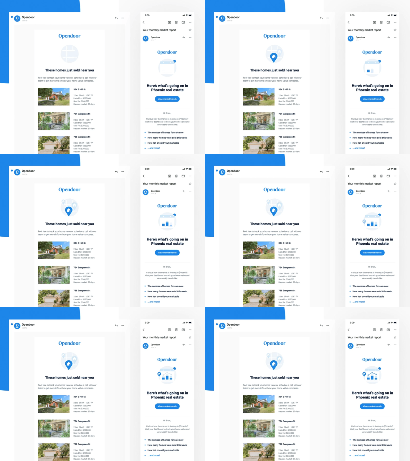
Micro-animations contained within illustrations add movement without distracting from the main message or action.
Lightweight motion is now a core part of modern email design. More and more animated templates for email marketing and email newsletter design are in demand. The goal is not to add more movement, but to use just enough of it to support clarity and hierarchy.

A subtle product animation adds depth without competing with the CTA, keeping the hierarchy clear.

Motion is focused around the product, drawing attention.
In practice, this means keeping motion controlled and focused. It usually lives within a single area, supports the main content, and avoids creating multiple competing focal points.
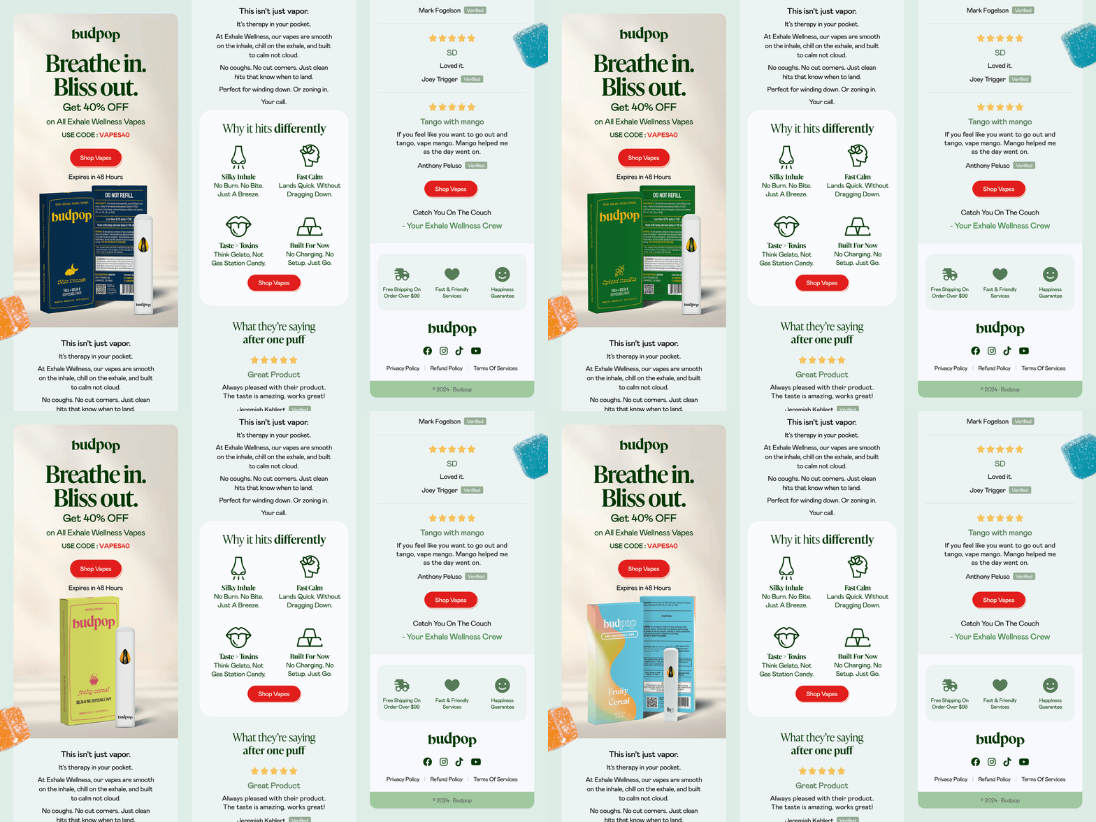
A controlled product rotation introduces variation without changing the layout, keeping the CTA stable while showcasing multiple options.
A simple way to use motion without overdoing it:
- Keep motion within one focal area
- Use animation to support the main message, not compete with it
- Avoid multiple moving elements on the same screen
- Keep the primary CTA stable and easy to spot
- Use subtle motion to add depth, not distraction
- Test performance to avoid heavy or slow-loading assets
Core Email Design Trend 5
Modular Personalization in Email Design
Personalization used to mean changing the message. When speaking of email design trends 2026, personalization often means changing how the content is assembled.
As email marketing becomes more data-driven, static layouts are harder to scale. Instead of creating separate emails for every segment, teams are building flexible structures that can adapt without redesigning everything. Here is how such a design may appear in your inbox:
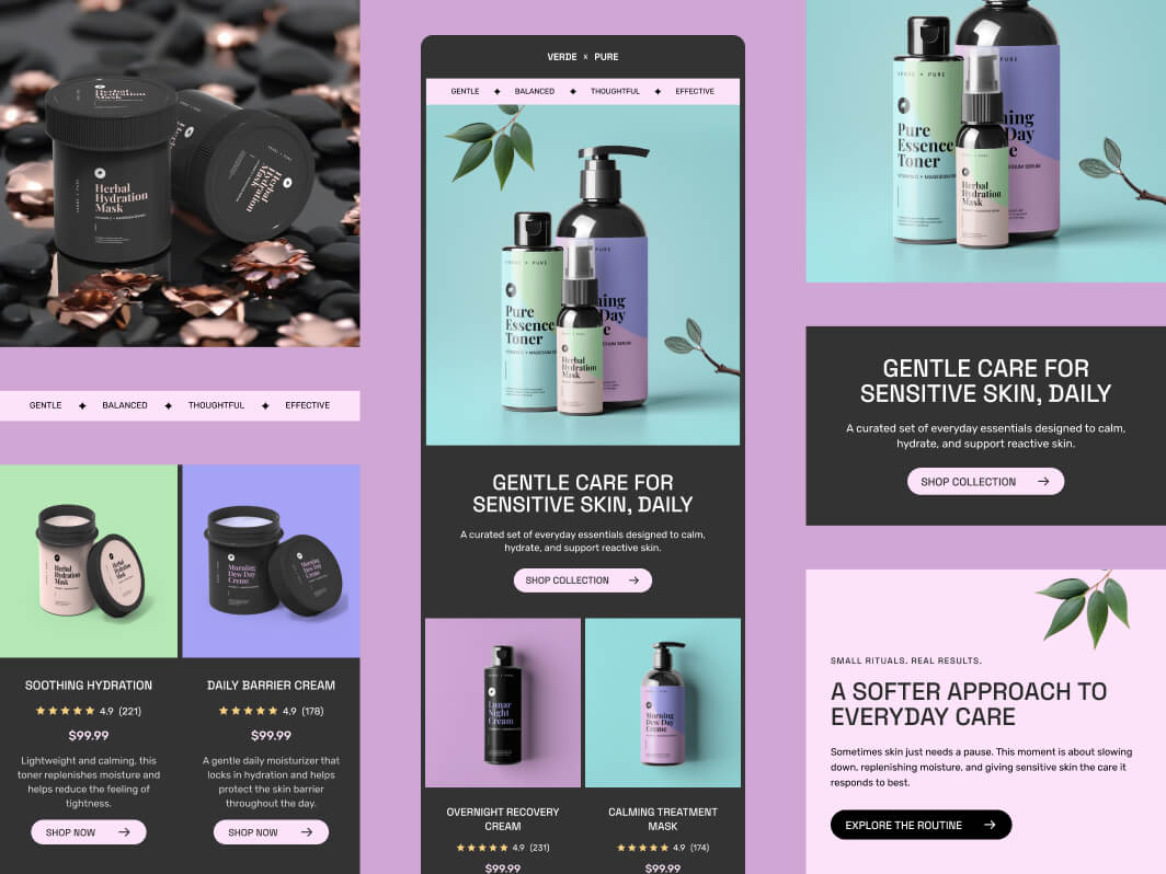
Each product block follows the same structure, allowing content to scale or change without redesigning the layout.
Modular personalization is at its peak right now, forming as one of the key email design trends of 2025 and 2026. Rather than designing one fixed email, you build a system of reusable blocks. Content can then be swapped, reordered, or adjusted based on user behavior, while the overall structure stays consistent.
In practice, this means working with reusable sections, flexible templates, and layouts that adapt to different users without starting from scratch each time.
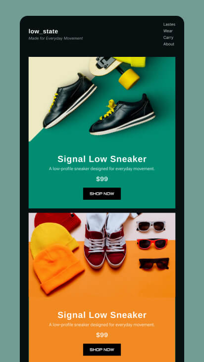
Each product sits in its own block, allowing content to be swapped or reordered without breaking the overall layout.
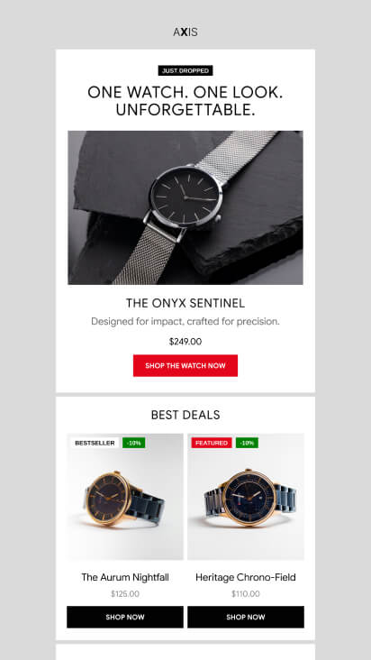
The grid structure supports multiple products while keeping a consistent layout that can scale across different campaigns.
This modular approach also sets the foundation for more advanced personalization. As these systems become more data-driven, they evolve into what we now see as AI-driven personalization.
Here is what to remember about modular personalization:
- Design emails as reusable blocks, not fixed layouts
- Keep structure consistent while allowing content to change
- Group related content into clear, repeatable sections
- Make each block independent so it can be swapped or reordered
- Avoid hardcoding content into visuals
- Plan layouts that can scale across different segments and campaigns
Supporting Email Design Trends
Supporting email design trends refine how the core ones are applied in practice. They improve clarity, usability, and decision-making within the email, and strengthen how core trends perform across real inbox environments.
Supporting Email Design Trend 1
Accessibility-First Email Design
People don’t always open their emails in ideal conditions. They check them on small screens, in bright light, on the go, or when their attention is limited.
Accessibility-first design makes sure emails stay clear and usable in all of these situations. In modern 2026 email design conditions, readability isn’t a nice-to-have. It’s the baseline.
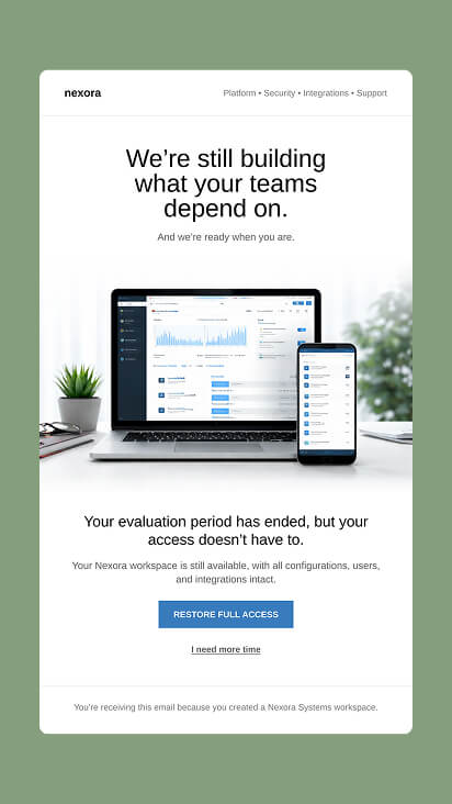
Clean and readable email layout designed to reduce cognitive load.
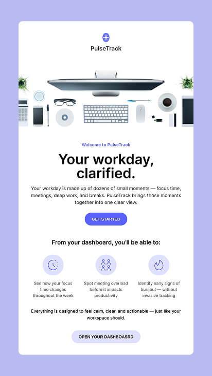
High contrast, large text, and clear spacing make the content readable across different screens and lighting conditions.
In real inboxes, the accessibility-first email design trend shows up through stronger contrast, readable typography, clear hierarchy, and consistent spacing. The goal is simple: make the content easy to scan and act on, without any effort whatsoever.
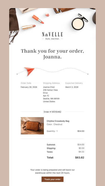
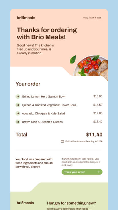
Both demonstrate accessibility by structuring order details clearly and pairing them with a visible “Track your order” CTA, making the content easy to read and grasp.
In practice, accessibility-first design comes down to a few simple choices:
- Use high contrast between text and background
- Choose font sizes that remain readable on smaller screens
- Structure content so it can be scanned quickly
- Keep spacing consistent to reduce visual strain
- Avoid relying on color alone to convey meaning
- Make key actions easy to identify and tap
Supporting Email Design Trend 2
Single-Focus Email Design
Too many marketing emails try to communicate too much at once. Multiple products, messages, and CTAs end up competing for your attention within the same layout. This increases cognitive load and makes decision-making harder.
Single-focus email design takes the opposite approach. It centers the entire email around one message and one primary action, making it easier for the user to click through.
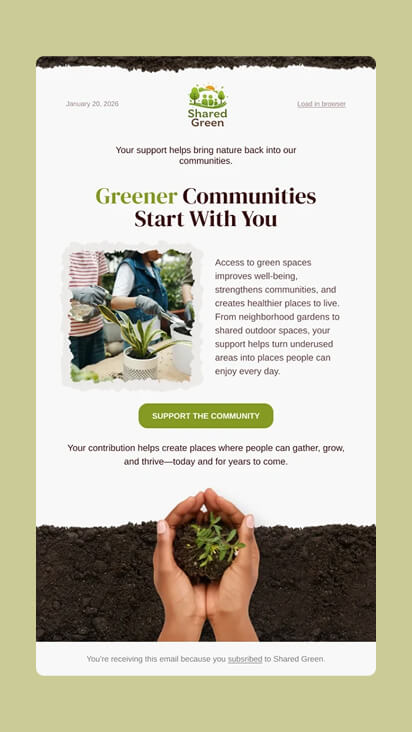
One message, one visual, and one CTA guide attention without competing elements or distractions.
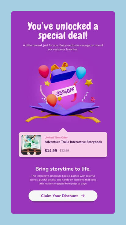
The entire layout is built around one offer, with visuals and copy reinforcing the discount as the only focus.
In practice, single-focus design comes down to one clear message, one primary CTA, and a strong visual focal point. By removing competing elements, the layout becomes snackable and the chances for conversion increase.
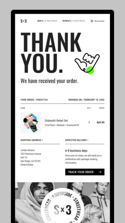
The oversized “THANK YOU” dominates the layout, with all order details placed below as supporting information.
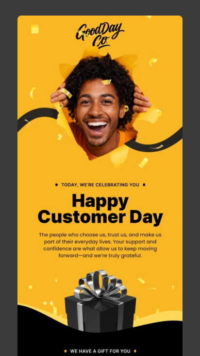
The layout centers on the “Happy Customer Day” message, with the CTA placed later to support it.
How to design single focus email campaings:
- Build the campaign around one clear message
- Use one main CTA, and repeat it only if the email is longer
- Choose one visual that supports the idea, not multiple competing ones
- Remove navigation and secondary links (keep only essential footer links)
- Limit the number of sections, ideally keeping everything within one screen
- Make the primary CTA visually dominant, so it’s impossible to miss
Broader Email Marketing Trends
Core and supporting email design trends define how emails work.
Broader email marketing trends define the environment they operate in.
These trends don’t change layout fundamentals — but they influence how email design performs in real campaigns.
Broader Email Marketing Trend 1
AI-Driven Personalization in Email Design
AI is changing how personalization works in modern email design in 2026. Instead of relying on static segments, emails can now adapt content based on user behavior, preferences, and context automatically instead of being manually configured.
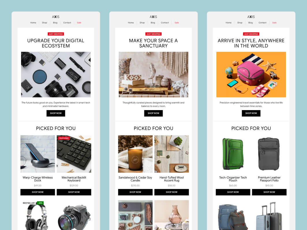
The same email layout adapts to different user interests by swapping product categories and messaging, while keeping structure and hierarchy consistent.
Rather than sending different campaigns to different audiences, the same layout can adjust dynamically by using advanced modern technology. Product selections, messaging, and content blocks change while the overall structure remains consistent.
In real inbox campaings, the AI-driven personalization requires dynamic product sections, modular content blocks, and layouts designed to support variation at scale.
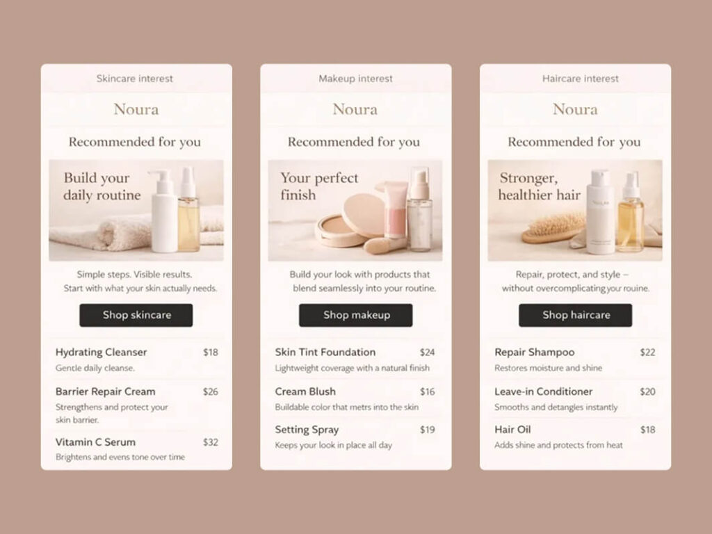
The same email structure delivers different product recommendations based on user behavior, demonstrating how AI personalization adapts content without changing the layout.
Broader Email Marketing Trend 2
Privacy and Data Transparency
Privacy is becoming a visible part of email design, not just a backend requirement. Elements like preference centers, unsubscribe links, and data disclosures are now more clearly integrated into modern email design campaigns in 2025 and 2026.
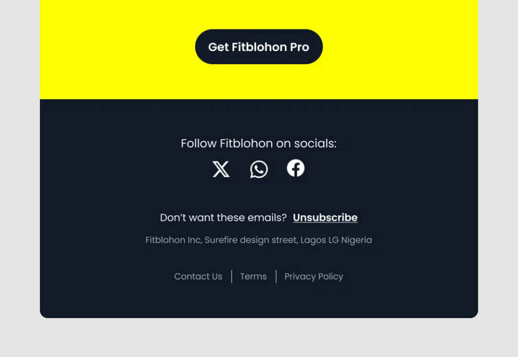
Unsubscribe links are now clearly visible and readable, integrated into the layout rather than hidden in fine print.
Data transparency usually shows up through more visible unsubscribe links, clearer preference management, and simpler, more readable privacy-related content within the email.
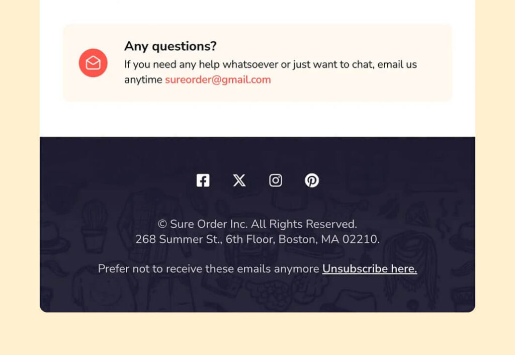
Unsubscribe options are clearly visible and written in a user-friendly way, making it easy to opt out without friction.
Broader Email Marketing Trend 3
Sustainability and Performance Efficiency
Lighter emails are not just faster. They are becoming part of broader email marketing trends focused on sustainability and efficiency.
In practice, performance efficiency comes down to simpler layouts, lighter visuals, and cleaner code. Reducing heavy elements and large images improves load speed, while cleaner structure ensures more consistent rendering across devices.
Here is how such an optimization may look in a real email campaign.
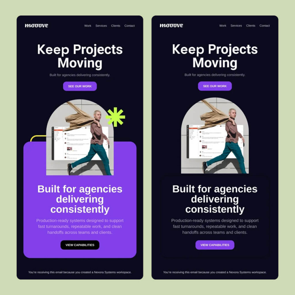
Simplifying layout and removing non-essential elements reduces visual complexity, improving both performance and readability across devices.
Email Design Patterns to Use as Reference
Certain layout patterns appear consistently in today’s inboxes because they make emails a breeze to understand and increase the conversion rates. Many of these patterns show up in some of the best email designs used in modern email marketing campaigns
Hero + Single CTA
Common in high-performing email campaigns, this pattern works especially well for promotions and product launches. It creates a clear entry point and focuses attention on a single action, removing any competing paths.
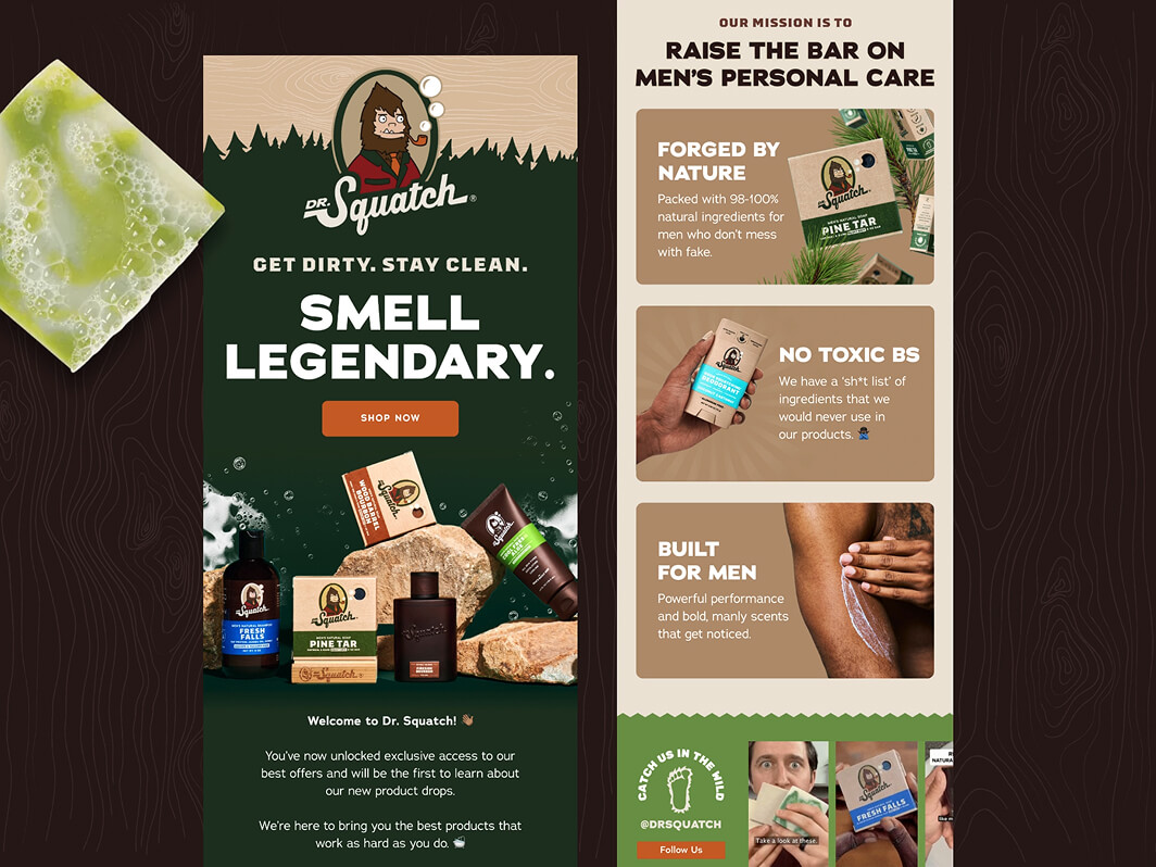
Each email centers around a single message and CTA, making the next action immediately clear without competing elements. Designs by Janna Hagan
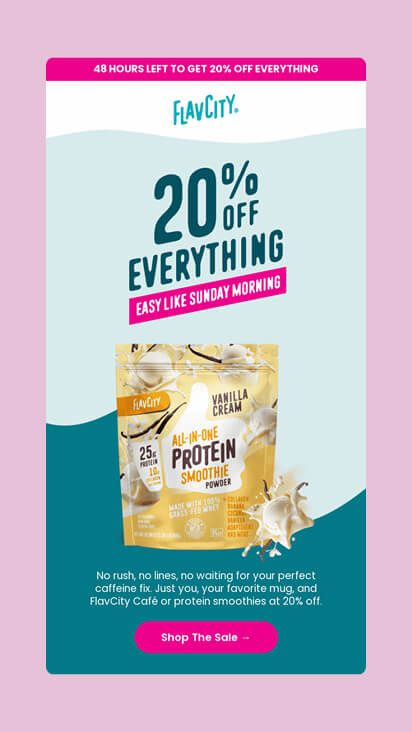
A bold headline and single CTA make the offer immediately clear, allowing users to understand and act without scanning multiple elements.
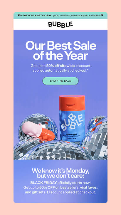
The layout combines a strong headline with a single CTA, using visuals to support the message without introducing competing actions.
Product Spotlight
This popular pattern is perfect for eCommerce emails and newsletter design where the focus is placed on a single product. This layout type highlights a clear value proposition and creates a direct, distraction-free path to conversion.
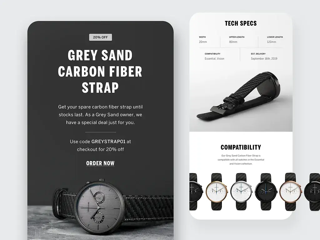
The email starts with a strong product focus and CTA, then expands into supporting details like specifications and compatibility, helping users evaluate the product without losing the main focus. Example by Janna Hagan
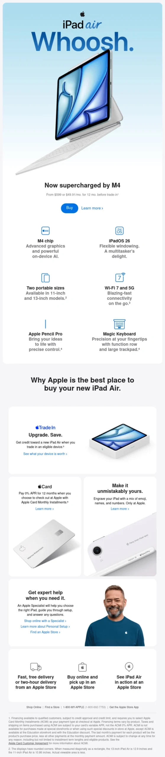
A clear product spotlight starts with a strong hero and CTA, then expands into supporting features, helping users understand the value without losing focus.
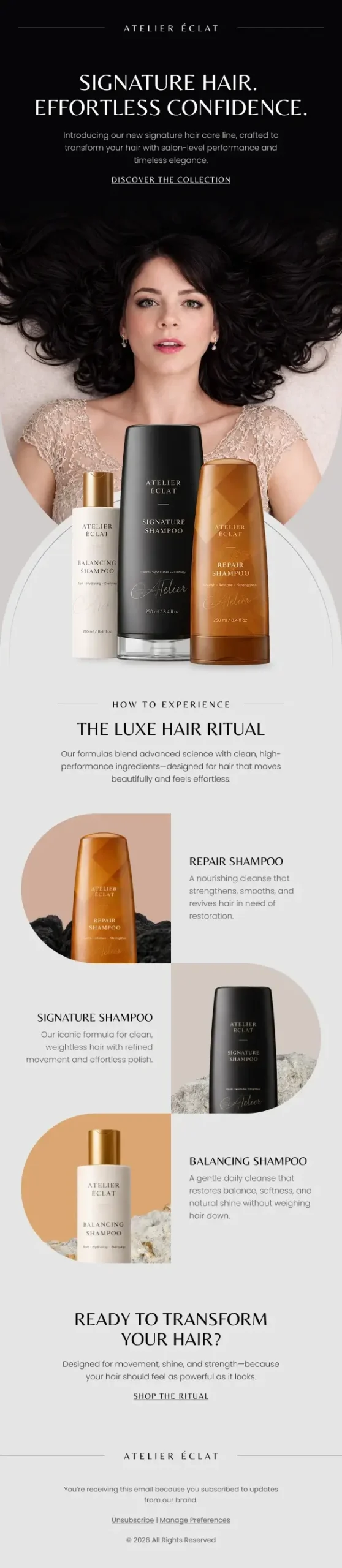
The layout combines a strong hero product with structured supporting sections, guiding the user through the product story before presenting the final CTA.
Minimal Announcement
This email design pattern is usually the best choice for updates, feature releases, and brand messaging in modern email communication. It keeps the structure simple and focused as it prioritizes clarity over visual complexity.
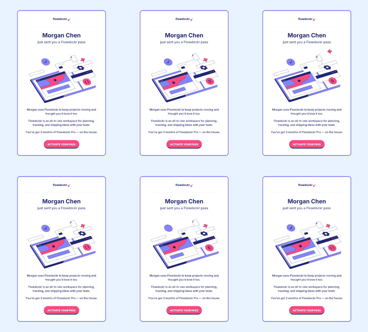
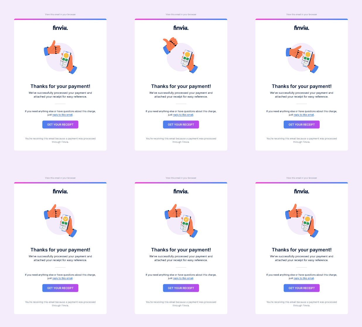
Both emails deliver a single announcement with minimal content, keeping the message clear and instantly comprehensible.
These patterns reflect that email design in 2026 is heading toward clarity, simplicity, and easier decision-making.
Email Design Trends That Are Often Misused
Not every email design trend improves performance. Some of today’s trendy email design practices create more friction rather than reduce it.
Interactive emails (limited support and overuse)
Interaction can improve engagement, but only when it works reliably. In many cases, it doesn’t.
Support varies across email clients, and behavior is often inconsistent on mobile. Without proper fallback, interactions can fail completely. In the end, this adds complexity without a clear benefit.
Patterns like sliders, tabs, and carousels work well in web and app environments, but they are still not reliable enough for most email inboxes, even in 2026.

Advanced interaction patterns like carousels, tabs, and filters are common in app interfaces, but remain inconsistently supported across email clients.
In practice, simpler interaction patterns tend to perform better. Clear tap targets, straightforward layouts, and predictable behavior are often more effective than complex interactive features.
Some interactions, like rating scales or single-tap feedback, work reliably because they don’t depend on complex behavior or client support.
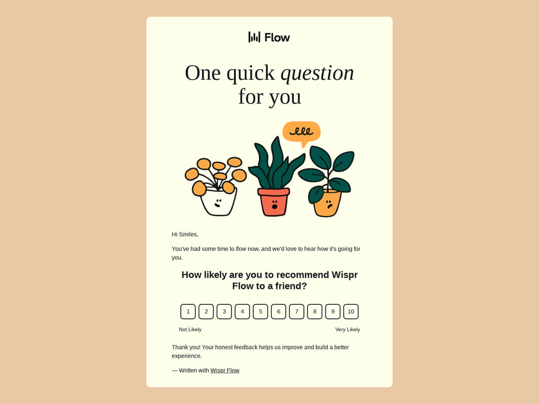
Simple interaction patterns like rating scales work reliably across email clients, allowing users to respond with a single tap.
Over-animation in email design
Motion works only when it supports the message, like the lightweight motion we discussed earlier. However, when overused, it starts to compete with it, which can weaken the entire email campaign.
Excess movement begins to override hierarchy, capturing attention instead of guiding it towards the CTA. As a result, key actions become less visible and harder to act on.
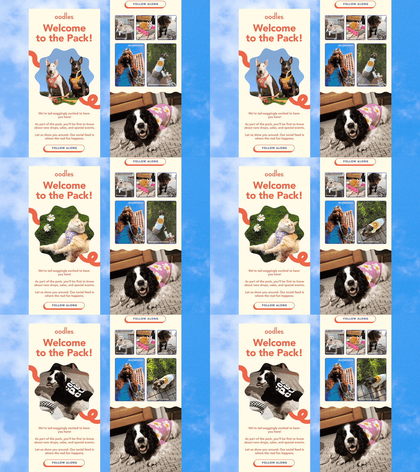
While visually engaging, the animation keeps attention on the visuals rather than guide the users toward the primary CTA. Example: Oodles

Multiple animated sections compete for attention, making it harder to establish a clear hierarchy or guide users toward a single action.
Dark mode misalignment
Dark mode is now standard, but not always handled well. When emails aren’t optimized for it, colors can lose contrast, brand elements become inconsistent, and readability breaks across different environments. Such email campaigns simply fail to yield the desired results.
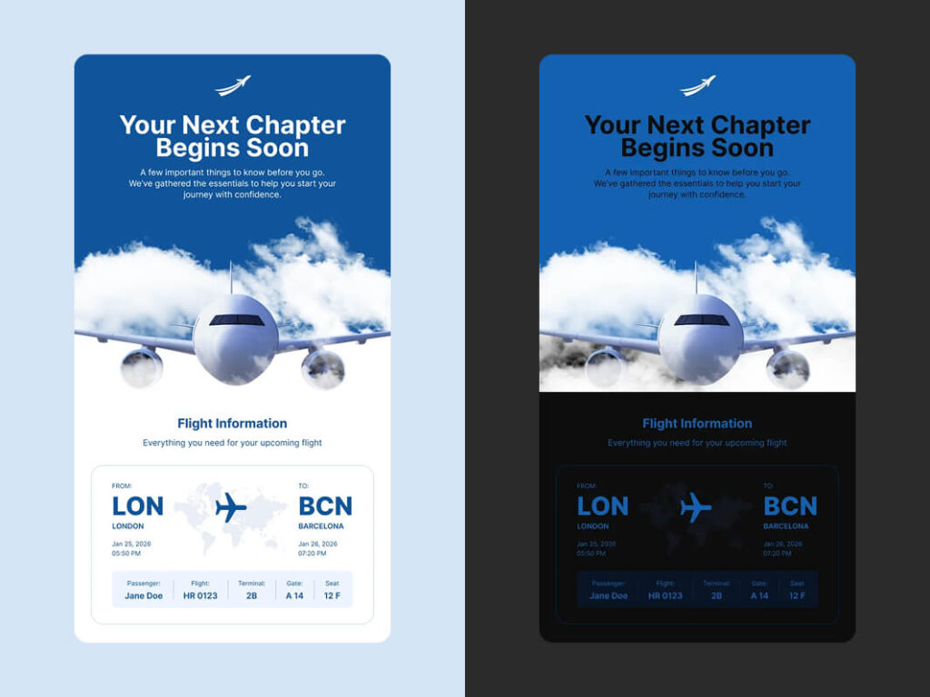
Dark mode may alter colors and contrast in ways that reduce readability and weaken the visual hierarchy.
Overloaded email layouts
More content doesn’t create more value. When an email includes too many focal points, users lose a clear sense of what to do next. Instead of guiding action, the design introduces friction and increases cognitive load. In the end, the user hits Back instead of moving forward.
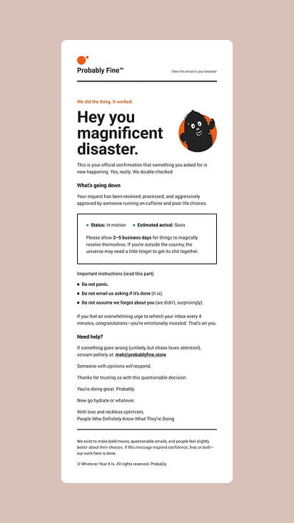
Key information competes with a lot motext and sections, making it harder to quickly scan and understand.
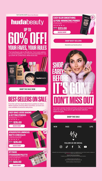
Stacking multiple promotions, product sections, and CTAs into a single email increases cognitive load and creates decision fatigue, making it harder for users to take action.
What High-Performing Emails in 2026 Have in Common
High-performing emails don’t succeed because of a single trend. They work because multiple design decisions come together to make things easier for the user.
- Thumb-first design makes interaction easier
- Glance design helps users understand instantly
- Dark mode-aware design keeps content readable
- Lightweight motion guides attention
- Modular personalization increases relevance
- Accessibility-first design improves readability
- Single-focus emails simplify decisions
Each of these principles improves a different part of the experience, but they all contribute to the same outcome: making the email feel like a breeze and making the user convert.
| Design Principle | What it improves | Why it matters |
|---|---|---|
|
Thumb-first design |
Interaction |
Makes actions easier on mobile |
|
Glance design |
Understanding |
Users grasp the message instantly |
|
Dark mode-aware design |
Visibility |
Prevents readability issues |
|
Lightweight motion |
Attention |
Guides focus without distraction |
|
Modular personalization |
Relevance |
Adapts content to different users |
|
Accessibility-first |
Readability |
Reduces effort across conditions |
|
Single-focus emails |
Decision-making |
Makes it easier to act |
Knowing the trends is one thing. Building responsive, dark mode-friendly email templates that work across inboxes is another.
MailBakery designs and codes custom HTML email templates that turn modern email design ideas into production-ready campaigns.
Framework to Evaluate Your Email Design
Instead of thinking in terms of trends, it helps to look at your email from the user’s point of view. If something feels harder than it should, it probably is.
A quick way to check your email:
- Can primary actions be tapped easily on mobile?
- Is the main message clear within the first screen?
- Does the email remain readable in dark mode and across clients?
- Does the layout guide attention toward the primary CTA?
- Is the content relevant to the user’s context or behavior?
If the answer to any of these is no, there’s likely friction somewhere in the experience, and that’s usually where performance starts to drop.
Email Design Trends FAQ
If anything is still unclear, the answers below cover the most common questions about email design trends.
Q1. What are email design trends?
Email design trends are evolving practices that improve how emails look, function, and perform across devices and real inbox conditions.
They reflect changes in user behavior, technology, and how email marketing works in practice, not just visual style.
Q2. What are the latest email design trends in 2026?
The main email design trends in 2026 focus on making emails easier to understand and interact with:
- Thumb-first, interaction-focused design
- Glance-based layouts for instant understanding
- Dark mode optimization
- Lightweight motion and interactive elements
- Modular personalization and dynamic content
- Simplified, single-focus email structures
Across 2025 and 2026, the shift is clear. Emails are becoming easier to use and less tolerant of unnecessary complexity.
Q3. How to use email design trends in practice?
Email design trends should be applied selectively. Each one solves a specific problem, not all at once.
For example:
- Interaction issues → use thumb-first design
- Low clarity → use glance design
- Readability issues → fix dark mode
- Low engagement → use motion to guide attention
- Low relevance → introduce modular personalization
The goal is not to make emails look more modern, but to make them easier to understand and act on.
Q4. Why does email design matter?
Email design matters because it determines how quickly users understand the message and whether they take action.
If users have to think about what they’re seeing, they usually don’t act.
Design is not just visual. It directly affects clarity, interaction, and conversion.
Q5. How do email design trends impact email marketing performance?
Email design trends improve email marketing performance by reducing friction between the message and the action.
They influence:
- How quickly users understand the message
- How easily they interact with it
- Whether they move forward or drop off
Small improvements in these areas often have a bigger impact than adding more content or offers.
Q6. What makes a good email design in modern email marketing?
A good email design removes unnecessary elements and makes the message easy to understand and act on.
If users hesitate, something is off.
Most effective emails have:
- One clear message and primary action
- Strong visual hierarchy
- Mobile-friendly, tap-friendly interaction
- Readability across light and dark mode
- Minimal cognitive load
Q7. How to improve email design without redesigning everything?
You can improve email design without a full redesign by making small structural changes that reduce friction.
- Reduce competing messages or CTAs
- Improve spacing and visual hierarchy
- Make key actions easier to tap
- Ensure readability across different modes
- Keep one clear focal point per email
Small changes like these often have a measurable impact on engagement and conversion.
What This Means for Email Design Going Forward
Email design today is not about creating a single perfect layout. It is about building emails that hold up across devices, clients, and real user behavior.
The emails that perform best are not the most visually impressive. They are the ones that make interaction simple, from the first glance to the final click.
That is where most teams struggle. Not with ideas, but with execution.
If you are already seeing that gap in your campaigns, you are not alone.
Designing emails that perform consistently takes more than good visuals. It requires systems, testing, and experience with how emails behave in real inboxes. That is where MailBakery comes in.
If you want emails that work the way they are supposed to, we would be happy to help.