How to Write Better Cyber Monday Emails

Move over, Black Friday, Cyber Monday is quickly climbing the ranks as the favorite holiday shopping event. In 2017, Cyber Monday beat out Black Friday in revenue by $1 billion in the U.S. Shoppers love snagging deals from the comfort of their couch, even more so now than years before. It’s like the Super Bowl of shopping.
So, what does that mean for marketers? It means your work isn’t finished just yet! Cyber Monday means another chance to impress your customers with your creative, visually appealing email marketing designs and bring in more revenue (and brand awareness) this quarter. However, your readers’ inboxes will be overrun with Cyber Monday emails. So how do you stand out? Think out of the box, of course. And MailBakery can help.
Below, we’ve curated a few of our favorite Cyber Monday email marketing design tips and included examples to inspire you as you create your own!
Hot Links in this blog:
Write a Killer Subject Line

Subject lines are like a magical front door. They offer a peek at your company’s personality, and if they’re intriguing enough, readers may struggle not to knock— or click on it — to learn more about what you have to offer. It’s also crucial to whether your email gets opened, or worse, deleted or marked as spam. In fact, Sixty-nine percent of email recipients use the subject line to decide whether they’ll mark it as spam or not.
Having killer subject lines also helps keep your bounce rates low and your deliverability and open rates high. Excellent subject lines are ones that make the reader so curious that they HAVE to click on it. They create curiosity, ask questions like, “are you ready,” they tell a story, or they playfully challenge what the reader knows, add discounts, or even make it seem like you know something the reader doesn’t.
Using emojis in your subject lines is another and popular design trend that increases engagement. According to experts, using them can result in a 56 percent higher click-rate than subject lines with text, when used from a B2C perspective. So, if they align with your brand’s identity, don’t be shy; make good use of the emoji keyboard!
Incorporate Your Brand’s Personality
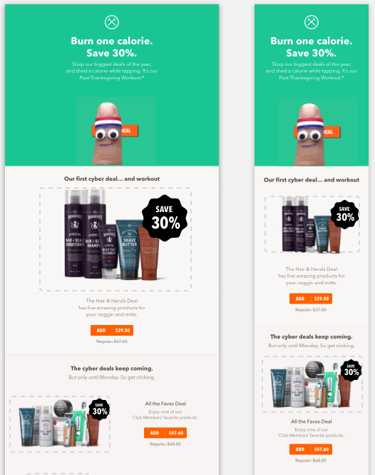
Speaking of brand identities, incorporating your company’s personality into your emails is a way to have fun with your designs while staying relevant and on-brand. Popular brand Dollar Shave Club showcases its lighthearted and funny brand personality in a Cyber Monday email about the ability to work out (i.e., burn calories) while doing online shopping. A single click burns one calorie, and they imply that you’ll be burning many a calorie as you click through their collection of products, especially if you take advantage of their 30 percent off discount.
Add Humor

The first thing that comes to mind when we think about Cyber Monday is computers, so one way to engage your readers is by incorporating a little tech-themed humor. Loft does this expertly, leaning into the tech side of Cyber Monday. They added a nostalgia-inducing computer, monochrome monitor green accents, and using fun computer-related humor like “no time for self-CTRL” or its “Command-Shop” call to action button. These clever design elements drive home the point that now is the time to act fast and not miss the final hours of their sale.
Break the Rules

Who says that Cyber Monday is limited to only a single day of the year? No one, that’s who! As the marketing team of your company, you call the shots. If you want to expand your Cyber Monday offerings to be, say, a full week-long, you can! That’s what the MLB Shop did in their Cyber Monday email marketing campaign. To further increase the chances of customers checking out their sale, they’ve put their BOGO half off deal front and center and included a holiday gift finder for those still on the hunt for the perfect gift.
Add Discount Tiers

Sometimes the way to make more money during the Black Friday/Cyber Monday shopping season isn’t getting new customers to shop with you; sometimes, it’s enticing your current customers to continue shopping with you. With tiered discounts, the more they spend, the more they save. It’s a win-win for you and your customers. Boot Barn’s email design puts its deals upfront, encouraging readers to take advantage of the doorbusters sale and detailing the tier structure to show that they can snag a deal no matter how much they spend.
Use Animation
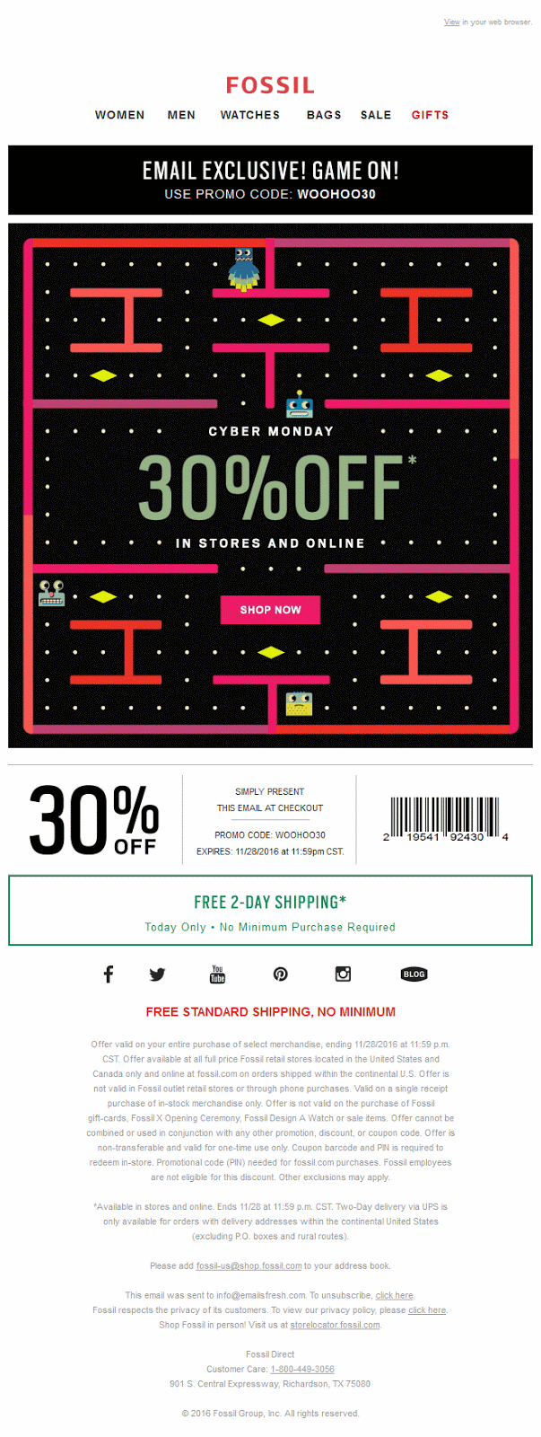
Animation is a design choice that’s enjoyed by companies and customers alike. The addition of animation can evoke emotion, entertain, or even motivate someone to do an action like check out an online and in-store sale. With watch juggernaut Fossil, animation is used to spark joy and a bit of nostalgia. Their take on Cyber Monday comes in the form of a Pac-Man-like game where everyone is in a rush to claim the 30 percent off coupon before the exclusive deal is over. But spoiler, your voucher is safe and sound at the bottom of the email! It’s a fun and innovative use of motion and one of our favorites.
Create a Final Countdown

Countdown clocks are a marketing email staple. Here, Hershel Supply Co. approaches it differently. In their minimalistic email, the countdown is not just a literal countdown clock that’s featured, it can also be found in the different discount amounts the brand offers: 20%, 40%, and 60%. An additional play on words is found in how the discounts are staggered like a set of stairs directing your eyes downward. It’s a fantastic design choice that will have customers clamoring for the call to action button.
Show Them What You’ve Got

We all know the saying, “show, don’t tell.” In this example, Udemy has fun with the phrase in two ways. First, the design highlights all the different kinds of topics and categories customers can take classes on, effectively showing them a world of knowledge that awaits them. This show and tell theme is further visible in the countdown clock that lives just above the fold, prompting the reader to take advantage of the CTA if they missed it before.
Get Interactive

We especially appreciate Apple’s design, which adds a festive pop of color amidst the brand’s signature minimalistic white and charcoal black design as it highlights Black Friday and Cyber Monday deals. We also love how the email reacts differently depending on the type of device it’s read on.
For Apple mobile devices and computers, the animated dots look like the brand’s calendar app icons and clicking on them or the call to action button opens the app. It allows the user to save the dates and set reminders so that they don’t miss out. For all other devices, the “save the dates” button opens their respective calendar app so that they can enjoy the event, too.
MailBakery
We hope our favorite email examples have got you interested in coding your own ideas. Cyber Monday is an excellent time to experiment with design trends and elements you wouldn’t usually consider. Incorporating these elements into your campaigns can promote your business and drive traffic to your website, even if you don’t have an explosive sale in the works.
If you’re interested in creating your own design, our team at MailBakery is happy to create an HTML email template that’s brand-specific and so stunning that you won’t be able to CTRL your joy!
Contact us today, and let’s bake something fresh!


